HOME | DD
 kmkibble75 — Bolty Betty 2017

#drawing #redhead #superhero #woman #boltybetty #leagueofdisgruntledgentlemen #cityofheroes #traditionalart #cohcov
Published: 2017-12-31 16:45:39 +0000 UTC; Views: 1461; Favourites: 31; Downloads: 0
Redirect to original
Description
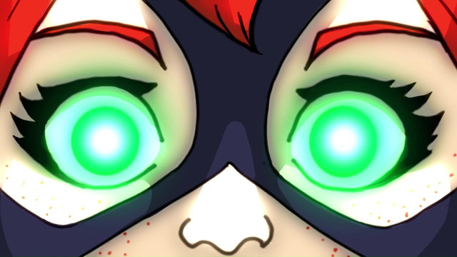
For the last drawing of 2017, I decided to play with my copics again and draw my City of Heroes energy/energy blaster Bolty Betty. If this were digital, I'd have enlarged her logo, but it isn't, so I didn't. I may need to change it some day, though, because it's kind of annoying to draw. :-/At any rate, I don't hate this one, and it's cool to see how far I've come since June of 2015. (The 2015 version was digital and probably took me several days to get right; 2017's is traditional and took maybe 5 hours total.)
Anyhow, let me know what you think -- any critiques, tips, and comments are more than welcome and appreciated!
Related content
Comments: 15

You're getting increasingly more skillful at establishing structural differences in your faces and it really shows in this piece. I continue to marvel at how well you establish a fullness of volume in the hair without going too crazy with pencil strokes, coloring and shading.
👍: 0 ⏩: 1

Thank you! Her hair, I think, might be a bit more crazy than I intended. I think I just went a bit too high with the top, and now something about it seems off to me, but I can't put my finger on what. I am glad the facial structure thing is working out, though -- it's one of the top concerns I have when I'm working on stuff because since so much of my output is just headshots, I'm afraid people will start thinking, "He's just drawing the same thing over and over..."
👍: 0 ⏩: 0

From
Good job on this picture. Comparing it with the one from 2015, this is definitely a step up. The picture looks much better, and so does the expression. It has a much simpler feel to it, which is actually really good. Since drawings and cartoon figures tend to be exaggerations themselves, it is very difficult actually copying an expression from real life, without making it seem exaggerated. Regardless, good job on the over all picture. Now, I do have a few suggestion.
Some shading and lighting would really benefit the image. I can see a bit of shades here and there, but a few more would really bring the picture to life. Another thing would be not to be satisfied with just one shade. It can be fine at times, but using multiple darker colors for the shading would give a warmer and more diverse feel to the picture. Lighting also helps. Unlike shading, just a bit of lighting on the side would do fine. Shading and lighting gives more dimension, as if you can see around it.
Regardless, it's still a good picture. Very well drawn. Keep it up!
👍: 0 ⏩: 1

Thank you for taking the time to comment on this, I really appreciate it.
I get what you're saying about the shading -- working in varying degrees of it is something I'm definitely working on. getting the highlights with the markers -- that's a whole lot harder, but I've been giving it a go (but screwing up the pieces, so they haven't been posted).
Thank you again!
👍: 0 ⏩: 0

Hello! I have come from ^V^
I'd like to start off by saying this is a really great piece! I love the contrast of her red hair and her blue top; it really draws the eyes in towards her face. This is especially helpful since it's one of the first places we tend to look in an art piece!
You seem to have a very good grasp of anatomy, too! Almost everything is placed correctly, however, I feel the shirt isn't warped correctly to her body. It's a bit off-center, as well as the logo. I also feel like the left eye got a bit more warped than the right; it looks a bit more drooped than the other. Of course, this could also be from her raising/lowering her brow, but from the angle of her face, it may seem like they both are the same height so that would be thrown off-balance.
Another thing I felt was a bit lacking was the shading. Of course, it's always fine to have just flat colors and no shading, but it appears that there are faint traces of it. You can faintly see it on the skin - such as the face - but almost nowhere else in the piece, especially the hair. The only "bold" shading is on her left brow, which looks a bit misplaced when you compare it to the almost no-shaded other aspects of the drawing. I believe if you had pushed the values a bit more, it could have made the piece a bit more cohesive
However, other than that I really like this piece and the character! Even though her hair is an unnatural shade of red, you still make it look believable with the style composition of the hair. The way you included subtle hints at the red and blue other places than the hair and shirt - such as the blue eyes and pinkish lips - really helped pull the piece together and not just slapping colors on there for effect. I feel you have a lot of potential and I can't wait to see what other amazing works you create! ^^
I hope this helps in some way! I also hope I didn't offend you in any way since that wasn't my intention ;u;
👍: 0 ⏩: 1

Thank you for taking the time to comment.
Her top was definitely causing me some issues as I worked on it -- I just couldn't get the dang thing to look right. I'll ahve to pay better attention to centering it in the future.
You're right about teh shading, too -- I need to stop pulling my punches in that regard.
Thank you again for offering your thoughts -- I really appreciate it!
👍: 0 ⏩: 1

no problem! glad i could help ;u;
👍: 0 ⏩: 0
Hello from ProjectComment
All in all, I think this is an outstanding piece. For starters, I really like how the red hair contrasts with the blue on her top. It's a beautiful shade, and one I feel doesn't get used often, so kudos for giving it some love. I also admit the level of detailing you've drawn into her hair with the way it flows from the top of her head down the stage right of her face. The minimal shading on her neck also helps add a great sense of detail, showing more of the throat without having to draw it on with lines, and I also like how you shaded the very far stage right to convey her hair blocking out the light. I also like the detailing on the tabs (for lack of the correct word) that hold on her cape, and the way you conveyed the flow of it and how it sits around her neck.
And what makes it even better is just how much you've improved when you compare it to the one from 2015. I'm not saying that's a bad piece, but the "flaws" definitely show when compared to this one. For example, I feel on the old piece the face feels a little "wonky", as it comes across like it's too much to the stage right, more so than in a way one would look when facing the way she does. Here however, nothing like that. The face looks like it's positioned properly, and while I feel it may be lacking a little due to the lack of a wink, it's a minor thing when compared to just how much better the face looks. Plus I also really like how the smile came out. I also feel the colours look better here, especially how much brighter and more vibrant the red is when compared to the old one.
Normally when I submit a comment for ProjectComment, I try to write a "Positive/Negative/Positive" one, but if I'm honest, I can't think of any obvious flaws that I could point out to you, bar maybe how some parts of the colouring are darker than others, such as a line to the stage left of the logo on her chest. However, that is a minor thing at best, and something I do all too often when I colour with a marker. The only thing I could think of is the eyes, as I feel they look best when around the upper quarter or fifth is covered by them. I do feel the ones here look a little intense, like she's staring straight at me with unblinking eyes, which normally I feel gives the character a bit of a psychotic vibe. However, that doesn't come across like that at all to me, so bravo on also doing a great job on the eyes, despite drawing them in a way I feel can make the character come across unsettling.
👍: 0 ⏩: 1

Thank you for taking the time to comment -- both on this one and a little bit on the old one 
Thank you again for the compliments and input -- it really made my weekend!
👍: 0 ⏩: 1

You're welcome. I'm glad it helped make your weekend. I wish you the best in your future work.
👍: 0 ⏩: 0

Hi there! I'm from
I think that this is a really nice piece of art. I've looked briefly through your gallery nd I must say, that I fell in love with your style of drawing faces, it's really nice! I love the way all of them have an expression.
Looking at the version from 2015 you added there.. well, you made a great improvement! Keep it up ^^
Even though I really love this piece, what I miss is depth. I would suggest playing with shadows more, don't be afraid of doing that. I think if you just shaded (is it called that way? 
I guess that is the only thing that is really appealing to me from the point of drawing itself, I don't like the "lines" made by the markers while coloring but I know it is really hard to get rid of them and it takes a lot of time.
About the logo, I personally would not make it bigger or anything, maybe just draw it from a slightly different angle
Lastly I would like to add, that I cannot stop looking into her eyes! I have no idea how you did that, but her eyes and look is amazing, even though I'd add colors as I said.
That's probablu all I wanted to say, keep up the great work!
👍: 0 ⏩: 1

Thank you so much for taking the time to comment!
I get what you mean about the shading -- I'm still stumbling along in the learning process of figuring out what markers work well together in that regard, so it's good to know this isn't the right one.
And you made my night with the comment about her eyes -- they're always the most important thing for me (eyes an eyebrows really make or break a face), so of course I love hearing that they look good.
Thank you again -- I really appreciate the input!
👍: 0 ⏩: 1

I guess it will come with time, do not worry, I'll definitely check out your future work!
I must agree, eyes are the key if you are drawing a face. Really great job!
And you are welcome ^^
👍: 0 ⏩: 0


