HOME | DD
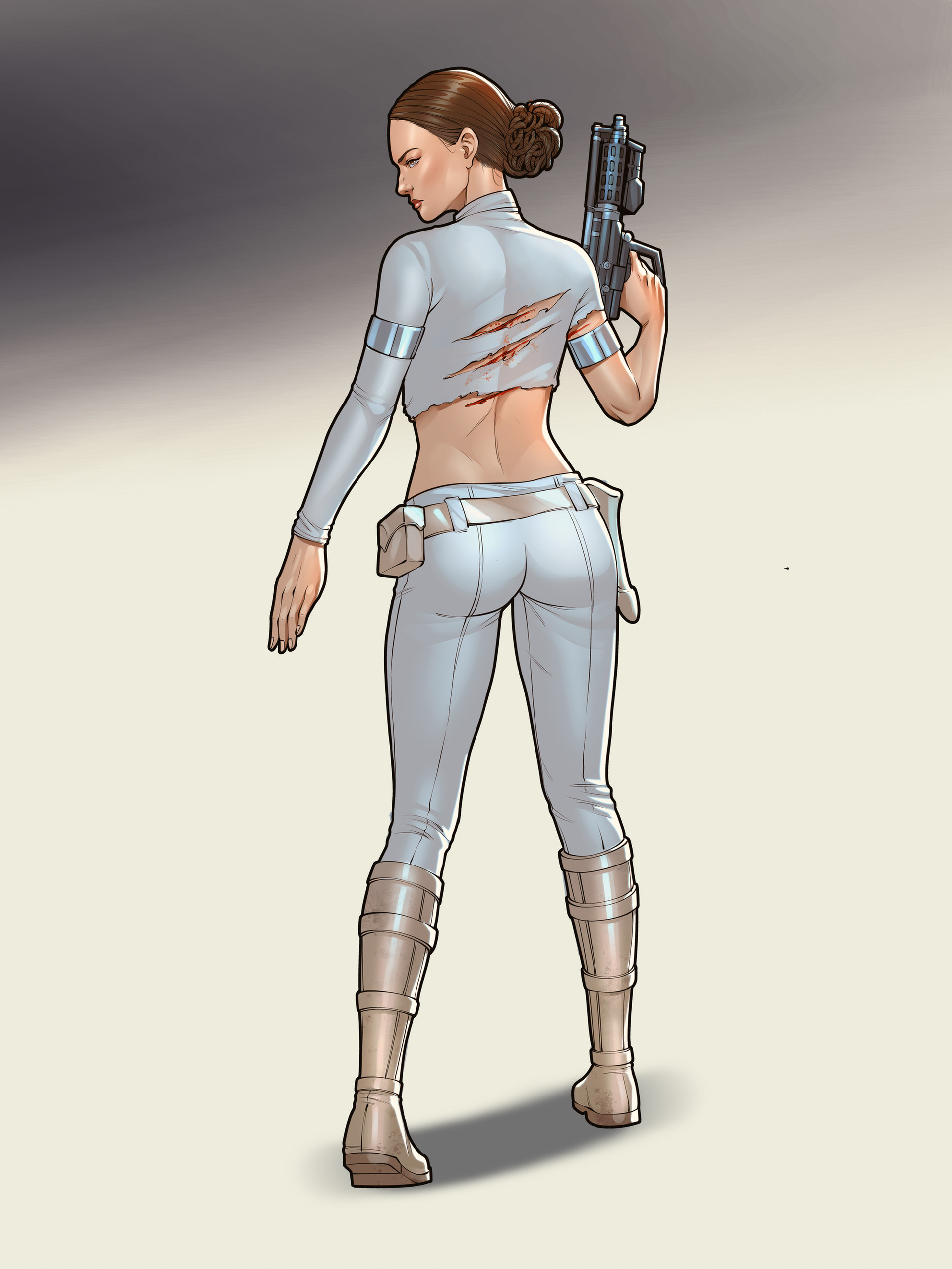
 kmkibble75 — Kitty Pryde

#digitalart #drawing #hazeleyes #kittypryde #marvel #marvelcomics #pixie #portrait #shadowcat #woman #xmen
Published: 2018-07-21 16:00:47 +0000 UTC; Views: 2111; Favourites: 68; Downloads: 0
Redirect to original
Description
Whenever I finish a piece that takes me a few weeks, I always swear that I'm going to stick to the quick and easy stuff for a while afterward. After spending a long weekend at the shore catching up on the "X-Men: Gold" series (spoiler alert, it's not very good), I decided to make my first quick-and-easy a portrait of Kitty Pryde. She'll always be a favorite of mine because of her days on the Excalibur team and how they've actually let her grow over the years from an awkward teen to a genuine leader. That doesn't happen too often in comics.Anyway, when I say "quick and easy," I mean this one took me about 6-8 hours, if you filter out all of the distractions and Critical Role watching over the past few days. And I'm posting it right away because I want to get more comfortable with considering things done, rather than hovering over them for days or weeks at a time. I'm pretty happy with it, though. But still, any comments, tips, or critiques are more than welcome and would be appreciated!
____________________________________________
Disclaimer: I’m red-green colorblind. Because of this, it’s difficult for me to tell similar shades/hues of different colors apart, and, therefore, I need to work with very limited palettes when I color pieces. For shading and highlights, I’ll generally adjust the ‘value’ portion of the HSV setting to make the base color lighter or darker; I’m unable to ‘cool’ shadows by adding blue or anything like that. I’ve often been told to be bolder in my highlighting and shading, and I’m trying to be so, but… sometimes it still seems pretty tame. I’m just saying this in case you mentioned I need to do that on a previous piece – I’m not ignoring you, and I appreciate the input. It’s just not very easy for me to implement confidently.
Related content


Comments: 28

👍: 1 ⏩: 1

👍: 1 ⏩: 1
👍: 1 ⏩: 0

One of my deepest crushes (because we were 13 at the same time).
That hair... that's just amazing. And yes, I love that she went from "young, brash kid" to full-fledged professional leader and chosen face of the X-Men.
👍: 1 ⏩: 1
Yeah, Kitty is a lot of folks' main comic squeeze, I think. And the short-haired look for her really grew on me, so to speak. I haven't looked at this one in a while, though, and I feel like I should give her another shot.
👍: 1 ⏩: 1
I'm for more Kitty.
Always happy to see more Pryde.
👍: 1 ⏩: 1

Hi there from ProjectComment
This is a very nice portrait. The anatomical structure of the face are well done, and the shading and lighting look well-put. Also the skin tone looks healthy and realistic. I don't know how much realism you wanted to put in that picture, but I will give you some advice in case you do strife for a more realistic apporach. First of all, her eyes look very large. That doesn't necessarily mean you have to "shrink" the eyes. However, I think the iris and the pupil of her stage left eye look larger than the right one, and if you look close enough you'll see they are. Then I think the shadow that is cast by the upper eyelid onto the eyeball should be more emphasised. That'll give your eyes a more natural "size", without making them actuall smaller. Furthermore, concerning the stage right eye, I think the lacrimal caruncle should be visible. That small area appearing white (instead of red-ish) also adds to the impression that the eyeball itself is too large. That's about it for the eyes.
Other than that you might but a small highlight on the tip of the nose, and give the hair more structure to make it look more natural. Also here, some additional highlights might help.
Thank you for your attention, I hope I could help!
👍: 0 ⏩: 1
Thank you so much for taking the time to comment -- I really appreciate it.
I get what you're saying about her eyes; I do think they're a bit bigger than they needed to be. And that's not a bad observation about the inner corners of her eyes -- that's something I used to do differently, but kind of shied away from recently for one reason or other. I'm thinking I should go back to it for the exact reasons you state.
👍: 0 ⏩: 0

Hei there!
When I saw this in PC gallery, my first thought was / oh, this must be from the good comic artist, I've commented on one of his characters before. You see, I've been going through your gallery just to find out it is really you!
With the first paragraph I just wanted to say that you have a really nice style of drawing and I still really like it. I mean I still do not get it how you can achieve a look like that even in the not-coloured version. Right now I am actually considering drawing in similar comic-like style but I am still too afraid to try it
Well, to the work itself, I must say that I love the overall bold impression of the characters. The rectangle in the background just fits there perfectly  (Smile)")
To the character, I think that overall it is really great. You really are colour-blind? That's hard to believe, I mean, I've seen many much worse works made by artist that see in colour, your talent is insane in that way.
There are few things I would suggest to the colouring, however, because there are always ways to get better. The thing that strikes my eye most is her neck, that looks pretty much the same to me, I think it could use a bit of darker color, as well as the part of her brow, just under the hair. You see, I myself have been afraid of darker colors for too long, but I think it would be worth a try
Maybe I would also distinguish the eyes a bit more, but I think it is not really needed in this style ")
To finish it off, I will tell you that I really LOVE her hair 
To sum it up.. you did AMAZING job there, I really love it and I'm looking forward to see more by you
Hope you are having a wonderful day and that I was at least a bit helpful

👍: 0 ⏩: 1
Hello again! Thank you so much for the comment and for such kind words -- I'm flattered that you'd think of me as "the good comic artist." That's really made my day...
Most of the color credit goes to the computer program -- I do everything in greyscale and then put a layer of color over it, so I can't take credit there (especially when I just pluck the colors from a comic book panel). But I get what you're saying about the shading on her neck and forehead. I've been getting bolder and more willing to get dark with those things, but obviously I still have some work to do. I'll keep it in mind moving forward.
Sharpening her eyes is a good bit of advice, too. For a while I thought I was going too strong on that, so I started pulling back, but maybe I'll give them a bit more emphasis again. And I'm glad you like the hair! The new look was fun to try out, even though I still kind of miss her ponytail in the comics.
Also, you should give a comic-y style a shot! I mean, your usual style is pretty amazing anyway, but it can be fun to just try something different every now and then.
👍: 0 ⏩: 1
Oooh, no need to thank me for the truth
Well, I think that even when working on a grayscale (I was actually considering trying that first too instead of starting with flat colours as I do, but never really did it
I think you should really try to be bolder with colours and your work because it is really awesome, there is nothing to be afraid of
I guess I will give it a shot.. once
👍: 0 ⏩: 1
Yeah, I can see why you might want to master one thing before moving on to another. But if you ever feel like goofing off for an afternoon, give it a try!
👍: 0 ⏩: 1
I'll definitely send you a note then
👍: 0 ⏩: 1

Thank you! I wasn't too confident in it, so it's really cool to know you like it.
👍: 0 ⏩: 1

you're most welcome it's only natural to support other artists !!
and omg no really this piece is gorgeous !!
it looks totally fine to me
👍: 0 ⏩: 0

This looks pretty good, very true to the character and a solid design with good coloring in general. I agree, it’s awesome to see her grow and change like that; really gives things a nice sense of progression ^^.
And how bad is Gold? I remember that racism controversy from issue one, anything else glaringly awful about it?
👍: 0 ⏩: 1
Thank you!
Gold may not be terrible; it just didn't align with my story tastes. There's stuff about California being an independent country and the rest of the U.S. is run by Hydra. It had to do with the Captain America as a Nazi storyline, which I think was eventually nullified, but... nah. Not my thing. I prefer storylines that could happen in our world, which X-Men Blue seems to have stuck to, for the most part. I skimmed a lot of Gold, which isn't something I usually do.
And the stuff that caused the problems was removed for the trade publications.
👍: 0 ⏩: 1
You’re welcome; this is phenomenal and you deserve to know that
I see, sounds... odd? That’s definitely more than a bit different than I was expecting. Do they even address if mutants are still hated or not? That seems to flip flop a lot lately. Yeah, I’ve heard a lot of the new X-Men books are middling at best; especially the Iceman solo series, which I’ve yet to hear anyone speak positively about.
That’s good, I’m glad they at least had the common sense to do that. I still can’t believe nobody noticed that in editing, that just blows my mind.
👍: 0 ⏩: 1
The volume I last read (#2), they were hated, which is why they set up California as a separate country for mutants.
I enjoyed the X-Men Blue series, as well as Jean Grey and Phoenix Resurrection, but Jean Grey is one of my favorite characters, if not my favorite, so that's not much of a surprise. I haven't read X-Men Red yet, though.
👍: 0 ⏩: 2
X-Men Red is the team lead by the adult Jean Grey after she came back to life in Phoenix: Resurrection (spoiler alert). It has Namor, Nightcrawler, X-23, Honey Badger, and I think one other hero. I've yet to read it, but Mahmud Asrar is doing the art, and he's pretty good.
If you haven't read any in a while (I liked "The All-New All-Different X-Men run, which focused on just the original 5 teams being pulled into the future), I'd just wait to see what happens after the storyline that's starting in August (I forget its name). It sounds like something that will result in the teen versions going back to their original places in time and some changes in the timeline overall happening (hopefully resulting in Jean and Scott being together again).
👍: 0 ⏩: 0
Okay, that makes sense to a degree. I just have two main issues with that; it segregates them (perhaps a bit ironic considering what they’re an allegory for) from the rest of the Marvel Universe which is primarily in NYC so crossovers are a bit harder, especially for street level heroes. And the other issue I have is that California seems a bit... obvious? Considering it’s history, especially recently with the gay right’s movement, that seems like a bit too obvious of a place for the X-Men to stay. It feels safe, from a writing standpoint. Maybe I’m just an old fart who doesn’t know anything though, haha.
Right, I’ve heard her younger self is very divisive; either you love her or hate her. What’s X-Men Red? Sounds like the family friendly version of X-Force, haha.
👍: 0 ⏩: 0