HOME | DD
 kmkibble75 — The Captain and Her First Mate
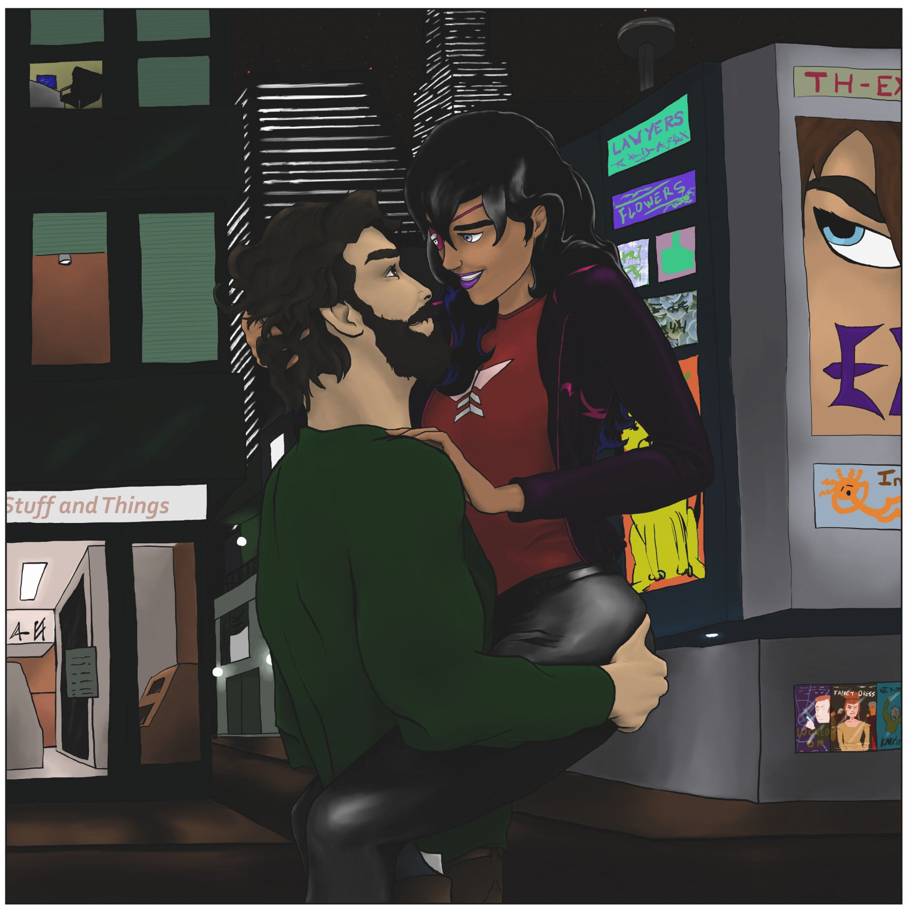
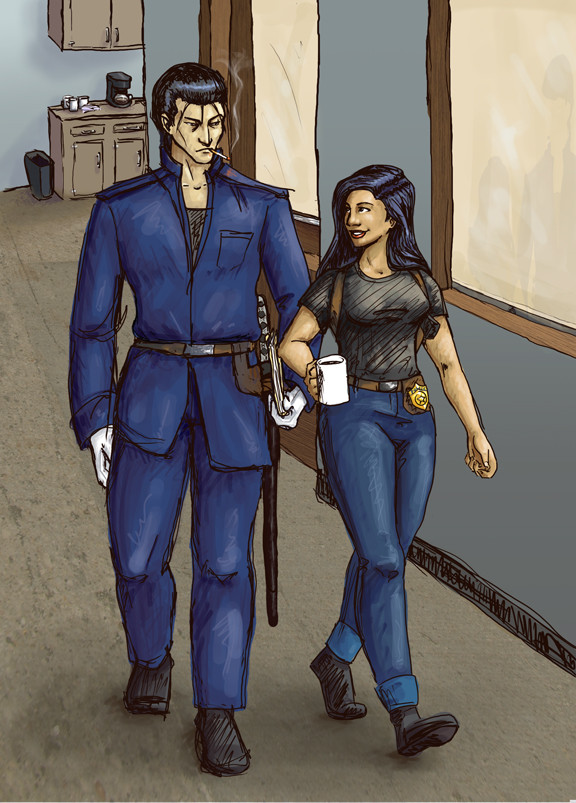
#couple #drawing #firstmate #man #oc #originalcharacters #romantic #spacepirate #woman #googooeyes
Published: 2017-09-05 00:50:47 +0000 UTC; Views: 652; Favourites: 24; Downloads: 0
Redirect to original
Description
This is the picture that has the background I was referring to in my status last week -- I wound up hovering between going all out on it and doing my usual half-assed job, but I don't think it looks too terrible. Not great, but not too terrible.Anyhow, This is The Captain and her sort-of first mate. Technically, he's not because the position was already filled when he joined the crew, but he *is* her husband, so... there's a lot of grey area there (that position was not filled when he joined the crew).
I'm not a fan of portraits that are this far back from the subjects, but I felt it was important to show as much of them as I did since it's the First Mate's first appearance and I didn't want people to get the impression that he's a good foot shorter than The Captain (he's 6 foot 2, she's 5 foot four). The cost of doing that, though, is that the way they're looking at one another could get overwhelmed (although the point of this was, technically, to practice my backgrounds, the picture still needs to get across its story).
Anyhow, please let me know what you think. The lighting made it a bear to try to get the highlights in her hair to play nice -- especially given since the lower half is super-dark blue. I think a style change to something more manageable might be in her future.
Any advice/comments are welcome and appreciated.
The Captain's previous appearances:
___________________
Disclaimer: I’m red-green colorblind. Because of this, it’s difficult for me to tell similar shades/hues of different colors apart, and, therefore, I need to work with very limited palettes when I color pieces. I’ve often been told to be bolder in my highlighting and shading, and I’m trying to be so, but… sometimes it still seems pretty tame. I’m just saying this in case you mentioned I need to do that on a previous piece – I’m not ignoring you, and I appreciate the input. It’s just not very easy for me to implement confidently.
Related content


Comments: 27

It's too bad there aren't a lot of pirate romances these days in fiction. I don't think I've ever seen a story that concentrated on just that either. The way the characters look is well-done and the background looks good too. 😊
👍: 0 ⏩: 1

Hello! Found this through and wanted to say 'hi'  (Smile)")
First of all, I love the pose and their expressions! The First Mate's musculature is very well done, and the shading on them both, while subtle, definitely works. I especially love how you did the Captain's pants - it gives them an almost leather/vinyl-looking texture.
I hear you on backgrounds - I'm working on them myself, and one of the hardest things is just perspective: the illusions that the background really is somewhere...further back. I love the skyscrapers in the far background, how you used the stark white lines to make the appearance of buildings. I also LOVE the details - the billboards, the ads, the chair you see in the window above that storefront...very creative and well-thought-out!
I'd say the main improvements are in pure technique - the vision is there. One thing that would improve this piece's background (and would be relatively easy to do) is don't try to line it all free-hand. Make use of the shape and line tools in whatever program you use to set the basic structures, then add details like cracks or softened edges after, as well as the colors and pictures on billboards. I'd also do all of that in a separate layer (or several, then merge when they're done) and maybe use a blur on it so that the two characters are focused in the foreground. It might give that illusion of distance.
I'm no expert on backgrounds, just speaking from personal discovery and such ")
👍: 0 ⏩: 1

Hello back at you!
Your advice is fantastic, so thank you for it! I actually figured out the whole "soft focus" thing after finishing this piece, and it helps exactly how much you say it would. I wish I'd known about it while working on this one! And you're right about using the shapes and line tools -- I'm still fighting with the idea that it's somehow "cheating" to use those, but it's not. I'm still putting in the work to make the picture itself -- I just have to keep convincing myself of that. Hearing it from other people really helps. I think you're right that using shapes and line would have made this piece a lot more solid.
And you're spot on about that "Oh. DUH" moment -- it's amazing how one instant can be such a rush and such a "dear god, I'm dumb" moment at the same time.
Thank you, again, for the compliments and the advice. I really appreciate it!
Kevin
👍: 0 ⏩: 1
Hi Kevin! I know what you mean by feela my that using shape tools and all is “cheating” - I felt the same way. But when you think about it...when we want to draw perfectly straight lines or even circles and whatnot, we use rulers and compasses or stencils. The tools in digital art programs are just...well, versions of that
👍: 0 ⏩: 1
It's always to know I'm not alone in thinking like that, and also in thinking that thinking like that is kind of silly.
And you're right -- there is a good bit of fun to it.
👍: 0 ⏩: 0

Hey! I'm from ProjectComment !

Let me start by saying I like your composition. The silhouette of the characters together is a visually interesting shape and makes a nice contrast to the angles of the background. I think the difference between the organic versus rigid shapes is definitely one of my favorite things about this piece. I know you’ve already addressed this in your own comment, but I would love to see this piece with a completed background. It just has so much potential. Keep in mind if you adjust the background, it helps keep the viewer engaged in the piece if the stuff along the edges of an image aren’t distracting. Some of the details along the edge could be washed out a bit, giving more focus to the characters in the center, since they’re the focal point anyway. ^^
I think adjusting the value could help this piece immensely. As it is, the characters in the foreground are the same value as the background. It makes it really difficult to separate them from the buildings behind. You can do this in two ways: Lighten the characters or the background. Even at night when against a city full of lights, atmospheric perspective still exists. Think of it like a fog of light. Even placing a semi-transparent layer between the fore and background of white or color would help give that effect and help the background become less of a focus like I mentioned earlier and help your characters stand out even more.
One more thing you might play around with in your next piece: colored lighting. Colored lighting brings visual interest and often brings balance to the color palette. I may be wrong, but it looks like for your shadows and highlights you primarily used burn and dodge respectively. This is digital, so you can use all the layers you want without screwing up your original art, so go crazy in experimentation and use all sorts of color overlays to bring the image to life. ^^ Real life is never only white light. If you look closely at objects, even your own arm for example, there is a lot of reflected light from the surrounding objects. If my arm is on top of a blanket, my arm has a hint of the blanket’s color while the blanket has a hint of the color of my arm. Reflective light is one of the biggest things that’s often missed in painting because it is difficult to master. So fake it. Add hints of various light sources to give the illusion while adding actual reflective light to the most obvious areas of your picture, like his shirt against hers and vice versa. Obviously you could add to other areas on the characters as well, but that's just one example.
Soo, that was a lot of suggestions, but all in all, you have a great composition and it has the potential to be really stunning. Keep up the great work and keep improving! ^^
👍: 0 ⏩: 1
Thank you for taking the time to comment, I really appreciate it.
I get what you mean about the values -- the background colors did turn out much darker than I intended. Since then I found a different way to apply colors, so we'll see how that goes in the future. The colored lighting idea is good advice, but I'm not sure I could pull it off -- there's a bit too much of a variable involved there for me to be confident given I can't see colors like normal people. I pretty much have to choose a wheelhouse and stick with it, you know?
Thank you for the ideas, though 00 I'll definitely keep them in mind.
Kevin
👍: 0 ⏩: 1
I think you could still pull it off with a little practice and feedback. The nice thing about overlays is it really brings the colors together. You can pick highly saturated base colors and with a couple of multiply or overlay layers, everything can be brought into the same palette. ^^ That being said, I don't see what you do, so do what feels comfortable. You have great work, I'm sure you'll only continue to get better.
👍: 0 ⏩: 1

hello! (sorry in advance im not good at English)
one thing that stands out instantly is its kinda hard to tell the background apart from the characters, i think this is from the light shading on your ocs and the heavily shading on the background.
the colors clash but you say you are red-green colorblind so you may get a pass on that.
face expressions are great and proportions and good
the hair bothers me, i can't put my finger on it, i think its the shading? or the highlights? i really can't tell.
references should help with drawing hair, sorry i can't really help i just can't put my finger on it
oh and the dude hand should be lower if he is holding her cause it looks like she's gonna slip
👍: 0 ⏩: 1
Thank you for taking the time to comment!
I can see why the background comes off as a bit dark, and so blends in with the characters. I'm not sure I used the correct technique for this sort of scene as far as colors go...
Which one's hair is bothering you?
Thank you again for commenting!
👍: 0 ⏩: 1
its the girl, i think its the highlights
👍: 0 ⏩: 1

Awesome job! The poses are great, and I admire that you took the time to draw the details in. Five foot four...goddamn, can I steal a few inches from her?
👍: 0 ⏩: 1
Thank you very much!
My original idea was to have her be really short, but then I decided that might be too kitchy (oh, look, a short, quirky captain... how original). So, she's just quirky and average-sized. Unfortunately, even in the future, height-exchanging technology hasn't been invented yet.
👍: 0 ⏩: 1
You're welcome!
Ah, yeah -- that was a good decision! Too bad I fit that category of short and quirky 😂. That's messed up. Guess I'll just have to wait till I'm 16 so I can mess around with my height DNA. I didn't learn about DNA in detail, so chances are I'll mess around with other DNA strands as well so I may get abnormally pointed ears and a noticable tail before I'm 6 foot 2.
Don't be afraid when you switch the telly on and watch breaking news about a 16 year old elf-like girl with metal-attracting abilities!
👍: 0 ⏩: 1
You're a real person, though, so you're allowed to be short and quirky.  (Wink)")
And I will have fan t-shirts at the ready to begin selling when your superheroing/villaining days begin.
👍: 0 ⏩: 0

Hey there, I thought I might try and rustle up a critique for you courtesy of
Let me begin by saying hat you've done an excellent job with much of this piece, the poses are good, the expressions are strong, the character's actually feel like they're interacting with each other and...well most everything is looking pretty nice.
Unfortunately, I wouldn't be hear unless I spotted some things that could use a little polishing.
Okay, so your largest difficulty is with how the man is holding your girl the Captain. While everything checks out anatomically and structurally, its doesn't read right because we don't get the sense that the Captain weighs anything. Unless you man is some kind of superhuman or just chemically enhanced, he really should be putting some more effort into carrying the woman. I'm not entirely sure how the pose would work in real life, but just from my personal thoughts I feel that he should be leaning back a little more- counter balancing her weight. Also, I think the crook of his arms should look less like a right angle and more akin to an obtuse angle. Probably the short of it is that he probably shouldn't be holding her up quiet so high quiet so easily.
As a quick note, you many want to consider giving the man's shirt some more wrinkles. From what I see, he does not look muscular enough to be really busting out of his clothing and thus there should be some form of wrinkles ( unless of course the shirt is green laytex). I know you have some on his fore arms, buts that where you can generally get by without them ( lol).
Okay, last note. This isn't so much of a critique as a suggestion and it has to deal with the background. So architecture is something that you can play around with as much as you like ( so long as it obeys the rules of nature yak yak yak) and what you can do with it is accentuate the main focus of the. piece. This technique works particularly well with picture like this one because of the single point of interest. A quick suggestion would be to have some weird tree curving with the Captain, framing that side of the couple. Or you could even have the tree curve in the opposite direction to add contrast. You could something similar with the man too, using a strange building to either accentuate his pose or clash against it.
Whelp that's all I got for you, I wish I could have offered more. Fare thee well.
P.S. I would have commented on your weak lighting but it seems you already know about that.
👍: 0 ⏩: 1
Thank you so much for taking the time to comment -- I really appreciate your input. I know a shortcoming of mine is the wrinkles in clothing, so it's good to know I need to keep at that. I'll look up more photo references in the future (The fellow in the reference photo I used did not have one, so I was kind of on my own for that. He was also an American Football player, which explains why he was able to lift his girlfriend up so easily. I actually bulked the First Mate up a little, too, compared to the source guy).
I like what you're saying about the background -- I definitely will try it out if I decide to get more in depth with them.
Thank you, again!
👍: 0 ⏩: 1

Hah! You know, I was hoping I managed to make him good looking.
👍: 0 ⏩: 0

Yesss! The sassy captain is back! This is incredible posing work. The way the two of them are holding each other has such chemistry and all of the shading and highlights you've done on and around interwoven limbs really softens a harsh city vibe and shows you this beautiful moment between the two of them. The expressions are on-point here was well and eye-contact is massively palpable and purposeful. (their history is super cute, by the way, like he's not TECHNICALLY first mate but she considers him first mate because it sounds important and loyal)
Although the background could perhaps use a little work in the way of symmetry, you've done well with depth and angles here to create a scene that booth glows in the night and retains pitch-blackness shadows where appropriate. The only thing that sticks out a lot to me is the silhouette of the 'stuff and things' building that overlaps the darkness of the alleyway beside it and the night sky behind it, and kind of fades into nothingness, so it looks like the windows are floating mid-air. I feel like if you lit the structure a little more it would have alleviated this, but the bright room through the window behind them still helps create the sense there is a building there. and the shape is still visible.
Keep working on your backgrounds though, dude. This really adds a spice and a fuller vibe to your work!
👍: 0 ⏩: 1
Thank you so much -- I think you nailed the concerns about that Stuff and Things building that I couldn't put into words myself. Now that I look at it, it does kind of stand out for the reasons you suggest. Working on it was when I really began to question why I put myself through things like that.
I'm really glad to see the characters came across for you. This was a pose I've wanted to do for a while and finally got around to, but I didn't expect them to be as googly-eyed for one another as I think they are. It's kind of like when you're writing a character and they do something you don't expect, and you just have to roll with it because clearly they know themselves better than you do. I knew these two were in love, but now it's like, okay, actually they're inseparable.
👍: 0 ⏩: 0