HOME | DD
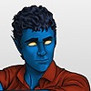 kmkibble75 — The Captain with a Different Look

#digitalart #drawing #portrait #scifi #spacecaptain #woman #bluishhair #thedemonsdaughter #attitudetospare
Published: 2018-09-06 01:38:13 +0000 UTC; Views: 582; Favourites: 24; Downloads: 0
Redirect to original
Description
I realized it's been over a year since I posted a new drawing of the Captain of the Demon's Daughter, so I decided to give her a quick go with a bit of a new look. It's not quite canon at the moment, but feel free to let me know if you think it should be.I have to admit -- it's really fun to try out alternate looks for characters.
Previously:
Any comments, tips, or critiques are welcome and appreciated!
____________________________________________
Disclaimer: I’m red-green colorblind. Because of this, it’s difficult for me to tell similar shades/hues of different colors apart, and, therefore, I need to work with very limited palettes when I color pieces. For shading and highlights, I’ll generally adjust the ‘value’ portion of the HSV setting to make the base color lighter or darker; I’m unable to ‘cool’ shadows by adding blue or anything like that. I’ve often been told to be bolder in my highlighting and shading, and I’m trying to be so, but… sometimes it still seems pretty tame. I’m just saying this in case you mentioned I need to do that on a previous piece – I’m not ignoring you, and I appreciate the input. It’s just not very easy for me to implement confidently.
Related content


Comments: 17

Nice work! Great pose and the composition of the character on the background works. She strikes me as confident and a bit fun. Your painterly style is nice and smooth although I do think some harsher shadows would help make the planes and 3Dness of the face pop out, especially around the corner of her eye, the bridge of her nose and around the corners of her mouth and such.
I've read your artist's statement regarding red-green colour blindness kind of being a hinder to to pushing the highlighting and shadows but I am wondering if you've ever heard of doing a black and white painting first and then painting the colours on top? I've seen a number of digital artists doing it on youtube and I was wondering if it would help at all. I ought to try out this technique myself at some point, but if you do it in black and white first you are pretty much forced to pay more attention to highlights and shadows and you don't get distracted by colours yet. Here is a quick video that shows a digital artist doing it: www.youtube.com/watch?v=zurMZ9…
Anyway, I hope you find this useful and I haven't trod on your toes - the comments regarding shadows and highlights must get tiresome and repetitive after a while but to be honest the only reason I'm commenting on those is because I have difficulty in critiquing any other aspect of your work. Keep it up!
👍: 0 ⏩: 1

Harsher shadows is definitely something I need to work on -- I keep trying to go deeper with them, but clearly haven't hit the sweet spot with them yet.
I often do use the black and white with a color overlay technique, though I do usually set up the color overlay first. Maybe I should set that side until the black and white is completely done to see how that goes.
And you definitely didn't trod on any toes -- thank you so much for taking the time to comment!
👍: 0 ⏩: 1
Perhaps and good luck!
You're welcome.
👍: 0 ⏩: 0

Hey there, I'm from Project Comment, and I would like to say that this art is outstanding! The perfect lighting and shading, the realistic look, and even the simplistic background really pull this all together and make it look complete and official! Keep up the amazing work.
👍: 0 ⏩: 1
Thank you so much! That means a lot to hear.
👍: 0 ⏩: 1
No problem, keep up the great work.
👍: 0 ⏩: 0

Hi! I´m from
i like how you made this awesome work ,,, the details and color are really cool ,,, ,,, i like that captain lol
👍: 0 ⏩: 1

Hi there, I’m from ProjectComment .
Overall: very well drawn! I like the composition a lot - everything about your character, from the bunny eyepatch (very cute) to her expression and pose shows a lot of personality, which I appreciate. I would’ve liked the creases in the clothing a little darker and harder-shaded, but the placement is very accurately done!
It appears you’ve heard this before, but if I were to critique anything, it’d be color and shading, since you are using darker/lighter versions of the same color to color your piece. I realize you are red-green colorblind, so: some advice for adjusting color. I am not entirely sure what art program you’re using, but search for a color balance tool. Very clearly labeled color sliders, so you could drop some paint on a layer, adjust the balance to be more red or yellow or something, then eyedrop it and apply to whatever surface you’d like.
Onto shading. I’d like harder shadows/highlights in certain areas. You know where these areas are, since you do have noticeably darker/stronger/lighter shading in them (under the hair on the forehead, under the lips, etc.). I’d like to point out the hair in particular. When I look closer, there is amazing detail work, but I can barely see it because it’s so dark. It would be nice if you ran over it with a lighter color.
👍: 0 ⏩: 1
Thank you for taking the time to comment! It's good to know the shading isn't as solid as it should be yet. I'm sort of tip toeing my way toward getting it right, so I'll keep pressing onward with that. Using different colors, unfortunately, isn't an option -- they'd be more likely to turn out pink or magenta or something totally off if I tried. So i just have to stay within the same colors.
Thank you, again, for taking the time -- I really appreciate it and will work on the shading and highlighting intensity in the future!
👍: 0 ⏩: 0

FANTASTIC WORK! Especially the color palette. Exceptional in my eyes. Striking, effective.
She is so powerful yet so feminine, wow, an icon. Love your use of form and the balance inherent in the piece.
In my work as a journalist I have interviewed several artists who told me they purposefully were told by their mentors to drastically limit their color palette in order to make stronger work and truly "feel" color. Actually Georgia O'Keeffe did that on her own, come to think of it, she forced herself to only work with black and white and then black, white and blue for a few years early on.
👍: 0 ⏩: 1
Thank you so much! It's awesome to hear that you were taken with it, and especially with the colors. I won't argue with my limitations being considered a bonus at times.
Thank you for taking the time to let me know you like it -- I really appreciate that!
 (Smile)")
👍: 0 ⏩: 1
My pleasure. All of our limitations or tough experiences have a silver lining right? Often are greatest gifts come from them. Anyway. You are awesome.
👍: 0 ⏩: 1
I'm really tempted to make it her thing
 (Wink)")
👍: 0 ⏩: 1

She would pull it off very well!
👍: 0 ⏩: 0