HOME | DD
 kmkibble75 — Winker
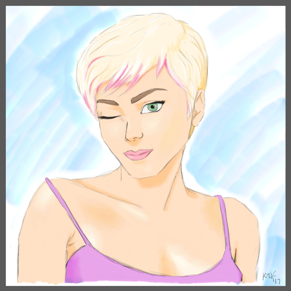
#drawing #pencils #wink #woman #pixie
Published: 2017-02-02 03:48:27 +0000 UTC; Views: 249; Favourites: 18; Downloads: 2
Redirect to original
Description
Continuing onward with my new colored pencil obsession, which is kind of running into a new Simple Portrait obsession as well. Anyway, I decided to add a little pink to her hair to liven her up a bit, but she added the wink on her own as I worked.Related content


Comments: 13

Hi! Firstly - this piece is beautifully done (anatomy, colour, shading....all that jazz  (Wink)")
👍: 0 ⏩: 1

Thank you for the comment and compliments! The ear could definitely use some work. I'm glad to hear the color combination worked for you; enjoy working with simple palettes.
Thank you again for taking the time!
👍: 0 ⏩: 1
 (Smile)")
👍: 0 ⏩: 0

I really like this piece, nice clear cut, defined lines.
Great use of limited colours and a great relationship between the tan, slight yellow, pink and blue.
Having the eye green offsets the composition very nicely, considering you have done this with coloured pencil the shading and blending is great.
I would love to see you come back and re do this in a month or so, I love watching progression.
Clear cut and bold spaces aren't really my area so I learn by observing the work of others in this respect.
Line six : Llama flying your way! ( Catch! )
👍: 0 ⏩: 1
Thank you so much for taking the time to comment -- the colors were kind of random, so I'm glad to hear they work well, and I've been thinking of revisiting some old stuff so maybe this will go in the queue down the line.
Thanks again!
👍: 0 ⏩: 1
I would say that you already had the colours in your mind just ready to go on, random is likely unstructured but a great job either way. Same here, old work is great to do, I sometimes look back and cringe hard! Haha.
And you are most welcome.
👍: 0 ⏩: 0

This is a great start! The color you are using are perfect together! Pink and Tan remind me of the beach and a nice warm sunny day!
I'm not a professional by any means when it comes to colored pencils. I'm not sure how many colored pencils you have - but adding different shads of the same tone add demention to her. Especially if you lay it on light at first and go harder or darker over top.
It looks like you have the light source coming from an angle - I think if you add more definition to the shadows and tones to her skin it will make the image less 'flate' looking and create more interesting image over all. Since you said your continuing - keep going! Add a varity of different colors of the same family to her shirt too and her skin tones to add some interest to the image. You could even add something to the background as well. Just a suggestion. You are doing awesome!! Keep it up!
👍: 0 ⏩: 1
Thank you very much for taking the time to comment -- I really appreciate it.
I like what you're saying about using various shades of the same family of colors, but that, unfortunately, is an issue for me since I'm colorblind. Reds and greens and browns, and purples and blues and some blacks all looks like the same family to me ay times.
Thank you, again!
👍: 0 ⏩: 1
You're colorblind? I'm sorry I had no idea.
👍: 0 ⏩: 1
No worries! I never know how much attention to give that fact. :-/
👍: 0 ⏩: 0

Nice technique! I really like her eyes ~ I think however that a few things are a bit out of place - as in, slightly off, not enough for it to be a big issue on its own but because alot of elements are like that as a whole the picture seems less controlled. For instance, the nose's angle is slightly off perspective-wise, one of the eyes is too high/low compared to the other, the ear is a bit too high... Nothing dramatic, but as i said the more there're small problems the less impactful a piece is
I also think that your line is a bit too trembly/lacks contrast - a sketchy style can be very refreshing but in this case the lines are thin and gray, which takes away the nice colors you used for the rest of the portrait. A good test is to see if your pic still looks good without the lineart (provided you use layers). In this case, I think you hesitated a bit between having a drawing that relies purely on flat colors/line and a painting that is sculpted out of bold shapes.
So, overall I think the picture looses a bit of impact because of the lineart/color problem and the small anatomy problems. However, you do have a good grasp on portraits and I really like her expression/the atmosphere this piece gives out.
👍: 0 ⏩: 1
Thank you for taking the time to comment -- I get what you're saying. I'll try to work on proportions and placement as I go. Line control has always been a bit of an issue for me, and I need to keep working on that.
But thank you for letting me know both what does and doesn't work for you -- it's a big help!
👍: 0 ⏩: 1