HOME | DD
 knightchick — Power Deep in My Soul

Published: 2014-03-27 22:17:17 +0000 UTC; Views: 365; Favourites: 20; Downloads: 0
Redirect to original
Description
Can't you see who I am I'm invincibleLike a force that is out of control
It's the key to achieving my goal
Unbreakable
Can't you hear what I say it's a miracle
Now you're scared that you're losing it all
But this power runs deep in my soul
Invincible
--"Invincible" - Amaranthe
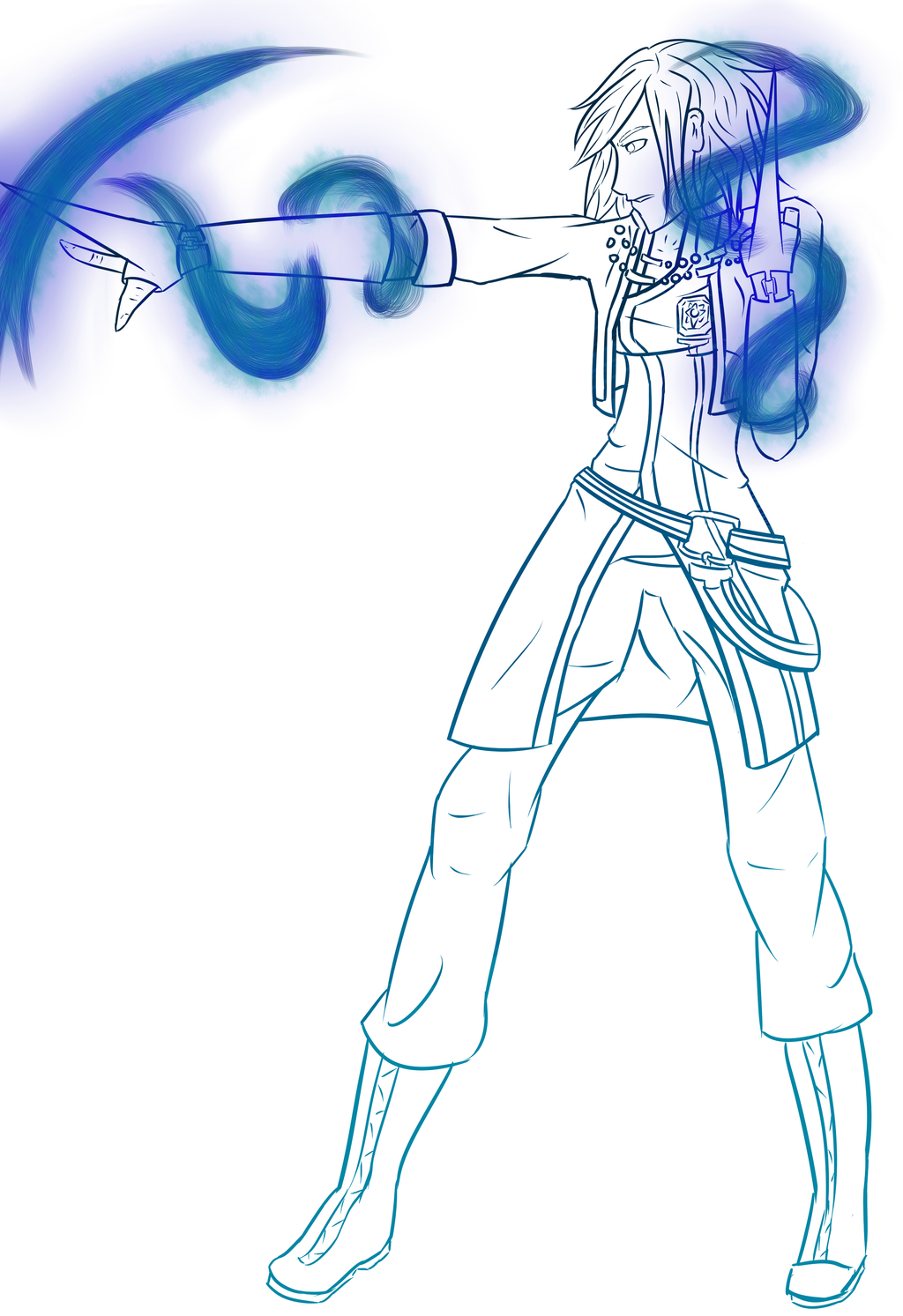
I ran across a tutorial on colored lineart a while back and wanted to try it out. I started this pose like a week ago and decided to give said coloring a shot
I might end up shading and/or coloring this, not sure
Oh yes, and the crystal appearance because I've fallen in love with it xD
If anyone's interested in coloring this, just let me know via note and I can send you the SAI file. I set it up so the blue is a clipped layer, so if you want to do just regular coloring all ya have to do is turn off the blue layer


All the WIPs and I still find the time to do new stuff *headdesk*
Adelphe McNeal, art (c) knightchick
D.Gray-man (c) Katsura Hoshino
Related content
Comments: 19

It looks so gorgeous! The shades of blue you used for the lineart are really nice!
and it also matches the crystal-water thing a lot too u w u ;
👍: 0 ⏩: 1

Thank you~ ;w;
Ehehhh you caught that did you? ;D I was actually torn between using red for the blood/crystal type but thought blue suits her more
👍: 0 ⏩: 1

You're welcome ~
Indeed Shads did *superman pose* Oh the color troubles * v * Yeah, the blue does look very good ! I wonder how it would look like with red color, though ~ or that beautiful rainbow color //shot
👍: 0 ⏩: 1

Color troubles indeeed :I though I went with the blue partially because there's more variance where red doesn't so much. Well liek . . . red has variants but in such a small surface area as lineart the variance in blue is easier to spot than red ahahahano I think Adelphe would shank me if I tried that |D
👍: 0 ⏩: 1

oh ho ho ; w ; I never noticed that before with the color range! //so smart, you are ~ And very agreed! Also, red seems to come off extremely bright in comparison (or that's just me)
you would be amazing at making books about color
Oh mai *patpat* that's rainbow power for chu : >
👍: 0 ⏩: 1

Ahah actually I just figured it out thinking about it, I never tried adding red instead of blue :'D mmm actually yeah, red ends up so much brighter. Must be because red's a warm color where blue is cool. Even vibrant isn't as bright as neutral red, depending on how much orange there is mixed in. asdfjhalf >//< ahaha an education may be good first |D pffft power of the raegbow maybe xDD
👍: 0 ⏩: 0

-BAMBIRAISESHERHANDUPFAST- MEEEEEEEEEEEEEEE //slap
-claps- very amazing job //slap
👍: 0 ⏩: 1

MEEEEEEEEEE LIKE YOU WANT TEH FILE?
asf;dkd thank you ;w;b
👍: 0 ⏩: 1

WHY ELSE WOULD I BE RAISING MY HAND
welcome <333
👍: 0 ⏩: 1

I'M SORRY, STILL BLOODY EXHAUSTED
IMMA SEND YOU A NOTE WITH TEH FILE~
👍: 0 ⏩: 1

WHY NOT SKYPE ME IT?
👍: 0 ⏩: 1

BLONDENESS, THAT'S WHY
👍: 0 ⏩: 1


