HOME | DD
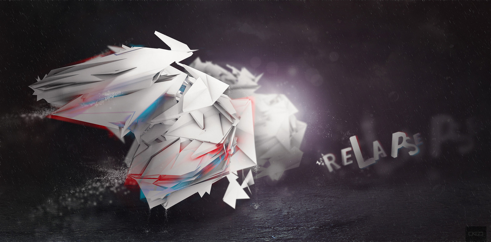
 kocho — Relapse
Published: 2010-11-10 00:10:32 +0000 UTC; Views: 2056; Favourites: 27; Downloads: 0
Redirect to original
Description
Originally for Evoke but it didn't make the final cut, which is fine. Wanted a slight anaglyph feel but without going overboard so it wasn't viewable. Anyway, ended up turning out how I wanted it originally with an empty, spacious feeling.Hope you like it. If not, stiff bikkies.
 (Wink)")
Related content


Comments: 10


Nice work Chris, it's good to see what didn't make it along with the other two. Like your use of blue and red in the main figure and the 3D type. Perhaps the glowing light in the centre does lead your eye away from the main figure though, but there's plenty of detail in it.
(Had to look up "anaglyph" as well.
👍: 0 ⏩: 0


While the atmosphere is real nice, I think this falls short compared to the other submissions due to the fact that its very crumbled up in one form. Your other pieces had alot more variety in terms of primary, secondary and tertiary forms which is kind of lacking here. The anaglyph effect works really nice with the type, but I think it actually goes over board with the structure you have there.
I cant emphasize on how much i like the atmosphere though, real nice job with the colour palette  (Smile)")
👍: 0 ⏩: 1

Thanks mate. Yeah, tend to agree. The feedback I go was that it was the render and how it was executed was what let the piece down. Can't say I'm totally happy with the movement of the render either. With the anaglyph effect on the render, I probably moved the red and the blue away too far, unlike the text.
Like you said, was happy with the palette and the atmosphere as a whole, but little things still frustrate me a bit.
Anyway, hopefully it's a good thing for future work.
Thanks for the feedback too!
👍: 0 ⏩: 0


