HOME | DD
 kon — Icons In Progress
Published: 2009-12-27 01:33:32 +0000 UTC; Views: 12322; Favourites: 61; Downloads: 1099
Redirect to original
Description
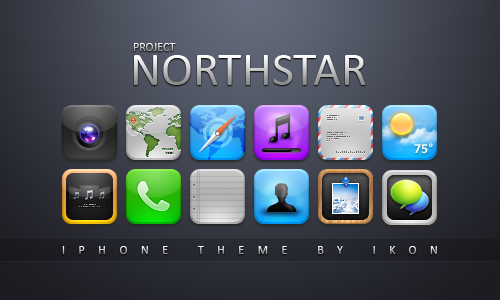
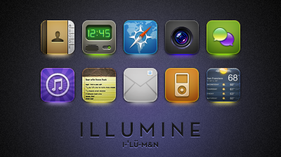
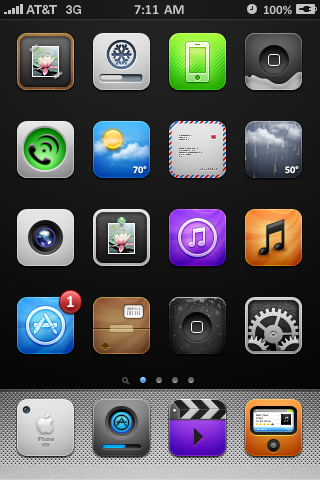
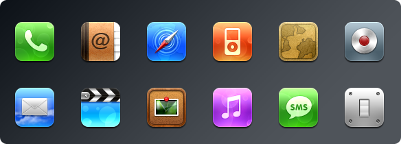
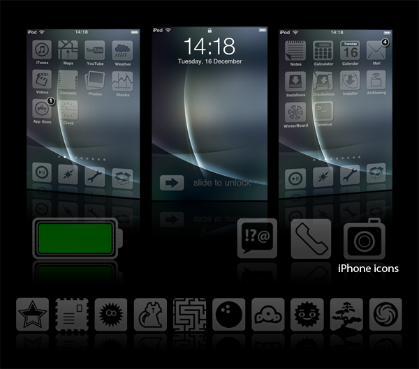
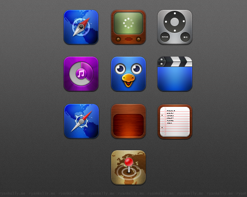
Here are some icons I've been working on over the winter break. I don't have a theme name and this is no illumine 2. I canned that idea for now.I'm not sure where I'm going with these. Just thought I'd post the work in progress.
- - - -
Update: Made some changes and added some more icons.
 kon
kon
Related content


Comments: 42


Really great icons !!
We begin to be accustomed with kon ! lol
I'm looking forward to the release...
👍: 0 ⏩: 0

I love these! Especially the App Store, Weather, and iTunes icons!
👍: 0 ⏩: 0

What can I say?
A-M-A-Z-I-N-G.
I can't wait...
")
👍: 0 ⏩: 0


It's coming out great. Keep up the great work brotha!
👍: 0 ⏩: 0

i love it!!! perfect way to start 2010 i would say lol... and if you ever make an illumin 2 i swear i will pay any amount of money for it, i was on illumine for 1 year long...
anyways great job and i hope to see an illumine 2...
👍: 0 ⏩: 0


I'm seriously surprised Apple hasn't offered you a job in their UI/Icon department (if such a magical place exists..)
That bar just keeps going up .. you keep outdoing yourself mate lol
👍: 0 ⏩: 0

Hmm... how 'bout a "custom" icon for Music/iPod?
👍: 0 ⏩: 0

These are really nice, especially the weather icon! Great work
👍: 0 ⏩: 0


I'm loving the progress on these! WinterBoard and the new App Store metaphors are excellent  (Smile)")
The pin on the photos icon looks cut on the left and right side.
The bevel looks a bit soft on that music note. I would increase the depth slightly.
Same gripes with your weather and old iPhone icon, unfortunately ")
All in all however, a GREAT improvement! Can't wait for release!
👍: 0 ⏩: 0


hi...
well i dun know why i thought to contact u for this problem,but in my whole friends list in dA i thought u are the one who can help me really.
well its long i have been trying to do something for it,since i was on windows xp,in xp icon size is small (by default) and also if u increase its size,its not that much precise as much in vista and 7.
i had diff softwares,as
[link]
since at the level of xp it worked fine.but when i tried this in vista,i couldn't get good results.an icon of 256 pixel,when converted by this software,reduced in size,and i thought may be its Showing small,but when applied,it was small.this link is of image,i took to show such icon,after converting.
[link]
i tried an online web icon converter.
[link]
[link]
but all same result,i need ur kind help,that how i convert .png to .ico and its size dont get small as i showed u in pic,it remain of same original pixel.i will be very thankful to u.
2nd.just one thing more,is there any possibility to apply .png image to folders,suppose i apply some icon to any of my folder,it accepts only .ico,n same for windows7 taskbar icon (making shortcut,applying icon,n pasting it taskbar).
dear i need ur kind help,i hope u will help me in this matter.
👍: 0 ⏩: 1


Amazing! Love the weather icons and iTunes icon with the background effect. Not so crazy about either app store icon though.
👍: 0 ⏩: 0

These icons are just awesome! Love the mail-icon ")
Anyways, can't wait to use it!
👍: 0 ⏩: 0


Lovin the apps and itunes store icons, cant wait bro
👍: 0 ⏩: 0

Just one word: A-a-awesome!! (sorry for stuttering)
👍: 0 ⏩: 0

I really like the rainy weather icon, and the colorful lenses .
👍: 0 ⏩: 0


I've always loved your camera icons and the alternate "App" and "Music" icons look great as well.
What I am most impressed with is the first weather icon, the rain looks great.
👍: 0 ⏩: 0

Really nice!
Name it "Intentio"
It's Latin and means "Design"
👍: 0 ⏩: 0

Lookin' good Kon!
Ralzaider made some good points.
Not a huge fan of that style of icon for the phone but you still managed to make them look super sexy.
👍: 0 ⏩: 0
-Loving the swirls on App Store and iTunes
-Weather icons are looking good, but the temperatures look kind of misplaced on them. Maybe have them match the colour of the icon more, with a slight shadow?
-Mail icon = pro
-I think the glow is too strong on the camera lens.
-Not liking the bevel on the (green circle) phone icon. I like the concept, but the bevel ruins it. I would try making the phone glyph white instead, and mess around with the bevel settings some more (outer bevel maybe?)
-Same bevel complaint with the iPhone icons. The Apple logo looks like its resting on top of the phone. Not sure about the "iPhone" text.
Overall, a good start. I would love to see more  (Wink)")
👍: 0 ⏩: 0

Beautiful! I especially <3 Applications. Fantastic lighting.
👍: 0 ⏩: 0


EPIC.
I don't really like the phone glyph stroke or the gloss, but everything else is wonderful. Nice job.
👍: 0 ⏩: 0

Nice! I dont like the white stroke on the phone icons glyph, nor the gloss on the phone icons. I also think the mail icons features need to be bigger :/
👍: 0 ⏩: 0


Weather and iTunes looks great! Very nice icons mate
👍: 0 ⏩: 0

