HOME | DD
 Koolstr — STYLE

Published: 2008-03-30 19:31:01 +0000 UTC; Views: 976; Favourites: 9; Downloads: 38
Redirect to original
Description
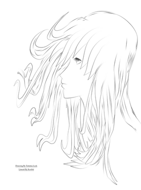
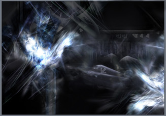
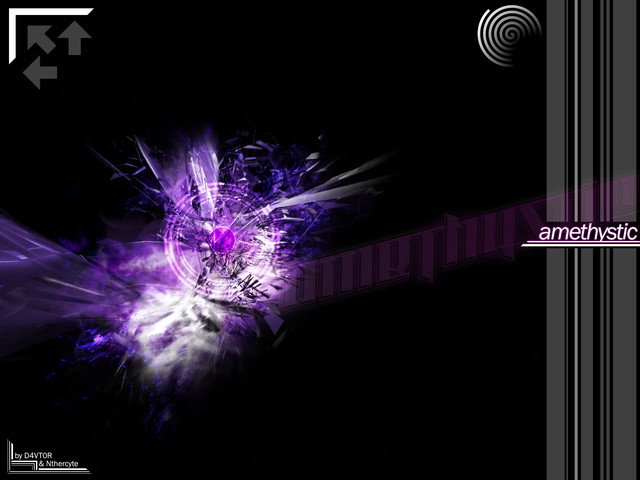
It's somewhat vector, but still this is one of my first LPs. And I think I did a pretty damn-good job at a first vector-like LP. I really like it.LP made in Photoshop CS3. Stocks are copyrighted by their original owner unless otherwise stated. This LP may not be used without my explicit permission.
Related content
Comments: 15

thats some nice work, what brushes did you use in the background, do you have links to the download??
👍: 0 ⏩: 2

The circle ones are the grunge vector brush set and the stars are from another vector set. There aren't a whole lot of vector brush sets on here anyways, so if you just do a search for them you'll find them no problem. If you really want the names I can look them up because I downloaded them from here.
👍: 0 ⏩: 0

Pshhh, I barely ever remember what brushes I use......Sorry.
👍: 0 ⏩: 0

Sorry, I don't remember what sets I used. I also pretty much use random sets, so I really don't know. Sorry.
👍: 0 ⏩: 0

Thanks, even though it is a bit bad...
👍: 0 ⏩: 0

wow thats... amazing. xD This is going to be one of my favs. Nice work! :}
👍: 0 ⏩: 1

Some text problem but other than that, pretty cool.
👍: 0 ⏩: 1

Bah, I was never good at text. D=
The more tan version makes the text look metallic, and it blends in well there. MAybe not here, though.
👍: 0 ⏩: 0

Looks very good, feels very good.
The flow is nearly perfect.
Would make a good cover art.
What I do not like: a bit too pixelish at the edges, around the person and the circles in particular.
Of course, only designers really spot this.
So you should be fine.
👍: 0 ⏩: 1

Thanks. ^^
Pixelish around the edges? Where?
👍: 0 ⏩: 0
