HOME | DD
 korpus — Phoenix
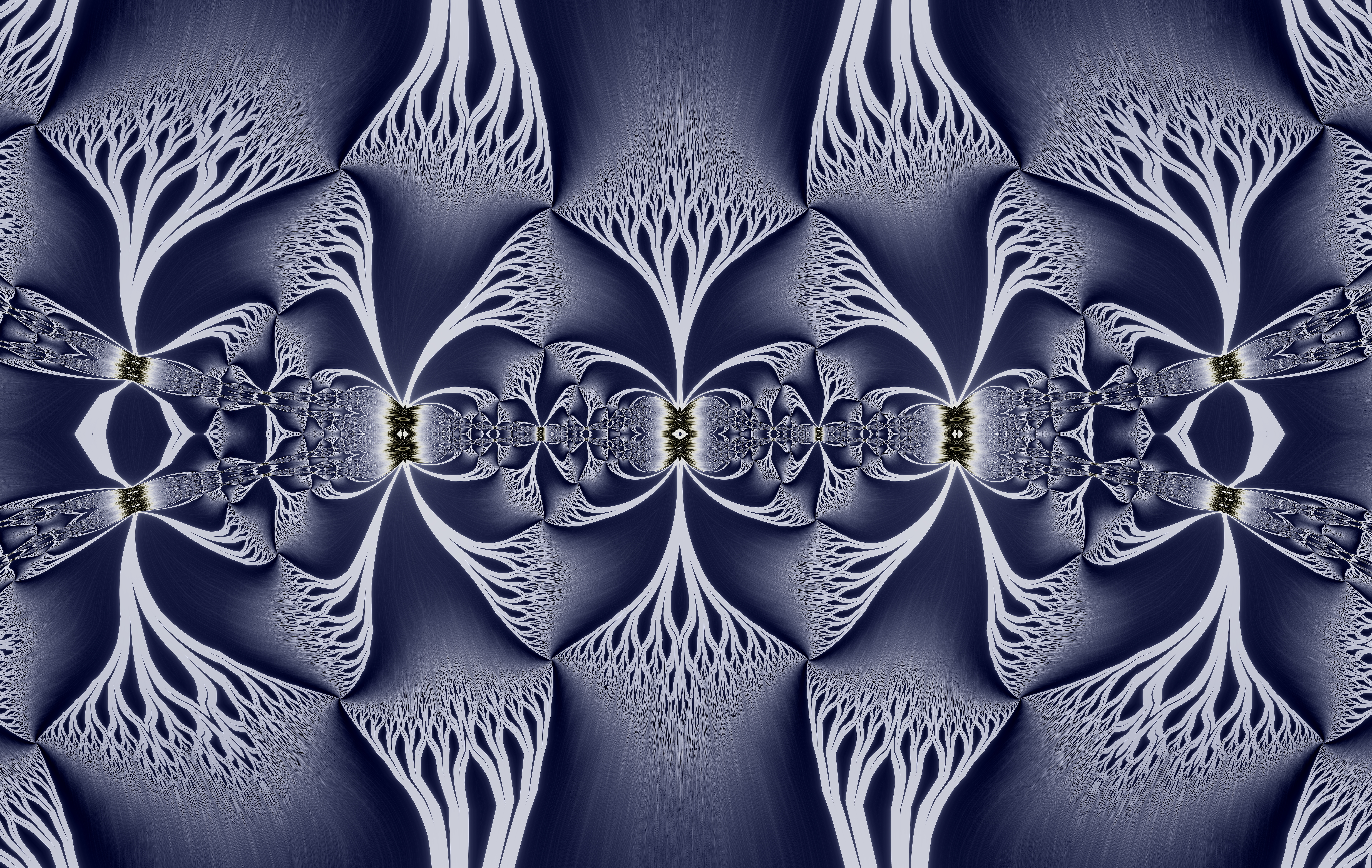

Published: 2006-01-22 10:12:17 +0000 UTC; Views: 12460; Favourites: 113; Downloads: 331
Redirect to original
Description
This is a simple design meant for modification. Lots of open space. This one has a print version comming within the next day or so.Related content


Comments: 34

omg i got this tattoed 2 years ago got it from flickr back then. gr8 design
👍: 0 ⏩: 0

That looks Awesome! Thanks for the link.
👍: 0 ⏩: 0

Very clean design. I'd like to use this on my wetsuit...that okay with you?
👍: 0 ⏩: 1
Yes, on one condition. Send me a picture when done. Sound good?
👍: 0 ⏩: 1

i really like this, i need a new logo...would you mind making it?
has to include a clockwork gear
thanks if you do it...and if you don't, i understand
")
👍: 0 ⏩: 0

Just thought that you would like to see this. I loved the design so much, that I got it inked, as well as my cousin got it as well.
http://img.photobucket.com/albums/v309/raul715/myself/DSCF0593.jpg
👍: 0 ⏩: 1
Thank you for forwarding me the picture. Does your cousins look the same? I'd like to see it as well.
👍: 0 ⏩: 3

ok lets try this link
[link]
👍: 0 ⏩: 0
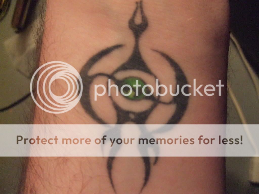
his is exactly the same except that his orb is green instead of blue in the center
👍: 0 ⏩: 0


awesome, very cool, the name suits it  (Wink)")
👍: 0 ⏩: 1
Thank you. I named it afterwards.
👍: 0 ⏩: 0


SKD

👍: 0 ⏩: 1

Hey there stranger. Thanks so much and its good to see your name!
👍: 0 ⏩: 1

You're welcome. Yea, I've been away, trying to survive college.
👍: 0 ⏩: 0

Simplicity, balance, elegance, style, timelessness. Wonderful!
👍: 0 ⏩: 0

great design as per usual, you'd be a good tattoo designer, or even stickers.. i'd so get one of your designs on my car!
👍: 0 ⏩: 0


Looks great. I like the effect of light shining onto it at various points. Well done.
👍: 0 ⏩: 0

Great clean style, Ben. I like how you made it not quite mirrored.
👍: 0 ⏩: 0

Very cool! Do you use a digital drawing pad, like a Wacom?
👍: 0 ⏩: 1
Thanks. No wacom used in this piece.
👍: 0 ⏩: 1
Do you ever use a wacom? I ask, because I just got the Intuos 3, 9X12, and wanted to know what functions you assign to the keys on your pad.
👍: 0 ⏩: 1
I use a tablet every once in a while. Mines a cheaper 4"x5" thought and I don't have keys on the pad. You have a nice one there.
👍: 0 ⏩: 0

OMFG this is way cool....I just love it...print? cool! I cant wait.....gotta 

👍: 0 ⏩: 0

EXCELLENT ! 
sharp edged and transformed into a shape u cant read...
great idea and design...PS gives it such magnificant depth  (Smile)")
keep it up
👍: 0 ⏩: 0

Really cool, great design. May i know how you gave it that 3d look?
👍: 0 ⏩: 1
Thanks for the great comment. 3d look done in PS by manipulating the Bevel and Emboss layer style, and some touchup work to really sharpen it.
👍: 0 ⏩: 0


👍: 0 ⏩: 0