HOME | DD
 KoTnoneKoT — Ward of Protection
by-nc-nd
KoTnoneKoT — Ward of Protection
by-nc-nd

Published: 2015-10-07 09:17:39 +0000 UTC; Views: 10311; Favourites: 313; Downloads: 0
Redirect to original
Description
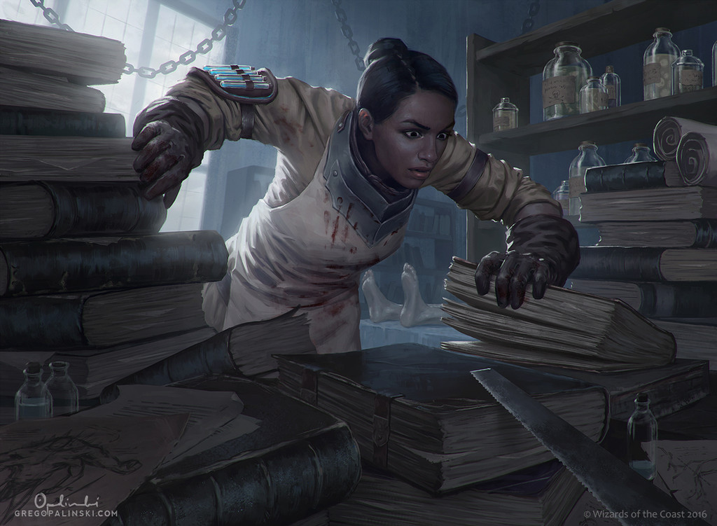
My new card illustration - "Ward of Protection" for the Call of Cthulhu the card game the Mark of Madness expansion!
Related content


Comments: 14

👍: 0 ⏩: 0

Overall
Vision
Originality
Technique
Impact
Very cool work. I might put some more light on the face to make it pop out a little bit more particularly around the eye. But I think that might be a bit nitpicky. I like the idea of the rain and think it adds atmosphere. But it's just not quite selling it. If you did some more abrupt lighting effects on the main character it would help. Not so many soft gradations on her skin. More hard shine points. And if you could get some reflection from her and the tentacles on the ground to show that it was wet I think that would also help. I love the colors and the corona, especially. I think that is a very cool effect.
👍: 0 ⏩: 2
Good! I'm glad I was able to help some.
👍: 0 ⏩: 0

Thank you, I think the same thing  (Smile)")
👍: 0 ⏩: 0


Originality

This is an impressive piece so I'm going to have to pad out this critique to hit the 100 word mark. I particularly like the red saturation at the edge of the glow between the red and green of the sphere.
So my main criticism would be about the legs. They do not feel like muscle and bone to me and it's partially because the highlights on them run so smoothly. As you approach the knee there should be a change in angle and you usually have some sharper edges around there because of bones rather than muscles creating the forms. On the right leg (her left) it doesn't feel like her calf is folded under her. When compressed that much the calf muscles tends to push out wide and the thigh gets a little bit more up plane.
The ellipses on the ground do not seem quite right. Like they were circles that were distorted into place. I'm no master with ellipses so I can't accurately describe the issue but they feel more incorrect the higher in the image plane they are. I would use a guide and draw circles in this arrangement, print it out and take a photo at this angle to try to get it exactly right.
Damn good piece though with the lighting,palette and special effects. I hope I helped.
👍: 0 ⏩: 1
Thanks for the detailed critique! I often forget about anatomy when in a fit of inspiration I draw color and create an atmosphere. I would like to draw everything at once, but in the eye does not see things and errors.
👍: 0 ⏩: 1
No problem. Like I said it's still an excellent piece.
👍: 0 ⏩: 0

Ok to start of i am not the best artist and i am not the best critic,but i will give it my best shot.
To start of the piece is amazing.
The coloring is stellar, both the lady and the tentacles are pretty realistic looking. The small details on the woman are also nice,like her messy hair and her jewelry having also light effects.
If i have complaints it would be minor nitpicks,such as the fact that the tentacles dont make sense coming from every angle and that it seems to be a sort of rain effects that seem kind of unnecessary
But overall this seems to be a excellent piece of work,shame that it will be shrunk down to be placed as a card.
PS.sorry for my not good english e.deviantart.net/emoticons/w/w… " width="15" height="15" alt="

👍: 0 ⏩: 0

Awesome art work, great job dude, congratulations!
👍: 0 ⏩: 0


Really cool work. I love the effects you used on it ")
👍: 0 ⏩: 0
Very cool work. I might put some more light on the face to make it pop out a little bit more particularly around the eye. But I think that might be a bit nitpicky. I like the idea of the rain and think it adds atmosphere. But it's just not quite selling it. If you did some more abrupt lighting effects on the main character it would help. Not so many soft gradations on her skin. More hard shine points. And if you could get some reflection from her and the tentacles on the ground to show that it was wet I think that would also help. I love the colors and the corona, especially. I think that is a very cool effect.
👍: 0 ⏩: 0
