HOME | DD
 KovoWolf — DeviantART Profile Mockup

#deviantart #mockup #profilemockup #bleedandbreedart
Published: 2014-12-11 04:04:30 +0000 UTC; Views: 9390; Favourites: 120; Downloads: 0
Redirect to original
Description
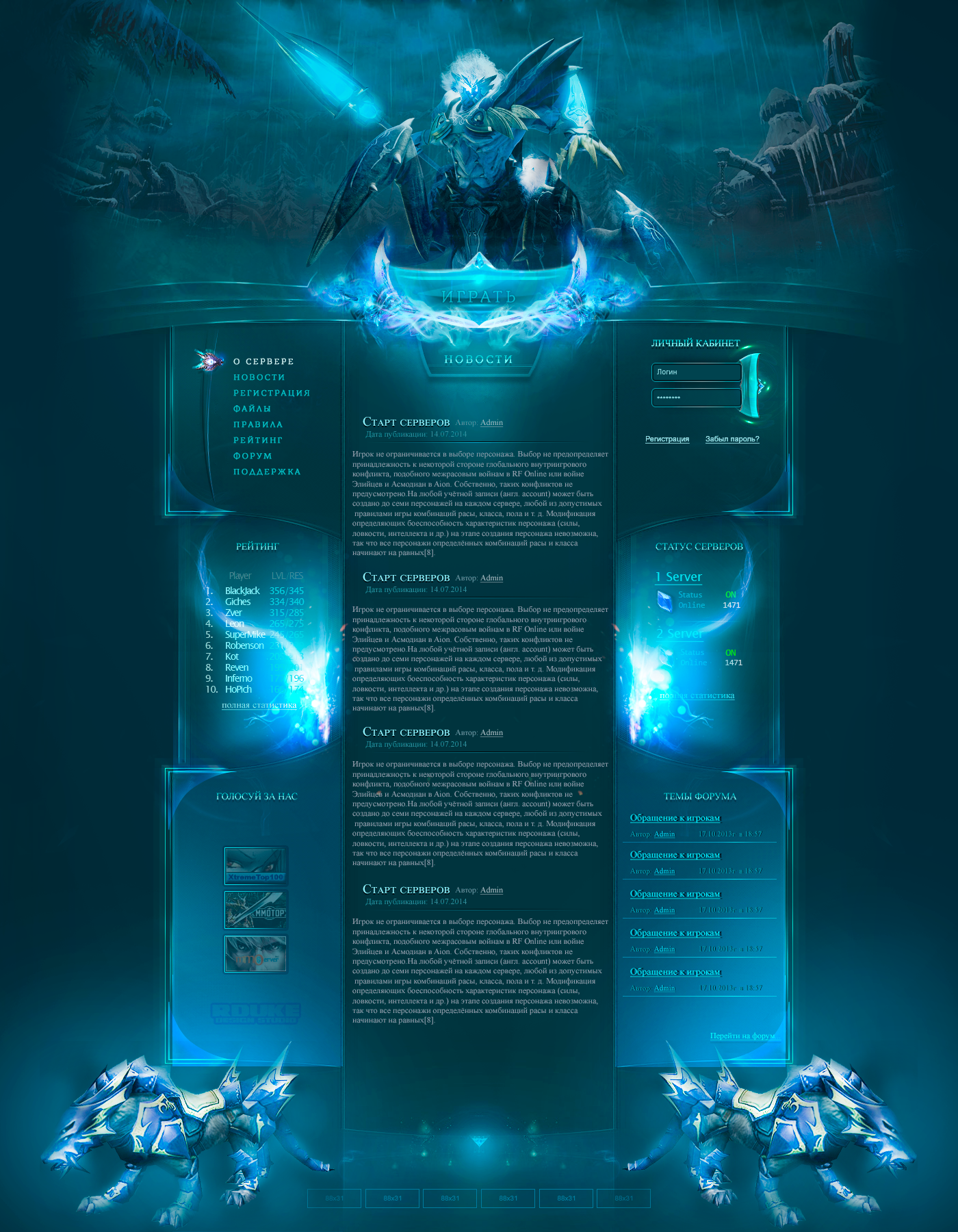
DeviantART Profile Mockupby KovoWolf
Click Here To Comment/Like This DeviantART Suggestion!
Join the Profile Discussion !
________________________________________________________________________
»»»»»»»»»»»»»»»»» Muse From The Artist «««««««««««««««««
¯¯¯¯¯¯¯¯¯¯¯¯¯¯¯¯¯¯¯¯¯¯¯¯¯¯¯¯¯¯¯¯¯¯¯¯¯¯¯¯¯¯¯¯¯¯¯¯¯¯¯¯¯¯¯¯¯¯¯¯¯¯¯¯¯¯¯¯¯¯¯¯
"The secret of change is to focus all of your energy, not on fighting the old, but on building the new" - Socrates
So I am a huge fan of the darker color scheme ( or light schemes too! ) that the app has on display. I currently can't play with the mobile app because I'm on iOS7 due to my device, but from what I've seen it's amazing. Beautiful. Stunning. Superb! In light of that, I decided to play around with profiles to reflect the new changes! This is just a mock up, some ideas thrown together. It's likely to change here and there but I felt compelled to feed the given inspiration!
Also, I'll probably work on the gallery page and the rest of the body to get more of an idea of what it would look like without custom widgets as the preview currently shows custom widgets (with a background).
*note I was thinking this could be available for all members of deviantART. Not just premium members but perhaps some perks could be available?
Edit:
I added a slightly different version. White with a little bit of variation as far as the header is concerned.
_________________
Thoughts
_________________
Header - I would absolutely looooove to have a header of some kind. This might seem mainstream and "everyone is doing it" but for an art site, I think it really pushes your brand and art to the front. You say "This is me" as soon as someone visits your page. Looking at the screenshots of the new app, this really inspired me!
Bigger Avatars - Even if it's just for our profile, that would be awesome

General Content - I think it would be amazing if the main content could be a little more stream lined along with the gallery/profile/favourites etc. being stream lined like the app. Still have the ability to modify your widgets? I don't see why not. It keeps the option to have your own personality for your profile :> Maybe have the option of a dark/light scheme?
Watch Me / Notes - Still playing around where this should be, but for now, I think that fits
 (Smile)")
Over All Thoughts
I am a huge fan of sleek designs and skins. I think a new look would really suite! Especially with the new branding and mobile app. Thoughts?
 DeviantART
 ps: sorry for the watermark on my art!
___________________________________________________________________________
»»»»»»»»»»»»»»»»»» Disclaimer ««««««««««««««««««
¯¯¯¯¯¯¯¯¯¯¯¯¯¯¯¯¯¯¯¯¯¯¯¯¯¯¯¯¯¯¯¯¯¯¯¯¯¯¯¯¯¯¯¯¯¯¯¯¯¯¯¯¯¯¯¯¯¯¯¯¯¯¯¯¯¯¯¯¯¯¯¯¯¯¯
"Da Profile Mockup" © 2014 Amber "Kovo" F.
 DO NOT take/redistribute/copy/alter this image and drawing in any manner what so ever. This concept is respectfully mine. My art is not to be used at all without my prio permission.
Related content


Comments: 94

Thanks 
👍: 0 ⏩: 0

I think a header with a bigger icon and the desirable content boxes would be great, but I wouldn't change the font or the green background. Maybe a little darker, though. I dunno. But I'd def like a header with bigger icon! (and not so that it messes op pixel art made at a 50x50 pixels size)
👍: 0 ⏩: 1

PS -- example is said incompetency: i just got the app and it looks just like DA here. there are pretties??
👍: 0 ⏩: 1
oh! sorry. i wasn't sure if i was making sense, or reading correctly. you mentioned that the app has a darker color scheme on display, and when i downloaded the app it just looks like normal DA and i couldn't find any settings. i was wondering if i was missing something?
👍: 0 ⏩: 1
I can't see the app yet because I'm on iOS7 but from the screenshots, it's darker.
Boldly Facing The Future
Artist Credit DanielaUhlig
Welcome.
Many of you have been in this community for a long time, but whether you’ve just joined or you’ve been a member since day one, this is your first impression of the new DeviantArt.
Change is not something that we take lightly, because it affects our collective identity. It was important for us to define who we are and what we’re made of at our core before we changed anything. We all have our own understanding of what that means, but the process of getting that core story down on paper took almost a year.
The result is “Bleed and Breed Art.” This is our center of gravity and our reason for getting out of bed in the morning.
It is the guide and the justification for everything, including our business partnerships, the development of the new app and the design of our new ide
👍: 0 ⏩: 1
ahhh, okay, i see what you're saying. i read that journal earlier, it my mind just didn't connect the dots x.x
thanks for explaining, though! i hope your able to use the app soon! (and i hope dark themes happen. they look really nice)
👍: 0 ⏩: 0
this is SO PRETTY!!! i'd love to have something like this. but then....i'd have to commission someone like you to make my page pretty, because i tend to be incompetent x.x
👍: 0 ⏩: 1


This would be awesome, and as you said, would make sense with the new branding too! (:
👍: 0 ⏩: 1

Hopefully it could be something ( or similar ) in the future
👍: 0 ⏩: 1
I submitted this as a suggestion so you are welcome to comment on it and like it there too :3
👍: 0 ⏩: 1


Wow, I really like your idea for the layout, especially the notion of larger avatars! ")
👍: 0 ⏩: 1
Thank you Falcolf ! 
👍: 0 ⏩: 0


Omg i love this layout design! I really wish they would do something like this because i am in love with this! So sleek and professional and modern. I really wish i could have my profile looking like this XD Sure could be different and get everyones attention~
👍: 0 ⏩: 1
Thank you TF-Chaos ! I really appreciate your positive comments and compliments about this!
ps: Click Here To Comment On This DeviantART Suggestion!
👍: 0 ⏩: 1
You are very welcome, I just am in love with that design!
I did and hopefully they will consider it! :3
👍: 0 ⏩: 1

I super approve of this idea layout!! It looks so nice!
👍: 0 ⏩: 1
ps: Click Here To Comment On This DeviantART Suggestion!
👍: 0 ⏩: 0

That's looks awesome! (And I prefer darker schemes too x3)
👍: 0 ⏩: 1
Thank you EsarosaKenway :>
👍: 0 ⏩: 0
<= Prev |