HOME | DD
 KovoWolf — WolfPaw Journal Theme
Published: 2009-05-21 22:01:41 +0000 UTC; Views: 5488; Favourites: 74; Downloads: 0
Redirect to original
Description

You can now install this journal skin!
INSTALL JOURNAL: Install
Coded by: *sergbel
LIVE VIEW: view

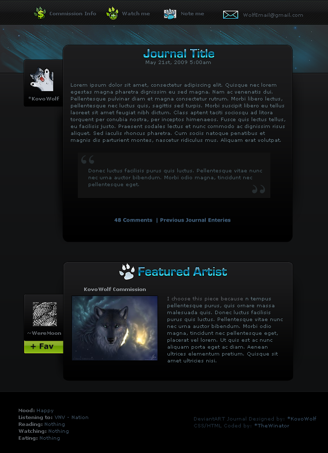
This is a design I worked on a lil while back, just got to finishing it. What do you guys think of it? It is kind of Wolf Themed, but the paw prints could represent anything else.
Big thanks to *sergbel for coding this journal skin!
"WolfPaw Theme"© 2008 Amber "Kovo" M.
DO NOT take/redistribute/copy/alter this idea/image and drawing in any manner what so ever. This idea/layout is respectfully mine. I’d appreciate it if you not use this idea (layout or art) without my prior written consent and permission.

Related content


Comments: 109

Thank you so so much for your critique on my journal design! I am humbled by your kind words. Its greatly appreciated! I hope I can at some point get this coded for everyone to enjoy
👍: 0 ⏩: 1

You are most welcome. ")
👍: 0 ⏩: 1


Technique
"Wow" would be my first response. I'm having a hard time figuring out where to start, lol.
I love the gradients; that and the way you've used shadows gives the design a real 3D feel that makes it stand out in both senses of the phrase. The header is quite simple in design, but it gives the focus to the content while still having great impact, and it looks lovely.
I would suggest centering the blockquote just to give it symmetry. I realise the rest doesn't technically have symmetry but it still looks smooth and centred and then the blockquote has unequal width with more padding on the right than on the left. For the same reason, I'd probably right-align the credit text in the footer, so it's exactly opposite to the mood list.
Now, the title text (Featured Artist, Journal Title, etc)... I feel like it doesn't fit, somehow, and would suggest sticking with Verdana, or maybe Arial Black or something like that. I do like the gradient effect and the darker border to make sure it stands out. I also like the splash of colour against the dark design, but the blue doesn't seem to quite match the header and that detracts from the overall design for me.
Speaking from a coder's perspective, you may actually have trouble with the Journal Title, as it's not possible (as far as I'm aware) to replace that with an image (like, you can make an image that says "featured artist" for use in the other headers, but you can't do that with journal titles because they're dynamic). I would consider plain text there instead, and plain text with CSS effects in any of the titles would give users more options (eg. if I wanted a title to say "Featured Dog", for instance, I'd only have that option if they were text headers (bizarre example, but I hope it makes sense...)).
I love the idea of having the avatar tabs like that, it really makes the design stand out. The icons are all really lovely, too, although I think I would have stuck to one colour against the black/charcoal base. A preference for monochromatic and complementary palettes may be a subjective thing, but to me the navigation strip with the icons at the top just seems a little unbalanced with the green and the blue-white.
That said, I really do love the +fav button and would leave that exactly as it is. As a browser, I really like the option of faving a piece directly from a feature. However, from an artist's perspective worrying about people fav+running without even visiting the artist themselves, so I'd suggest only linking to the piece rather than using the +fav link itself.
It's a gorgeous design overall, and I'm very interested in using it when it's released. Really good work (and perfect choice for the featured thumbnail, it really helps to show off the design there). e.deviantart.com/emoticons/t/t… " width="15" height="15" alt="

👍: 0 ⏩: 2
You're welcome. It's my first design critique. xD
I never knew that about green, I'll have to remember it. Anyway, I hope this was useful to you.
👍: 0 ⏩: 0
First off. Thank you for taking the time to make such lovely suggestions and a critique as well.
The journal title will be actual text, not an image because as far as I know myself doing html and coding that you cannot have an image be 'text' that someone can simply input. Nothing has been created for that yet
The blockquote will be centered once it is coded because I do realize in the mockup itself, it isn't centered which will be fixed :>
I can play around with the fonts for the "titles" and see what else I could come up with that may make it stand out a little more.
Regarding the icons at the top. I went with the green for the simple fact that alot of people associate green with money, or adding somethin. The blue was to contrast the title headers as they're blue
For the fav button, it would link directly to the deviation and wouldn't be able to 
Thank you again for all your critiques and feedback! I will apply it
👍: 0 ⏩: 0

i installed it but the actual journal looks different than this one...
👍: 0 ⏩: 1
The features part, it isnt included, but i am searching out how to add that to my journal with Serbel!
👍: 0 ⏩: 1
I believe it was but no worries.
👍: 0 ⏩: 1
No, sergbel took it out, but i made my own  (Smile)")
👍: 0 ⏩: 0

Do you have the coding for this version? I actually like this one better than the version 2 one
👍: 0 ⏩: 1
Are you talking about the one you download?
👍: 0 ⏩: 1
Like this one here, not the instalable one.
👍: 0 ⏩: 1
Ok, I can put my modification and have it be installable. Is there something in specific you like better about this version then the other? I can request serg to possibly upload changes?
👍: 0 ⏩: 1
Well I just like the featured box in this one where it is seperate from the entire thing.
👍: 0 ⏩: 1
Ahhh I see. It was not coded to have a separate box
👍: 0 ⏩: 1

Wow what a awesome journal skin!!!!! Would you mind if I make this Journal skin???
👍: 0 ⏩: 1
yea in code
👍: 0 ⏩: 1
Hmmmmmm... sounds like a good deal
👍: 0 ⏩: 1

can I have .psd file so I can separate background and other things to match my css?
👍: 0 ⏩: 1
I will have to look for the PSD tomorrow on my external HD
👍: 0 ⏩: 1
could you send it to my email pls
👍: 0 ⏩: 0
I would prefer the psd file so I can crop and cut it  (Wink)")
👍: 0 ⏩: 0

*Wishes she could do this* I am completely awe struck by this.
👍: 0 ⏩: 1

I saw in 2009 you were hoping to make this a CSS code.... is it made into one yet?
And I love your Journal skins and just your work in general! I know I've said that to you once before.. 
But anyways do you do commissions for journal skins? If so how much?
👍: 0 ⏩: 1
It isn't coded yet
👍: 0 ⏩: 1
Ah ok, I'll have to think about it! Roughly how much does it cost? Adverage?
👍: 0 ⏩: 1
Hmmmm... for a simple one, about $15 - $20 bucks.
👍: 0 ⏩: 1

I just wrote you a critique, but I just want you to know that I'm looking forward to seeing this available as a skin or as a CSS code. It's very well done.
👍: 0 ⏩: 1
Everytime I find something amazing it ends up being you who made it!!!
👍: 0 ⏩: 1


That is gorgeous, first layout that I've actually thought about using because it would fit me, but it's for your use only. 
👍: 0 ⏩: 1

This is so cool! I really would love to get the CSS for it some time!
👍: 0 ⏩: 1

Wow, great journal design! I love the shiny text, especially.
👍: 0 ⏩: 1

| Next =>