HOME | DD
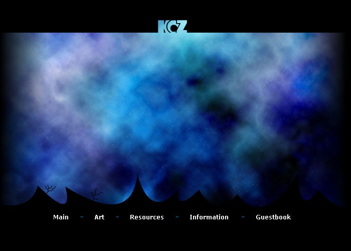
 koz — Koz v2
Published: 2004-02-06 03:45:54 +0000 UTC; Views: 676; Favourites: 1; Downloads: 503
Redirect to original
Description
This is the second version of my personal site. I never got the first version fully functioning. Hopefully I will pull through with this version. I still have a long way to go and I would like to implement suggestions any of you may have in the early stages of development. Any comments or suggestions are greatly appreciated.Related content


Comments: 7


god i never know wheather to be honest or not, haha, well here goes, i dont think its the best u have done, just had a peak through your gallery, i am not one for heavy colours like your background, almost looks dike u just did a photoshop clouds filter, every site needs some structure, i like the idea of the way the top sectio pans thats great, i just peel you need to design a erally awesome horizontal set of buttons(nav), i know u can make something cool coz i saw that fash nav u did with the clouds, much nicer, much cleaner, clean is good i think things just tend to get too messy especially if its going to be a portfolio site and you are wanting to punt other work, then it wont work because the rest of the site will be too distracting, basically what i feel is that you should keep outta this design the panning idea. I hope you dont take this the wrong way and you are more than welcome to go check out my portfolio site and let me know what u think ... good or bad .. its all good, i hope that u can understand what i have said. Peace Shaun heres a link to my sites ..... current one thats working .... [link] .... and my new one i'm working on .... [link]
👍: 0 ⏩: 0

interesting layout, i already learned flash and now i'm planning to make a site.
i love the buttons

👍: 0 ⏩: 0

Hey I really like this.
I need to learn to work with flash seriously.
yes so this is pretty cool.
 (Smile)")
👍: 0 ⏩: 1

I didn't think i would ever get a comment on this piece, thanks
")
👍: 0 ⏩: 1
 (Wink)")