HOME | DD
 kracklepop — GREASE
Published: 2011-02-16 20:55:17 +0000 UTC; Views: 3383; Favourites: 27; Downloads: 67
Redirect to original
Description
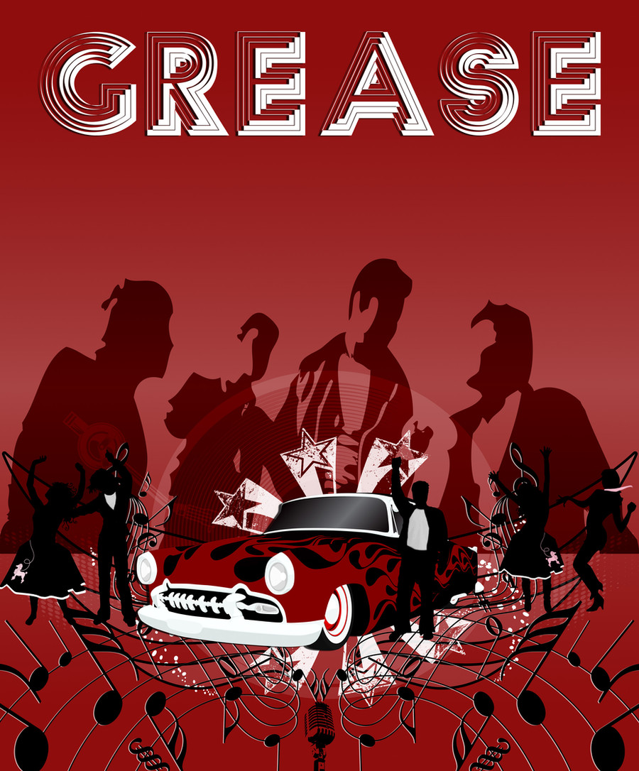
This is the base for my GREASE poster. I am directing the musical and I have spent a lot of time working on designing the show and doing the advertisement is one of my jobs. I want to clean up a few things before I do a massive printing but this is it so far.This was built in Ai and then Ps all of it is vector images.
Related content


Comments: 17


This is fabulous. I do, however, have a slight beef with the color. The red is a little too blood red, I think. I'm not sure which direction you could push it, but blood is the first thing I thought of when I looked at the thumbnail.
Otherwise, though, this thing is so awesome. Totally the spirit of the show.
👍: 0 ⏩: 1

Didn't really think of blood, but I can see your point. I was trying to make it stand out since the show is so popular its really hard to come up with an original design. On the final poster I did tone down the color a bit so the red on the car would pop more and added drop shadows for the dancers so they don't look like they are floating. Thanks for the feedback.
👍: 0 ⏩: 1
Haha. Awesome. I love the car. Just the overall effect and exact shade of the red made me think of blood. But that was probably just me. And I hear you on original design. Stuff can get super cliche super fast.
I'm glad the car stands out more in the final. And I think the design is superb. That was just me having nitpicky suggestions.
Great poster design!
 (Smile)")
👍: 0 ⏩: 0

")

This looks great! It looks really original, which is hard for a popular show!
👍: 0 ⏩: 0

This is awesome! So different. I hate how so many theatre posters look the same!
👍: 0 ⏩: 0
This is awesome! So different. I hate how so many theatre posters look the same!
👍: 0 ⏩: 1
Thanks so much. Sometimes I wish I could make a living at just designing theater posters. Check out my other ones when you get a chance.
👍: 0 ⏩: 0


awesome! I am absolutely in love with the typography, it looks great. You have done a perfect job of the composition, the vision is just amazing for this piece. Also nice work with getting the correct perspective on the car, the decal would of been a bugger to get right but you executed it wonderfully

👍: 0 ⏩: 1
Thanks for the kind words. I had to take off the rest of the required info from this piece so that the design would stand alone, but for publication I have to add all the in conjunction with, rights royalties, dates, etc. It still looks cool with a different font but rarely do I get a chance in the public eye to just have the design. I love typography I have a 500g external that is nothing but fonts that I have collected over the years.
👍: 0 ⏩: 0

Cool! I did a Grease poster too, and I was Sandy in our High School version haha
👍: 0 ⏩: 1

Very nice! My roommate got the lead role in this play at ENMU-R campus. She'll be excited to see this.
👍: 0 ⏩: 0