HOME | DD
 krazytim — Simple Cream Portfolio Concept

Published: 2007-09-25 06:37:38 +0000 UTC; Views: 8170; Favourites: 41; Downloads: 366
Redirect to original
Description
Read Me: This is a deviation submitted under my old account (krazytim). My new account (timsilva) is here: [link] - Please watch my new account.Do not make comments or add this deviation to your favorites. Instead, go to the mirrored version of this deviation here: [link]
----------
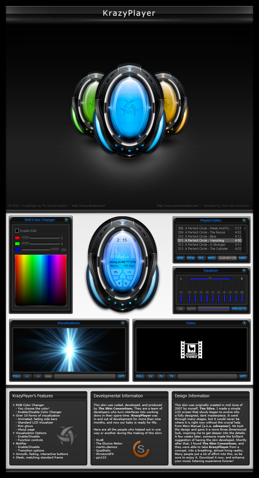
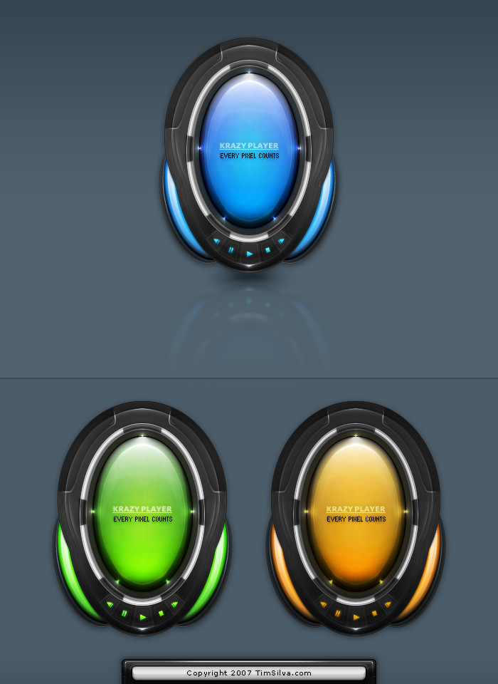
Not much to say about this one. I don't know what the title has to do with it, I just made it up on the spot
 (Wink)") I always liked these clean designs and I want to get better at them. I lost half to PSD to this because it come corrupted, but I was able to extract enough from it to work with and finish it up. Please enjoy
I always liked these clean designs and I want to get better at them. I lost half to PSD to this because it come corrupted, but I was able to extract enough from it to work with and finish it up. Please enjoy  (Smile)") All comments and +favs are greatly appreciated.
All comments and +favs are greatly appreciated.Also, I am fairly new to the whole clean/simple design area, so if anyone has any blunt but true comments about it that will help me improve my skills, please let me know. Does the content area flow well(?), is the navigation and logo aligned well(?), etc.
Related content


Comments: 73


Blunt but true comments?
Well the layout is...ok I guess, I don't like the image with the text over the top of it above the content area and below the navigation. The text with bevel doesn't appeal to me either, doesn't look clean...just like the stock photo (don't tell me about the PSD and all this, I'm just pointing it out). The border around this section is inconsistent to the rest of the boxes.
The content area. Ack. The font picked is horribly small and then the colour picked for the main bulk of it is too light, and so the darkened text draws the eye away from the text and makes it hard to read as the contrast is so large. The text in the bottom right hand corner box is just as bad, the small text, with that font and the black combo make it hard to read and I think is bad for anyone trying to read it. (I can read it, but it's not clear and clean).
Nice colour scheme overall, good choice of colours and well used white space. Not too cluttered outside the boxes, but inside them the text. Good for things like that small image above the scroll box, but for content text is bad (even if they aren't the same they're too similar to make out the difference).
The footer is nice as is the header's overall style. But the little grey box over the navigation could be changed. I don't know what for. I'm not a designer, I head more towards usability making it better for the user.
Sorry about the long comment. I very rarely give time to give a comment like this. But this design appealed to be somehow. And with some more work applied to it I think it can become a good, professional, clean and usable template for a fresh looking site.
👍: 0 ⏩: 1

Wow, thanks for the detailed c&c. Thats probably one of the first times I can think of where someone was brutally honest. To tell you the truth, I have never been a big fan of my font choices. I started out with flash (oposite end as you it seems), so small fonts have stuck with me a little bit.
The top box - It is a different box, I actually started out with the upper part and then designed the lower content boxes later. And yes, that beveled text was poorly handled. That was from the corrupt part of the psd, but I easily could have re-done it. Next time around I won't be so lazy
As for the contrast of the colors for the fonts, I struggled with that too. Since I used a lot of whitespace on this design, I felt that all black text would be too harsh, so I tried to use soft greys for some areas, but I think now that I should have done that for ALL the text areas.
I won't be re-designing this one, since I like to start new designs instead, but I will keep all of these things in mind.
Anyways, thanks for your time, I am glad and shocked that someone was actually honest on dA (never seems to happen here), so you rule
👍: 0 ⏩: 1
It's ok ")
I'm sure next time you work on a piece you'll be more aware with what you should try and fix and such
mhmm, I see what you mean with the softer grey. It can be difficult to find the right balance of colours.
For sure 
'tis ok. I was surprised by myself the amount I wrote, it was like 11 at night when I wrote it D:< was nice to give a bit of C&C for once
")
👍: 0 ⏩: 1
Cool man
I will keep that in mind
👍: 0 ⏩: 0

Nice, like it, especially the header, and I've never heard of this program: Adoge Dreamweaver...is it any good?

👍: 0 ⏩: 1
")
")
👍: 0 ⏩: 1

yup, I fixed it a while ago but I forgot to upload the new version. ty
👍: 0 ⏩: 0


That's pretty good, at least better than most of my works
👍: 0 ⏩: 1

hey mate, spellcheck much
👍: 0 ⏩: 2
lol, I just saw "Adoge Dreamweaver". ah well, no biggie
👍: 0 ⏩: 0
lol, did I make a typo?
Thank you
👍: 0 ⏩: 0

The clean and simple style is great. I've just made a similar design with the same layout-structure for a battle. I'll upload it if the battle is finished
👍: 0 ⏩: 1
Thanks for the +fav
I'll look forward to seeing that
👍: 0 ⏩: 0


looks nice. but i don't like the footer that much ^^ xD
👍: 0 ⏩: 1
lol really? The footer is my favorite part
👍: 0 ⏩: 1
xD don't like this grey
👍: 0 ⏩: 0


you're welcome krazytim
👍: 0 ⏩: 0


nice and simple, some more work on the content would be good to see, but yea still ok mate
👍: 0 ⏩: 1

i like the color combination,
but really the keyboard stock pic is kind of dirty, you can see all kinds of spots on the keys it's not very attractive
i know its just practise stuff but still
👍: 0 ⏩: 1
That was a part of the psd I lost the source to. I was either going to remove it or just make a new version, so I just left it alone. I kinda liked the dirty keyboard anyways, its like coffee on the keyboard because I am working late/early hours on client projects. I dunno
👍: 0 ⏩: 0


nice and simple. the nav could use some work and the logo could be a bigger. it's a nice design and would be easy and fun to code. I like your 'other' designs as well but I'm also a BIG fan of clean 'web 2.0' designs.
👍: 0 ⏩: 1
| Next =>