HOME | DD
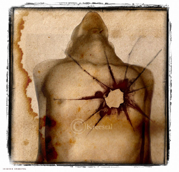
 kReEsTaL — F u t i l e
Published: 2003-12-04 22:31:11 +0000 UTC; Views: 1671; Favourites: 41; Downloads: 726
Redirect to original
Description
Something different.A try out for my CD art.
Well... after some reflexion I am not completely satisfied of it. I will probably make a new version soon. This was just a try out.
 (Wink)")
*
Stock: *F4shstock ~thppt-stock
Brushes: *aleksandra #asunder
Related content


Comments: 84


salut salut, j'aime bien ce que tu crée... celui là me rappel un truc que j'ai fait lol
")
👍: 0 ⏩: 1


thank you a lot for this picture ...
i like it very, it is that source of inspiration i needed
since days, no ... since weeks i don't have an inspiration on how to manipulate the stocks that i have on my hd .. i tried and tried .. i think there are about 100 or more tries that where deleted after i finished them.
THANK YOU
👍: 0 ⏩: 0


I might use this as one of my LJ icons, if that's alright with you. [link]
👍: 0 ⏩: 1

Providing you credit me, I agree.
👍: 0 ⏩: 2
oops, just realized maybe you don't remember thats my stock account? I haven't updated the journal in a while... I really should. basically the only thing I usually do in return for free use of my stock is use the pics of me as LJ icons at times. But I always ask
👍: 0 ⏩: 1
That's okay, I remember your stock account!  (Smile)")

👍: 0 ⏩: 1
alright. I will when i post descriptions of the icons.
👍: 0 ⏩: 0
yeah, I definatly will if I ever get around to making a more explanitory icon post, as I have done in the past.
Yer all favorited and linked in my stock though
👍: 0 ⏩: 0


Feeling so alone...
A hole, in the heart...
Just fantastic...
👍: 0 ⏩: 0


aille. ça fait mal, rien que de regarder! c'est un travail tres puissant et beau à la fois.
👍: 0 ⏩: 1
merci beaucoup... je voulais quelque chose de violent... tout en étant esthé tique... Mais la violence est souvent esthétique, c'est ce qui la rend terrible!

👍: 0 ⏩: 0
the border is just wicked..
it is nice to see the use of male stock!
👍: 0 ⏩: 0

I like this a lot. The sepia tones and the stained look are very effective.
👍: 0 ⏩: 0

I like it.
👍: 0 ⏩: 0


I like this. The paper material looks great! Nice edges too.
👍: 0 ⏩: 0

that's really really good. It's different colors and such than what you usually use, but it's definitely awesome! The bullet hole like layer over the heart goes wonderfully with the agony the body seems portray. It's great!
-Micci
👍: 0 ⏩: 3
oh gosh, it was posted 2 times. sorry dear!
👍: 0 ⏩: 0
thank you dear Micci for your great comment! indeed I wanted a slight change of what I "usually" make. (am I getting boring?)* I'm very happy you like this experiment. you're so sweet

👍: 0 ⏩: 0
thank you dear Micci for your great comment! indeed I wanted a slight change of what I "usually" make. (am I getting boring?)* I'm very happy you like this experiment. you're so sweet
👍: 0 ⏩: 0

this is very cool!
i love how u did it as if he was shot.
👍: 0 ⏩: 0

Pretty minimalist, but I really like the feel of this one. Would work great for a CD.

👍: 0 ⏩: 1

Thank you my little carrying angel

👍: 0 ⏩: 1


The mix of a broken heart, or something torn away, or a bullet wound... but the obvious pain and mortal harm that wound has inflicted. The essence is there. Very nice new direction for your work!
👍: 0 ⏩: 0

I love the concept but I think something is missing (really don't know what, don't ask.. lol) I like very much the sepia tones you used!!!

👍: 0 ⏩: 0


very nice, the shot looks like it went through a window, i think maybe if you got a border that looked like wood instead of white it would look even better, that angel of the body is a nice touch along with the stains, great work
👍: 0 ⏩: 1
Thank you for your constructive comment! Yeah I should definitely try a wooden frame, I've not tried it yet.
👍: 0 ⏩: 1
ill be looking forward to seeing it
👍: 0 ⏩: 0


I love it!
👍: 0 ⏩: 1
thnak you beauty! I hope you've been well.
👍: 0 ⏩: 0

Thank you my dear!
It's been time since I haven't heard from you...

👍: 0 ⏩: 0

this is truly something different yes! I like it allready, so im looking foreward to see the new version!
👍: 0 ⏩: 0


Very nice concept - different again but it's very unique and it represents your improvement ... texturizing is great as always - and so is the brush work ... even though the brush on the left is a bit out of place and too blurry for my taste - but that's only me and a little detail ... excellent work overall sweetie !!!
👍: 0 ⏩: 0
| Next =>