HOME | DD
 kricky — Purely Untitled

Published: 2004-10-14 09:57:43 +0000 UTC; Views: 2646; Favourites: 39; Downloads: 789
Redirect to original
Description
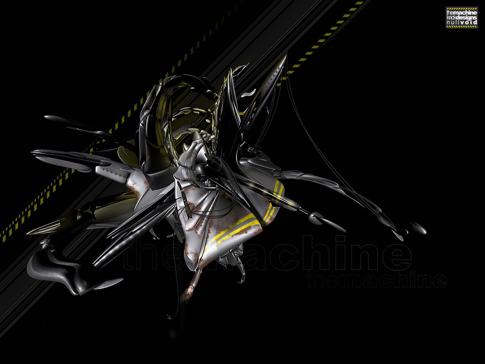
I did this piece for v4studios.comand its for the first pack: Purification
Enjoy!
Related content


Comments: 52

wow, nice, reminds me of dragons for some reason... nice work!
👍: 0 ⏩: 0

Interesting stuff, reminds me of those uhf/vhf antennae suddenly animated into life like techie dragons. It could be a synchronized mating ritual
Of course your interpretation will be different! Love it!
👍: 0 ⏩: 0


ah i love it
it really is enjoyable
i like this pink color too

👍: 0 ⏩: 0

WOW cool man! good colours and i like the double lines that seem to float across the image, drawing the eye in, very nice.
👍: 0 ⏩: 0

Wow i really like this its so original I thnk the pink really makes it likable.
👍: 0 ⏩: 0


thanks, though thats not much of an answer to my forum post
👍: 0 ⏩: 0


the hues of pink you use give the image an amazing vitality, and the render fills the rest very nicely.nice work
")
👍: 0 ⏩: 0
now that are some complex thoughts

👍: 0 ⏩: 1

lol
i really do love it though
its a very complex piece with a complicated structured foreground, yet with freeflowing edges against a completely calm, freeflowing background, which could definately turn out to be jsut as complicated as the foreground if extended outwards and on.
👍: 0 ⏩: 0


cool piece... bt for some reason it looks too sharp?
other tahn that.. it pretty good!
👍: 0 ⏩: 1
i heard that before...
yes, i used the sharpen filter quite a few time on this, i had a problem with the render
anyway... on my screen it looks okay..
thanks for your input
👍: 0 ⏩: 0

purely untitled .. is that different from just untitled?
anyways, im a pink lover so you got that going for ya .. and i love pretty much everything about this .. it looks a bit grainy to me but that could very well have something to do with this piece of crap public computer im on, so i wont hold it against you .. but overall this looks great
👍: 0 ⏩: 2
shit.... italic codes got fucked up
👍: 0 ⏩: 0
thanks,
purely untitled .. is that different from just untitled? ")
👍: 0 ⏩: 0

I love this..
Its your old original style mixed with a bit of tech style..
Purely beautiful..
 (Wink)")
👍: 0 ⏩: 0


wow. very clean 2d work. the 3d is also very nice. awesome piece.
👍: 0 ⏩: 0

nice job, i love the render and your colour choice is good to.
👍: 0 ⏩: 0

")


no offense here, chico - because this is absolutely great - but i think you should try to extend your style into something more. i'm finding that it's all beginning to look the same to me... and granted, it's all GOOD, but it's all... eh, yeah.
does that make sense? does it manage to not offend you? gosh, i hope not.
great job, though, seriously.

👍: 0 ⏩: 1
Ofcourse im not offended
You are completely right, and that has a reason
i created this piece over a month ago, i couldnt release it before the arpack at v4studios.com was out
so therefore it still is the same style as my work back then, i guess i HAVE moved on though, if you look at my latest pieces, the ones before this (there arnt many new ones though), i think it definately changed.
so. great spot there, this indeed is old
👍: 0 ⏩: 1
heh, glad to hear it.
i DO look forward to seeing some newer pieces. just let me know when they're coming!!!
your logo designs have definately been more uncharacteristic, and by god, i love em.

👍: 0 ⏩: 0

sweet work man. very modern and sweet colors
like this
greetz
____polka
👍: 0 ⏩: 1
thanks
hey, what about the battle project thing you asked me to join?
whats up with that?
👍: 0 ⏩: 1
oh damn man i know and I´m so sorry about that.
I tried to start that shit in September but damn man i had no time for it. I tell you i really had no time for nothing. That´s so bad. I worked the whole holidays for my partnership company cause i need the money for my semester abroad.
I consider to cancle this Battlebay cause of lack of time. If i can´t find some time in the next few weeks i will do so. hope you understand my situation and hope you won´t be angry with me if i would cancle that.
ps: sorry for my bad e *g*
👍: 0 ⏩: 0

hmm that doesnt work... its [link]
👍: 0 ⏩: 0


Awesome job, love the colors and the pinkish/white shadow behind the render, 
👍: 0 ⏩: 0


The colours are pretty near perfect for this piece. And very cool abstarct work for the centre piece.
👍: 0 ⏩: 1
near perfect, any idea how i could get the colours to be perfect then?
👍: 0 ⏩: 1
hmm. No idea. I like it how it is.
👍: 0 ⏩: 1


beautiful colors used.. outstanding work krick  (Smile)")
👍: 0 ⏩: 1
"make a wallpaper version"
that sounds like an order.... should i really?
👍: 0 ⏩: 0

this is great i love the composition and i like the typography up in the right hand corner and the colours are great welldone!!!
👍: 0 ⏩: 0

great job my man, love the render.
but pink?! always the pink ")
gj my friend!
👍: 0 ⏩: 1
| Next =>