HOME | DD
 krysdecker — Elsbeth

#pinup
Published: 2016-01-18 18:43:19 +0000 UTC; Views: 27721; Favourites: 436; Downloads: 739
Redirect to original
Description
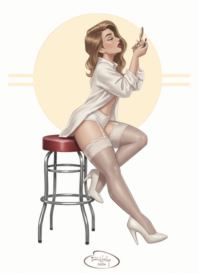
Hey guys, this is Elsbeth, a pin-up comissioned by one of my patrons. I loved her idea from scratch, and I tried to give her a more gentle, delicate look since she's a young vampire. (Smile)")
And as usual, if you like my work, you can always support it at www.patreon.com/krysdecker . You get can high-res versions, nsfw alternates, the original PSD and all that fun stuff
If you want to follow me on other social media:
www.facebook.com/krysdecker/
www.artstation.com/artist/krys…
If you are interested in getting my previous work, you can find it at:
gumroad.com/krysdecker
")
Related content


Comments: 9

👍: 0 ⏩: 0


Yeah this is good. You used a white colors, when black would have made it pop more. That's interesting. Because, it makes the overall atmosphere softer and more approachable. I love how you simply define the background with only a few stress marks that give the impression of a cloth. That's really skilled, yet almost amateurishly simple. Damn. Good work. And of course the dark red hair and lips create amazing value contrast, draw the eyes well, and look lovingly cared to. Astounding piece. Thank you for making it.
👍: 0 ⏩: 1

thanks for the detailed comment
I tested a black/darker background, and while she did stand out more due to the contrast, the main point of the image (which was to make her more delicate) changed. So I opted for the white background instead. Which also made her lips/hair stand out more, and it's a common trait in vampires to have very strong red tones in the lips.
On the background, initially I started to actually draw it but then I decided to try something new, so I used raw brush strokes blending with the initial lineart of the background. And I really liked the result. I believe it's one of those "less is more" situations, where the contrast between the finalized figure of the woman against a more simple, rough background would be better than if I just detailed the background.
I think it's a similar result that I got in Zayel where drawing a rough version of the wings was more beautifull than realistic wings. I believe that if I made them realistic, people would just see what they expected and wouldn't really pay attention, while the contrast between styles jumps in the eye in a good way.
I'm still learning a lot between pin-ups in refining this "new style" that I'm using on them, since they differ quite a bit from the realistic/high detailed style I use on my other drawings.
👍: 0 ⏩: 1
You made really wise decisions then! You're doing fantastic work. Keep it up!
👍: 0 ⏩: 0

beautiful colors and look. nice to see the full thing now
👍: 0 ⏩: 1
thanks ... I really liked to make this one
👍: 0 ⏩: 1
you did quite well. very nice shading and look
👍: 0 ⏩: 0