HOME | DD
 Kshegzyaj — SCRAPPED - Rhon
Published: 2010-03-12 15:31:27 +0000 UTC; Views: 4814; Favourites: 30; Downloads: 0
Redirect to original
Description
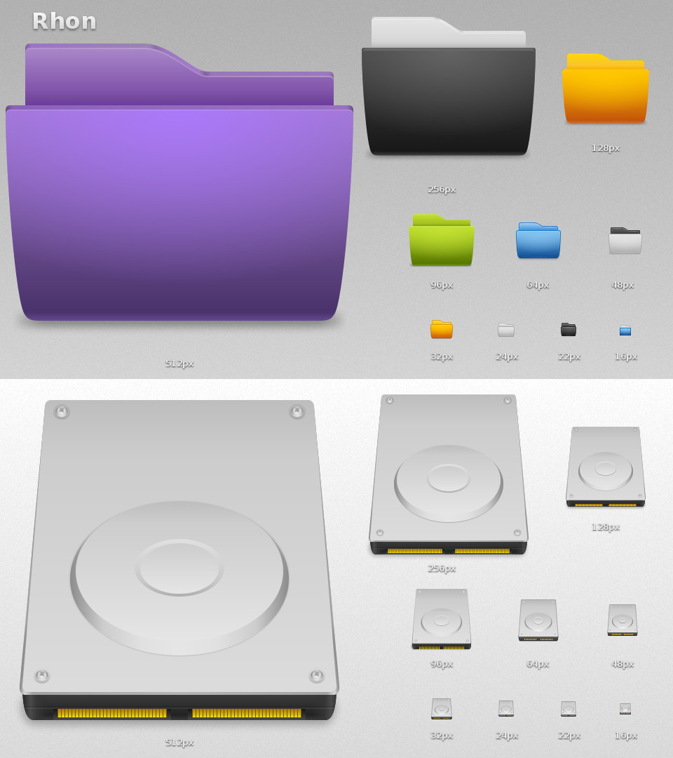
THIS PROJECT IS SCRAPPEDThe icons that had already been designed are available for download here .
Work In Progress : Rhon
Tango-ish icons really look good at little sizes, but when scaling up, the strokes look awful. This is my attempt at making modern icons, that look good at any size, without going too far from the tango style but far enough for the bigger sizes to match the little sizes style.
Changelog :
WIP2 - March 22nd 2010
Dropped the red folders.
Added a preview of the Hard Drives.
Wonder if squared folders would be better at 24px and 22px.
WIP1 - March 12th 2010
Folder colors : black, white, red, green, blue, orange, purple.
For more regular updates (including some intermediary states), follow me on Twitter or Forrst .
Related content


Comments: 29

Looking forward to using the final release. <3
I believe 512+ is the future.
👍: 0 ⏩: 1

Hehe
It's been a while since the last update of this preview...I'm currently working on some glyphs for the folders. I only have some hand-drawn sketches, for now.
If you use Twitter, follow me, I share much more previews on Twitter, since editing a deviation here on DA is quite long ")
")
👍: 0 ⏩: 1
I don't use twitter any longer. However, I will check your updates regularly.
👍: 0 ⏩: 0


The feel of bigger curved icons is lost @ 16^2 px. I think you should make them more rounded at the edges. HD looks nice, but can I suggest an LED light on it ?
👍: 0 ⏩: 1
Yeah, but the curves at this size didn't look very good, to me.
I don't know about adding a LED light, I may try when having some free time
👍: 0 ⏩: 0


Wow, these are brilliant.
Looking forward to release!
👍: 0 ⏩: 0

YOu should use a little darker borders for direcotory icons since in Tango they are too dark and here there are too light. Tango icons are nice just becuse the use that kind of borders in smaller sizes so try to darken yours a little.
👍: 0 ⏩: 1
Aww, making them darker just feels wrong to me.
The more the borders are dark, the more they draw attention to themselves. But to me the strokes are here to help the icon in looking sharp and not blurry - especially at small sizes where each pixel counts - wich is the reason why the borders should remain discreet.
👍: 0 ⏩: 1
Well the icons loks strange when the inner part is the same color as the cover of folder. White outside and black inside folder icons are good though
 (Wink)")
👍: 0 ⏩: 1
Ah ! So you were talking about the front and back parts of the folders ? I thought you were talking about the 1px strokes...
Yeah I may try to darken a little those parts to see how it looks.
👍: 0 ⏩: 0


Pas mal, les formes générales plus arrondies donnent plus de dynamisme par rapport au similiar.
Par contre sur les grandes tailles :
- l'épaisseur sans légère perspective aux coins par rapport au dégradés qui sont eux inclinés donne un aspect étrange je trouve.
- l'ombre au sol n'a pas évoluée
👍: 0 ⏩: 1
Ah oui c'est vrai, il y a une petite impression que les dégradés sont inclinés, pourtant le dégradé est bien horizontal...je vais essayer de déplacer légèrement les points de 1 ou 2px vers l'intérieur et voir ce que ça donne.
Pour l'ombre au sol, c'est vrai que ça rendrait sûrement mieux, mais j'essaie tracer un minimum d'objets et de dégradés. Là c'est un simple dégradé linéaire noir vers transparent du milieu vers les extrémités que j'ai flouté. Peut-être qu'avec un dégradé radial très étiré et flouté je pourrais m'approcher de ta méthode.
👍: 0 ⏩: 1
Oui je pense qu'avec un dégradé radial étiré et flouté ça peut être plus sympa qu'actuellement  (Smile) - :)")
👍: 0 ⏩: 0

Sympa !
Par contre tes dossiers (entre les différents packs) ont tendance à beaucoup se ressembler, tu devrais y faire attention.
👍: 0 ⏩: 1
En fait je voulais justement faire une sorte de petit mix de mes précédents dossiers. J'aimais bien les couleurs de Classic 2, mais il faisait un peu baclé (avec seulement les 32px qui étaient retravaillés), et Similiar était plutôt bien fini je trouvais.
Enfin, en ce qui concerne les couleurs, je pense aussi en faire des déclinaisons moins agressives, des couleurs aussi vives deviennent vite lassantes.
👍: 0 ⏩: 0

Yup, they look really nice, that would be only folder icons or a regular icons set?
👍: 0 ⏩: 1
I plan to make some devices and filetypes
👍: 0 ⏩: 0


Please, please, please, please, please release these. I like the Tango look, too, but yeah at hi-res they look a bit rubbish. I know that jimmac, designer of the Tango look, is upgrading the icons, called Mango.
/izo\
👍: 0 ⏩: 1
I also plan to make some devices and filetypes. And the folders still need some glyphs/icons.
I already saw the Mango icons, but some details look odd (for example, the folder's bottom part). I prefer the Gnome Icon Theme .
👍: 0 ⏩: 2
Solid update. That HDD is looking real nice.
/izo\
👍: 0 ⏩: 1
Thanks
👍: 0 ⏩: 0
Sweet, look forward to it. I hadn't seen that GNOME Icon Theme page before, looks nice!
/izo\
👍: 0 ⏩: 0