HOME | DD
 Kthco — Creature of interest

Published: 2016-09-18 04:34:49 +0000 UTC; Views: 307; Favourites: 21; Downloads: 0
Redirect to original
Description
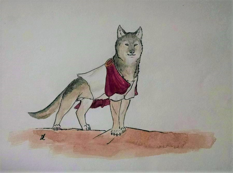
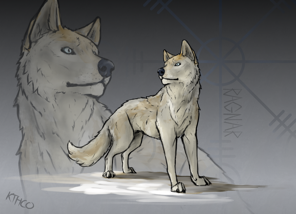
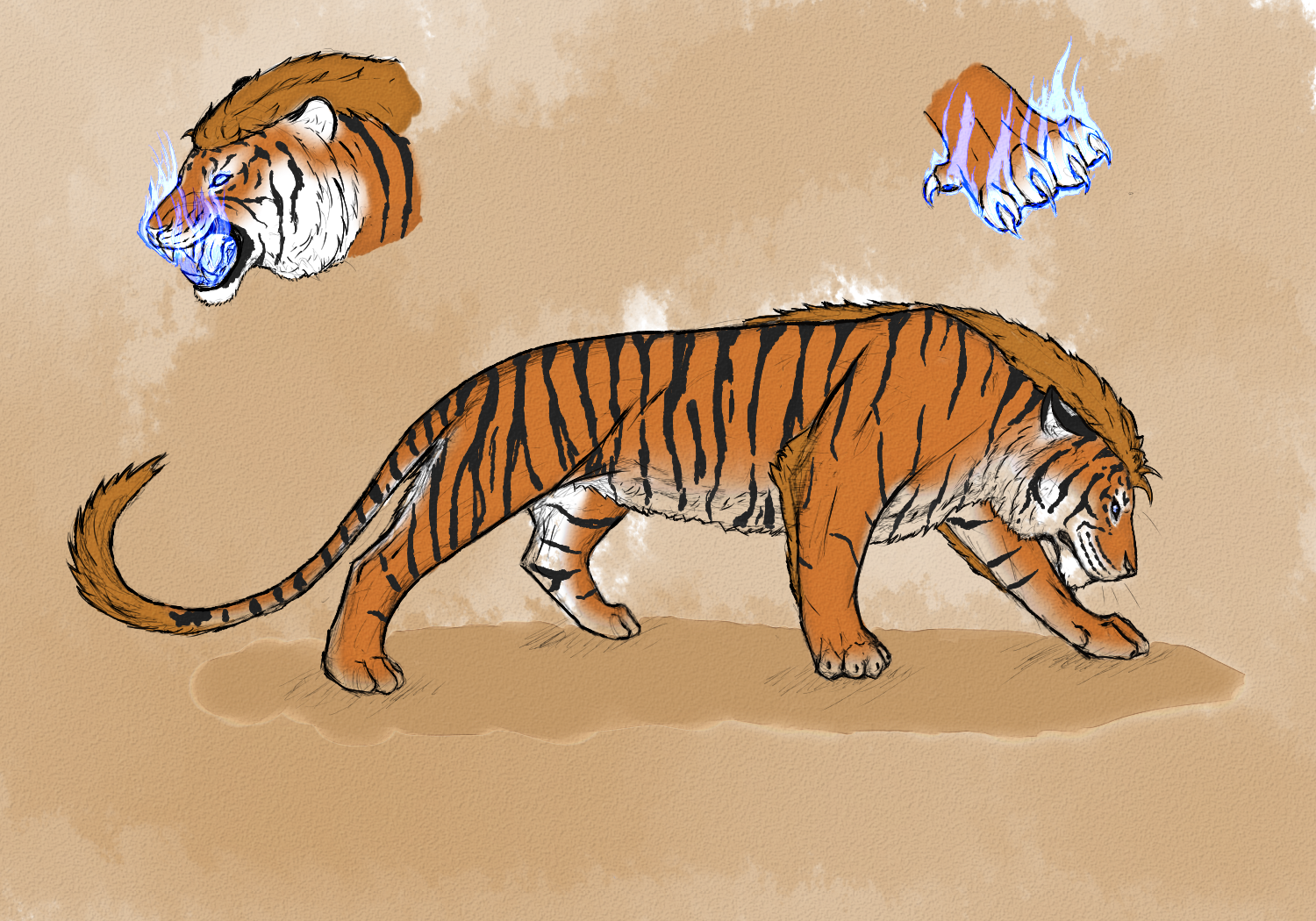
Guasche and inkRelated content


Comments: 10

+Lynxskyrider
like this: theworldillustrated.deviantart…
👍: 0 ⏩: 1

Ya the contrast is cool!
👍: 0 ⏩: 1
Thanks! great hob on this, by the way
 (Smile)")
👍: 0 ⏩: 1

Reminds me of a leopard/bobcat looks nice, but would look nice if you painted the leaf like an red-orange color
👍: 0 ⏩: 1
Ya I probably should have like the other one. Btw which type of line work do you think is better thick and bold(the other one) or thin and detailed(this one).
👍: 0 ⏩: 1
The thin. but it all depends on the subject I guess, sometime it may be good to use sometimes not.
👍: 0 ⏩: 1
Ya i think the thinner more detailed stuff looks better to.
👍: 0 ⏩: 0
