HOME | DD
 KuroCross — Work in Progress II
Published: 2011-05-02 05:38:34 +0000 UTC; Views: 176; Favourites: 5; Downloads: 0
Redirect to original
Description
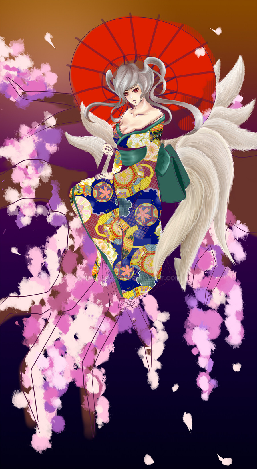
Progress snapshot #2 of the current piece i'm working on.THE KIMONO LOOKS SO WEIRD *sob sob*
if you guys can compare it with this version [link]
and tell me which one looks better that'd be great.
From now on i'll be updating snapshots of the progress on this piece frequently, so feedback is constantly welcome~
For the first Progress snapshot click here: [link]
Related content


Comments: 8

Ooooh this is so pretty. ")
Oh, the shading on the hair seems a little too grey and warm. Maybe try some more silver-y and/or cool tones?
Hopefully some of that helps. I'm not actually working on this so my suggestions may end up being awkward and falling flat... But it's worth a shot. xD
👍: 0 ⏩: 1

hey, thanks so much ^^ haha i actually think the problem is that the kimono is too busy and its becoming a distraction almost :s i wanted to keep the red parasol (i had this weird sort of red parasol=sun in the night sky concept) so right now i'm trying a orangy kimono on her without the patterns. i dunno, it gives a different feeling...but i sort of like the cool-tone oriented look too.
ahhh decisions decisions == maybe i'll upload the orange kimono one on here too...
anyways, thanks so much for all the feedback!! i'll definitely take them into consideration

👍: 0 ⏩: 2
Yeah, I like the red parasol too, I actually like how it stands out. A simpler kimono could work well, I'd say try a few different colors and see if that works better. If you post it I'd love to see, I'm curious how it looks!
👍: 0 ⏩: 0
so i ended up uploading the orange version too :[link]
if you have time to take a look and tell me which one you think is better, that would be awesome ^^ thanks so much
👍: 0 ⏩: 0

I think with the kimono you may want to try more warm colors and maybe bring down the red. As it is, the parasol "pops" too much.
👍: 0 ⏩: 1
hmm, good suggestion, in fact i was considering a redish orange colour. will give it a try, thanks so much!
👍: 0 ⏩: 1
I love the reddish orange version!
👍: 0 ⏩: 1
thanks!! i'm probably going to be using that version ^^
👍: 0 ⏩: 0