HOME | DD
 kurohacker — Faris

#anthro #faris #grey #icon #wolf
Published: 2016-04-30 10:59:26 +0000 UTC; Views: 238; Favourites: 3; Downloads: 0
Redirect to original
Description
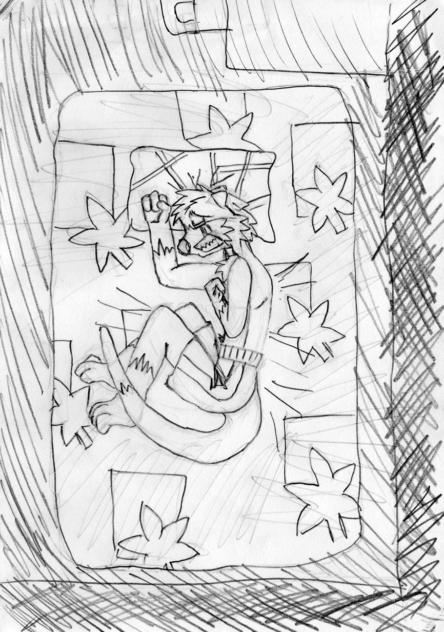
So it's species change week at the furry forum that I visit often, where for one week starting from the first Sunday in May, you get to change into a different fursona. I chose to be a grey wolf this year, because I like wuffs.Name is Faris, which means 'knight' in Persian, and pronounced 'far-rees'. One day I'll draw a full body like I did with my Pokesona last year, but now, an icon will do.
P/s: I was told that this is pretty much vector art. I dunno =w=
Related content


Comments: 8

Species change week? How fun. If I were doing that, I would probably try a scalie race, since it seems that I kind of like those too. (In fact, I have been considering a kobold avatar for my D&D/Pathfinder forum interactions. It's a lot more well-known the catfolks lol.)
👍: 0 ⏩: 1

Hmm, I never know you are into scalies. Though I could totally see you as a kobold :3
👍: 0 ⏩: 1
Oh yeah? I could be a big, powerful dragon too XP. Of course, personality-wise I'm still most similar to a cat.
Btw, I just noticed, maybe you should try a lighter background for those portraits, like a lighter/paler blue. Maybe it's the contrast but the current blue background seems to stand out too much.
👍: 0 ⏩: 1
Dragons are secretly big scaly cats anyway xD
I know about the background, I just picked a random colour for it. I kinda liked it though, the obvious contrast
👍: 0 ⏩: 1
Contrast is good, but currently the background is standing out more than the character itself. Normally you want the other way around (the character standing out more than the background). If you don't mind me being a little frank, bright colors aren't too easy on the eyes, especially when they occupy a lot of space.
Try 7092BE for the pale blue or 425772 for the dim blue for the background. Trust me and give them a try, both will make Faris stand out a lot more! If you don't find them to be an improvement, well, okay then.
👍: 0 ⏩: 0
