HOME | DD
 kuronekonoyoru — Portrait

Published: 2010-02-14 17:40:53 +0000 UTC; Views: 844; Favourites: 15; Downloads: 14
Redirect to original
Description
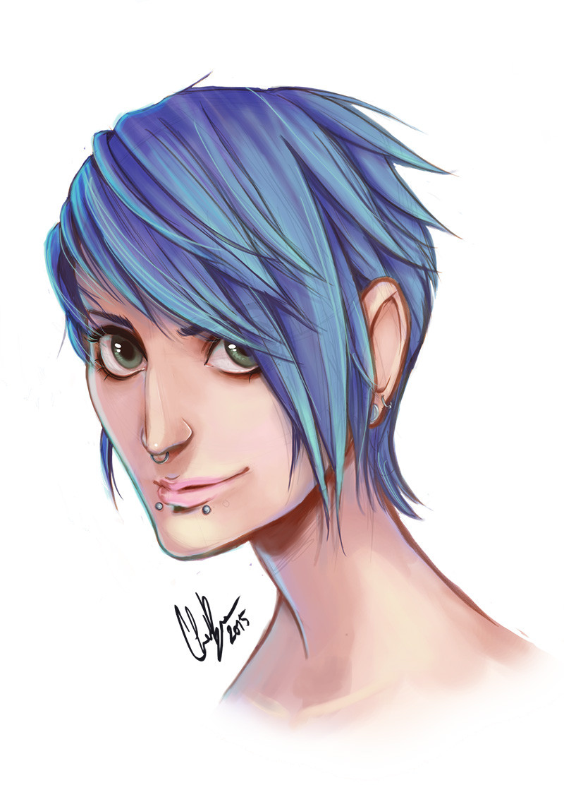
Made in SAI, and photoshop CS4if you like it, write comment please

------------------------
Me gusta mucho la verdad como me quedo, lo acabo de terminar, asi q si les gusta comenten pro favor
-----------
actualización:
Le agrege luces al pelo
 (Smile) - :)")
Related content


Comments: 33


Looks pretty good. I love how you were doing the skin tone. ")
Only thing I see that I would change is the lighting. You seem to have 2 different light sources which is great if that is what you are aiming for. But if you are aiming for 2 light sources maybe add some more light on the back of the head?
If you were aiming just for one light source I would change the backside of the neck. I am assuming that is light hitting the back of the neck since it is going from dark to light starting from under the chin and going towards the back of the neck. I would change this just because you have a light source already on the front of the face on the left side of the picture.
Now this lighting would be correct if there wer 2 flashlights shing at those 2 spots, but then the rest of everything else in the picture would have to be almost black. 
Over all though it a good piece! I especially like the head lighting. You did that wonderfully. Thats one reason why I saw to change the neck lighting rather than the face lighting. the face is to good too redo. xD
I think :devmanagaacademy: has a lesson on lighting but I am not 100% sure. check it out if so though!
👍: 0 ⏩: 1

thanks a lot
When i pain it, i was learning to use the tablet, so
i did no think in the light, i just paint without thinking
👍: 0 ⏩: 1
Oh, I see. yea. still, you did a great job with it. Especially if that was your first time using a tablet. haha I remember when I first used a tablet too.
keep on painting!
👍: 0 ⏩: 1

Very nice! Great shading, and very painterly feel
👍: 0 ⏩: 1
you're welcome
👍: 0 ⏩: 1
Ah, that amazing program!
👍: 0 ⏩: 0

he`s adorable and he`s got suck pretty eyes ^^
👍: 0 ⏩: 2
i ment such not suck xD sorry
👍: 0 ⏩: 0

le falta profundidad, y detalles, pero buena imagen!
👍: 0 ⏩: 2
por cierto a q te refieres con profundiad? ._.
👍: 0 ⏩: 1
bueno el manga generalmente es plano,y si no tiene demasiados volumenes, pero si tiene, además mucho volumen lo ubira echo más realista , perdiendo el estilo manga .-. o eso creo yo
👍: 0 ⏩: 1
perdón entonces, pensé que hablamos de realismo. No es un retrato entonces. xD
👍: 0 ⏩: 1

-Lo mismo ke le puse en la submission del 506-
Ke buena la expresion y los ojos, me agrada mucho el estilo del coloreo, pienso ke mas practica y va llegar hacer algo super con ese toke.
Por eso le noto que aun hay puntos de mejoria, como el area de los hombros y la pega con el cuello de la misma area, creo ke existe una desproporcion y una perdida de la direccion del cuerpo en perspectiva, evidencia de ello es la camiseta. Pero hey muy tuanis el estilo, me recuerda un poco a alguno bretes de studio gihbli (como sea ke se escriba) y no a manera de copia, sino como inspiracion e influencia. Siga con la crema!
-Lo mismo ke le puse en la submission del 506-
👍: 0 ⏩: 1

se ve con una mirada muy profunda, felicidades
👍: 0 ⏩: 1

Muy buenas las sombras y luces.
Las proporciones faciales tambien me gustan mucho.
👍: 0 ⏩: 1
Me gusta, bastante bonita. Aunque sí estoy de acuerdo con northersando en lo del pelo.
👍: 0 ⏩: 1
👍: 0 ⏩: 0

mm me gusta que veo que manejas bien la luz y sombra, si siento que se le deberia de dar un pokito mas de volumen, y quizas definir un poco mas la linea, ahunque creo que aca la idea es que se vea asi, pero asi no esta mal, talvez haverle metido un brillo al pelo, para que quedrara con mas volumen, y pues a seguir practicando con el photoshop, que ahora hay que ponerle jeje, saludos!!!!
👍: 0 ⏩: 1
si el pelo me quedo oscuro al final, el dibujo lo hice directo casi todo en SAI, el photoshop lo uso para modificar un poco los canales de color XD
👍: 0 ⏩: 1
ahh pues vas bien jeje, ya ahi con el tiempo y practica ya solo seran detallillos los que hay que ir corrigiendo con forme se hagan mas bretes jeje, saludos!!
👍: 0 ⏩: 0