HOME | DD
Published: 2009-03-25 08:03:21 +0000 UTC; Views: 1200; Favourites: 43; Downloads: 40
Redirect to original
Description
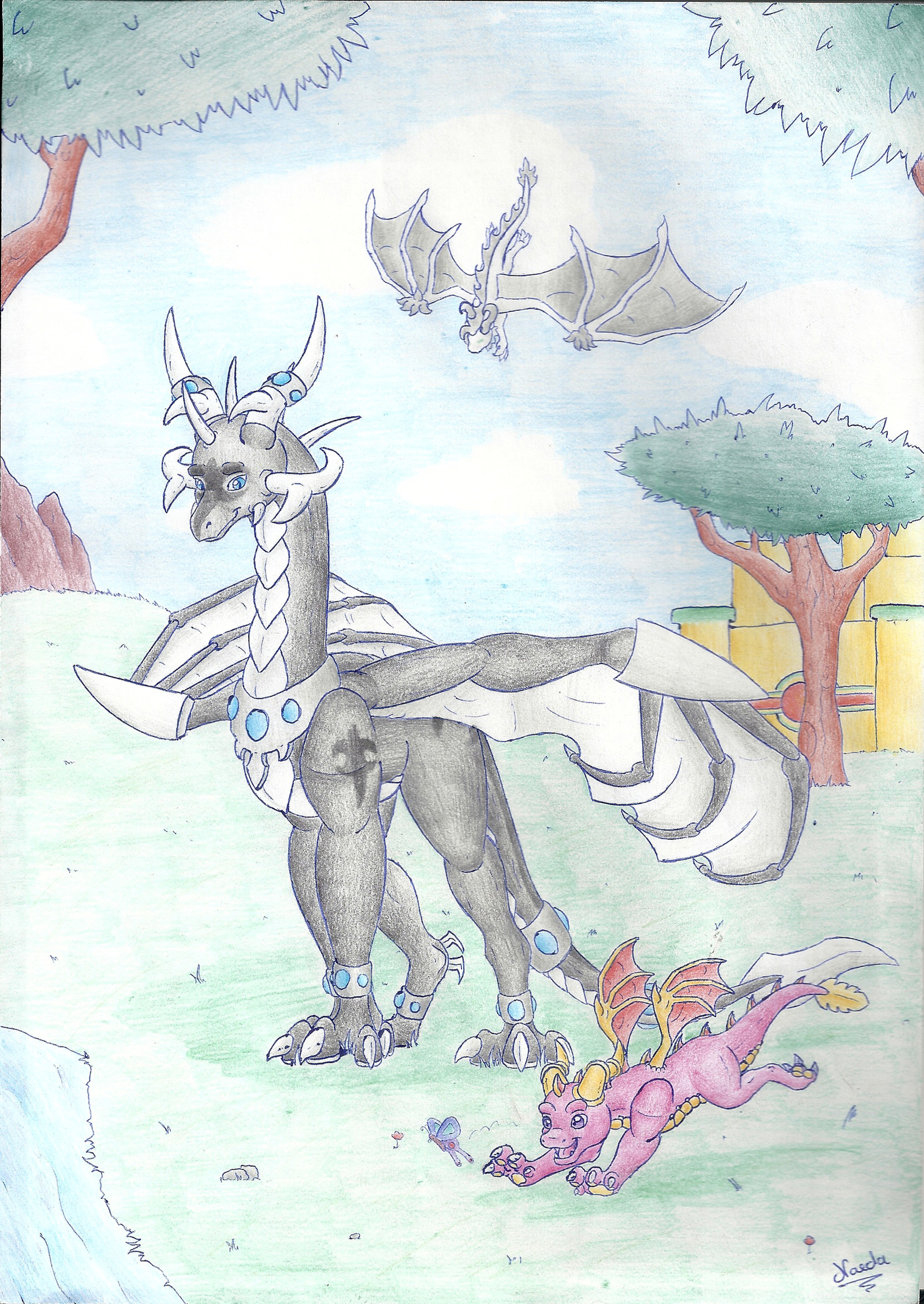
My god this took forever, but it made what started off as a crappy day go by rather quickly. I've been meaning to color this picture for quite sometime but never got around to it until now.I added the temple in the background and some scenary just to fill up the picture and make it epic.Enjoy ^.-.^
Related content


Comments: 26

I love the father and son images of Spyro and Iggy
👍: 0 ⏩: 0


Krystal: is this guy his dad? i've heard he was o3o
👍: 0 ⏩: 1
Kurtassclear In reply to Krystal-the-fox [2009-05-30 21:37:14 +0000 UTC]
no Ingitus not his father, but Spyro views him kinda like a father figure, Since he never knew his real parents
Thanks for the fave on this one
")
👍: 0 ⏩: 1
Krystal: Hmmm...I wonder if the Spyro series will ever go back to old times...after the movie :C sad they won't include our faves in the movie D: Hunter, Bianca, Elora, Zoe, Ripto, The Sorceress...MAN! they should make a movie of old times...like...kinda like the videogames, but with more drama ")
👍: 0 ⏩: 1
Kurtassclear In reply to Krystal-the-fox [2009-05-30 21:53:05 +0000 UTC]
Im just hoping they dont screw it up.
I like all the spyro games but i have to say the legend series games are my fave by far, eternal night and dawn of the dragon beings some of the best games Ive ever played (I <3 DOTD)
but hell i would be happy for any kind of spyro game/movie as long as they just keep making them
👍: 0 ⏩: 1
Krystal: I guess I am too much in nostalgia XD I was like...eight when I started playing Spyro o3o S2:RR was my first one, but they took out all the guys that I loved~ I'm pretty sure they will go back to the old guys though o3o...maybe...
👍: 0 ⏩: 0

The pink dragons body seems squished. Crowded. Like, his head and neck seem alright, but the body doesn't seem to match. It should be bigger. Spyro probably would have looked better on the other side of the dragon, so that he isn't blocked. Also, Spyro's wing just looks weird. It's too far forward. I had to figure out what it was at first. The depth perception is definitely lacking in this photo. The door does not look as far away as it should. And the tower, or whatever building it is, is lopsided, along with the walkway. The markings on the door are also uneven, both in size and in being even. The pink dragon should not get skinner as his stomach goes back from his chest. There is an obvious dip right between his back legs, and it shouldn't be there. That dragon needs more weight, he's pretty big. And his wings look lopsided. Either the right (my right) one is too far up, or the left one is too far down, or a bit of both. While Spyro's claws are separate from his foot, and they are also a different color, yet the pink dragons claws merge with his foot, except for the one yellow claw on the side of his left front. I think the tail on the pink dragon should have been a bit less turned over, so that his yellow spikes/fur (whichever) would be showing a bit more. The position just doesn't seem natural, like his tail is flipped upside down. The sun should have been more round. It just seems a bit too....oval, I guess. Also, the moss growing on the side on the tower, or whatever it is they are standing on, may have looked better outlined. There's a white patch in the very bottom right corner of the piece. Intentional? Well, nice job on the coloring once again, also, the trees and stream look very good, as do the colors coming up from the sun, however, I think the sky should have been more blue and less purple, unless purple was intended. Nice job on whatever the two dragons are standing on, and on Spyro's body. Bricks on the building are good.
👍: 0 ⏩: 1
Kurtassclear In reply to Kilama [2009-04-07 22:30:44 +0000 UTC]
ahh be kind lol
this one was an old picture that i decided to color so i know some things are off, like the wings.
it was hard to make everything in perfect proportion since i was drawing the scenery around them instead of the other way around.
the white patch was an accident, i miss really obvious things sometimes.and the sky color was intentional, i was going for a sunset kinda feeling with a ting of purple.
thanks again for the critique
👍: 0 ⏩: 1
No problem, you are welcome!
👍: 0 ⏩: 0

You know I love this one. I don't have time to do a full-on critique, but I will say this:
The only things I don't particularly like about this is 1) Both of their right wings look a bit off to me. I can't help but imagine that they would look like tubes if viewed from above. It's like they are curled too much or something.
2) The line above Ignitus' head (the edge of the tower) looks like it's at too sharp of an angle. I understand there is an angled perspective but it still indicates that the tower is tilted but everything else makes it look like the tower is standing up straight.
That's my two cents. Count 'em.
Aside from those two little things, this this is your masterpiece as far as I'm concerned. Beautiful detail in both the characters and the environment. Good show.
👍: 0 ⏩: 1
Kurtassclear In reply to Jester-Race [2009-03-31 03:33:41 +0000 UTC]
ROFL oh man you leave the best comments
its nice to hear some criticism, no one else gives me any
thanks for the fave ^.-.^
 (Smile)")
")
👍: 0 ⏩: 1
I wish I could spend more time on each one but yeah, I think it's important to be realistic with these comments. Don't get me wrong, comments saying "Cool! Very Good!" are nice, but I much more appreciate it when somebody takes the time to give some helpful feedback.
👍: 0 ⏩: 1
Kurtassclear In reply to Jester-Race [2009-03-31 04:59:44 +0000 UTC]
ha ha agreed, thanks for taking the time to critic, your a good friend
👍: 0 ⏩: 0


Kurtassclear In reply to SexyCynder [2009-03-27 22:17:04 +0000 UTC]
thank you very much, im glad so many people like it considering how long it took to do
👍: 0 ⏩: 1


")
Kurtassclear In reply to kritken [2009-03-25 23:14:22 +0000 UTC]
ha ha thanks man, this took soooooooooooo long to color, its quick ridiculous really but people seem to like it
thanks for the fave ^.-.^
👍: 0 ⏩: 0

Kurtassclear In reply to WhiteTigra [2009-03-25 21:17:56 +0000 UTC]
what, you dont like the rock guy
👍: 0 ⏩: 0

Kurtassclear In reply to sigma-the-dragon [2009-03-25 21:19:42 +0000 UTC]
aww thanks, and for the fave ^.-.^
👍: 0 ⏩: 0

Kurtassclear In reply to R-Spanner [2009-03-25 21:16:50 +0000 UTC]
awww your so kind.
thanks for the fave ^.-.^
👍: 0 ⏩: 0