HOME | DD
 kyo-tux — Copenhagen

Published: 2010-03-31 16:10:44 +0000 UTC; Views: 26044; Favourites: 166; Downloads: 0
Redirect to original
Description
Download from here ...Comments and favs will be appreciated
 (Smile)")
Related content


Comments: 87

HI, they are very nice.
How to download that set? cant find them there...
👍: 0 ⏩: 0


 (Wink)")


How do you make such marvelous icons??
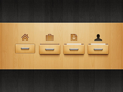
A little critique here (less intense than ~PraX-08 , however...): I just don't like the font in the preview. A little part clarifying the icon sizes provided would be nice as well.
That aside, your style is phenomenal and aspire to be this great someday.
👍: 0 ⏩: 1

thanks for your suggestion, I'll edit the preview as ASAP
👍: 0 ⏩: 1
Awesome! And, just curious, what's with the title?
")
👍: 0 ⏩: 1
The set was named by another person and he named it after his home city
👍: 0 ⏩: 1
Oh, I see. I love the new preview, by the way.
👍: 0 ⏩: 1


Absolutely love this icons, especially the 48px ")
👍: 0 ⏩: 1

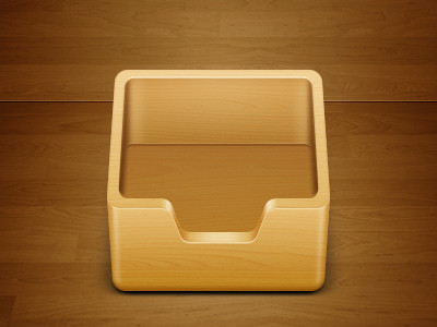
That thing dangling between the legs of the binocular made me laugh, did your reference have one ? Twitter bird's eyes are looking in two different directions and feet could have been Tridactyly rather than Didactyly. Globe compromises on Greenland for clarity. Cupboard could have been more woody. Still not happy with your preview style.
My usual disclaimer of "critic aimed at your welfare" applies here.
👍: 0 ⏩: 1
Binoculars' reference image had that thing too but it was much shorter [link]
I wanted to make the bird Tridactyly but when I did so, the 1px stroke messed up everything.
I never thought to make the cupboard wooden, I just selected a random color.However, I think it'd have been better if I had applied wood pattern.
Is the idea of presenting all icons in three sizes not working well or the background/text needs to be changed?
I appreciate all your suggestions but the problem is that the icons are already released.I'll ask the admin if he can resubmit the set with modified icons.
Thanks

👍: 0 ⏩: 1
Background and font selection is the problem. They look jerry rigged when compared with the icons. Don't resubmit the icons. Keep in mind these things on doing the next icon pack.
👍: 0 ⏩: 0


| Next =>