HOME | DD
 kyuumu — Trees in Cups

Published: 2011-04-01 03:47:45 +0000 UTC; Views: 1059; Favourites: 21; Downloads: 0
Redirect to original
Description
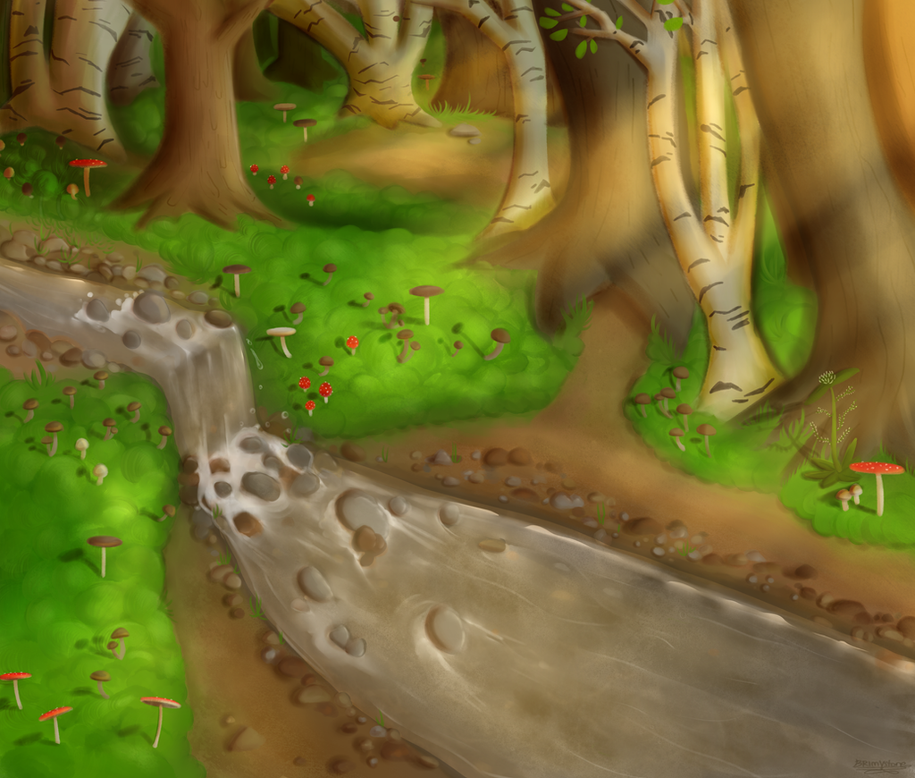
Okay, this puppy gets to go up extra early cuz I'm a keener this week apparently.This is for my critique next week, so feedback is lovely! I can still change it!
*caps* FEEDBACK!
SO. This is for a sort-of-not-but-really-is editorial *shudders* project where we had to make a brochure image depicting a company's corporate image in a new way as demanded by make-believe art director. So I chose Tim Hortons, out of irritation that they have recycling bins for their bottles and cans, but not their coffee cups. Which is akin to sweeping the floor with a very thin straw.
So here I depict our beloved Timmies as having biodegradable coffee cups that can be used to plant trees. My apologies for the offense this image may cause those sensitive to methane levels in the atmosphere.
This was my first shot at lasso painting, and I really like it! Counting to use it for my work till the end of the semester, its faster and, lets face it, looks more interesting...
Related content


Comments: 6


Beautiful! I love the colors - they're rich and bright at the same time. The concept is great, too
 (Smile)")
👍: 0 ⏩: 0

I love the overall feel of this piece it definitely has an organic earthy feel to it. I also love the textures, but I think the texture that was placed over the whole image is just abit too intense. I think if you just toned it down alittle it would help. Other than that I have nothing else. I also wouldn't have thought you used the lasso tool if you hadn't said anything. I am horrible with using that tool. I have tried many of times to use it and have still failed.
👍: 0 ⏩: 0

This is awesome. Very creative and unique. I also love the lasso painting style you used. 
👍: 0 ⏩: 0

I love the composition. The textures is a tad overpowering though, so maybe toning it down would do nicely.
Oooooor, you could cut the texture completely and think about printing this on textured paper, if you're feeling adventurous. Especially if it is supposed to be for a brochure emphasizing recycling. It would make me want to pick it up, if only to feel that texture.
I would have to say the representation of everything feels spot on except for the shadows. They should expand as they approach the viewer, since shadows diffuse as they extend. The fade to green, diminishing contrast, and shrinking of objects as the image recedes into space really adds depth to the image. Also, the crisp, vector feel makes the image seem more modern, and since recycling (or at least the increase in awareness) is a modern concept, your image reflects the times nicely.
So, over all, adjust those shadows and decide what you want to do about the texture. Other than that, this is a very strong piece. Good luck with critique!
👍: 0 ⏩: 0

I would say although I really like what the texture adds to the image, it takes away from the main sprout. Maybe take some of the texture off of the main sprout.
also, for me, that shadow of that one tree confuses my brain to no end. maybe just make it less pointed.
also, you could have shadows cast by the sprout leaves where they're hit by sunlight
👍: 0 ⏩: 0