HOME | DD
 Laiin — EDGE Magazine Cover v2

Published: 2006-04-01 14:59:05 +0000 UTC; Views: 8935; Favourites: 94; Downloads: 5689
Redirect to original
Description
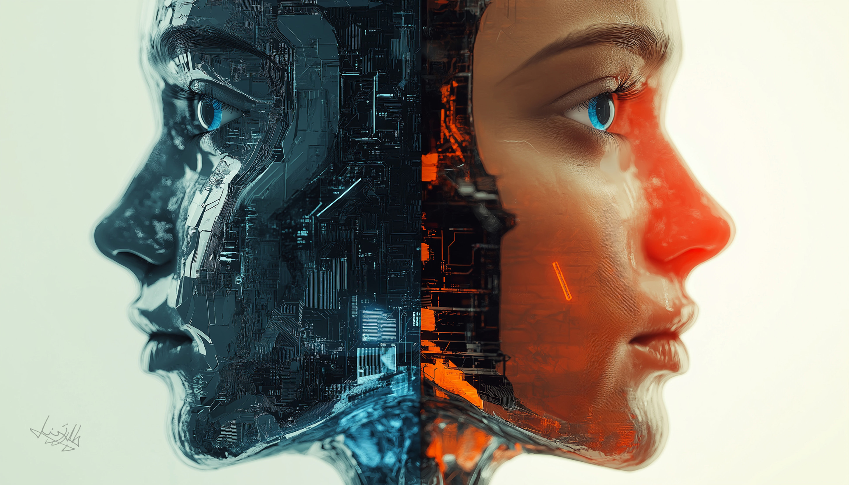
After negative feedback from my teacher on v1 cover I decided to redo it.Related content


Comments: 23


i love this.
i would buy this magazine if i saw it in a shop, i would defenetly be attracted to it anyway, and thats what a good design for a cover should be about, so well done
👍: 0 ⏩: 0


Wow, this is awesome. I love the choice of colours -- great work.
👍: 0 ⏩: 0


I really like this hence the reason i Faved it. However there are two things that let it down for me.
1: The 'organic element', it just looks out of context.
2: i cant say i'm a fan of the font used for the magazine name.
The rest is great though. I even learnt a new word 'synaesthesia' so thanks  (Smile)")
👍: 0 ⏩: 1

Thanks for that. I will look into this organic element. Its too late to change the font as I have used it for other pages in the magazine.
Thanks again for looking at it in such great detail.
👍: 0 ⏩: 0
I hope you are not as sick as my work?
👍: 0 ⏩: 1

haha. nah, i'm pretty much better now
👍: 0 ⏩: 0

I liked the last one, but think I prefer this one. Blue is so nice. ")
👍: 0 ⏩: 1
Of all the compliments I think I like "kid" the best
👍: 0 ⏩: 1


yeah very nice... why is the circle on the topish left sorta rough tho? only thing that lets it town
👍: 0 ⏩: 1
Cool thanks. Yah I was trying to add some organic element to it. I will experiment some more though
 (Wink)")
👍: 0 ⏩: 0

I like this one a lot better. There's more to attract the eye's attention and the composition (i think thats the word! hehe) is better.
👍: 0 ⏩: 1

wow that sucks! APRIL FOOLS!!!! it's amazing, as usual, ^________^ +fav!
👍: 0 ⏩: 1
I was working all day and completely forgot about april fools
👍: 0 ⏩: 0

Looking much better, well done ")
👍: 0 ⏩: 1
LOL, go blue! Thanks for commenting
👍: 0 ⏩: 0