HOME | DD
 LancerWolf13 — Words Cut Like A Blade to the Skin
Published: 2013-10-30 14:30:48 +0000 UTC; Views: 2093; Favourites: 142; Downloads: 0
Redirect to original
Description
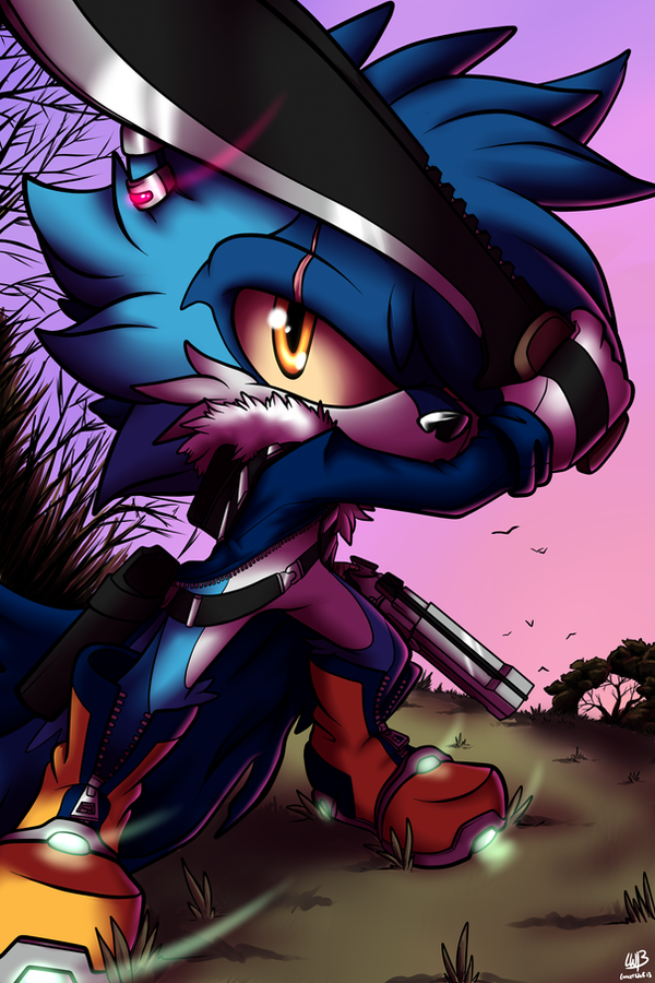
I needed to let off a hefty amount of steam, and I needed a good amount of "in your face" music to pull this off. Nothing but the heaviest from August Burns Red and classic pure punk aggression from Rise Against's youth. Here I tried to do a little more than usual. I pumped several hours into this. I was just in that mood, ya'know? Please critique! I'd love to see what you all think! <3
Programs used: PaintTool SAI
Time: 8+ hours
Musical 'motivation': "State of the Union" by Rise Against - www.youtube.com/watch?v=9N7mRn… , and "Animals" by August Burns Red - www.youtube.com/watch?v=e7OS4F…
Art and Character belong to me, LancerWolf13.
Therefor, only I may use, edit, and post this image.
Related content


Comments: 19

Overall

Vision
Originality

Impact
(Been a while since I've done a critique so I thought I would try again for some fun. When it comes to work I'm not one to sugar-coat things, I'm kinda blunt. XD)
Okay so overall this piece is visually astounding. It really stood out in my messages, the coloring especially. The contrasting colors like the orange of Lance's eyes and boots really makes this picture stand out. Also, the way the background is almost curved really adds to the perspective of the picture. And it's also clear to see how much detail you have put into this picture - the detail of the zippers on his jacket and boots. I also like the new design for his sword too.
Also, watch out for the size of Lance's head. I can see that you have tried for perspective, but his body isn't leaning far enough forward, making his head appear slightly bigger than it should. Also, making the foot in the foreground bigger would help with the head.
What I really like about this piece is the movement you can see. The light coming from his boots and ear piece really make this piece come alive as you can see the movement. But, the sword in this picture appears in front of Lance, pointing towards the viewer, yet the light from the ear piece appears in front of the sword. It would make more sense if the light was to appear from behind the sword since the ear is behind it. But still, it creates a good effect.
Overall this piece would be perfect for a kickass poster or even the cover of a game. You did really well with detail here and your coloring has always been amazing. This piece really shows off Lance's badass nature. It's full of personality and really brings to light how much effort you put into your work.
Awesome job as always, Dan! Now get some sleep, you deserve it. XD
👍: 0 ⏩: 1

OMG Y U HATIN THIS IS BEST PIC EVR HNGGGHHH
Well thank you for the critique lil miss Meggy. Not much more I can say XD
However you said the head is too big... BUT! Most people draw the overall height of mobians to be 3x the height of the head. I however draw 2.5x the height of the head. That's why his head looks on the bigger side.
You also got to remember, like you said there appears to be motion due to the light trails... but the body is free to move too. Maybe he sword wasn't there a split second ago, maybe he's stepping back and pivoting, giving the light trails that curve. Just because the blade is in front of his face now doesn't mean that it was before. I worked in three dimensions here so that was taken into account XD
Though it wasn't executed perfectly, I still think it turned out great <3
👍: 0 ⏩: 1
Oh. OH. OKAY THEN.
I see you have made everything I said appear to be total bullshit, why thank you best friend. X3
Well hey, I tried. And don't be bringing out all this math stuff with me, we both know how stupid I am.

👍: 0 ⏩: 0


")


Your steam just made art that invokes feeling . . . strangely, I can see a fight between Rabies and Lance . . . that would actually be something interesting to see. O3o
👍: 0 ⏩: 1
That's what happens when I'm pissed off XDDDD
👍: 0 ⏩: 1
👍: 0 ⏩: 0

I have to know how you made this, this is freakin' awesome! I especially love the lights in his shoes and earring, it really gives a sense of movement that you can see where his feet were.
Keep up the good work!
👍: 0 ⏩: 1
 (Smile)")


Looks pretty damn awesome Senpai~. You feeling better too? ): 👍: 0 ⏩: 0


fascinating work on the coloring and shading style and definitely Lance's pose too!
👍: 0 ⏩: 0


o3o~ Amazing drawing! Love the eyes! But heck, love the drawing all together!~ And the colors look fantastic~
👍: 0 ⏩: 0