HOME | DD
 lantairvlea — Hitch in Line

Published: 2013-01-04 23:35:58 +0000 UTC; Views: 558; Favourites: 20; Downloads: 0
Redirect to original
Description
There are parts of this that turned out really awesome like Nordland's head, and other parts that are not what they could have been. I know I'm probably one of the only ones to notice these things, but this style holds power for me because it is more than just random squiggly curly cues slapped on the page. Rough spots are what I get for being rushed at the end, but that's okay. I've also realized that watercolors is not the best way to go with these if I want smooth, consistent lines. Gouache works much better as it is easier to get a flat, consistent tone.Anyways, for the year-end championship show at I had to get at least one entry in despite my lack of time for art this year.
Nordland in the lead. Geheime Macht as the right wheel and Demütigen Gnade as the left wheel.
Horse's names: Nordland lantairvlea.deviantart.com/art… , Geheime Macht lantairvlea.deviantart.com/art… , and Demütigen Gnade lantairvlea.deviantart.com/art…
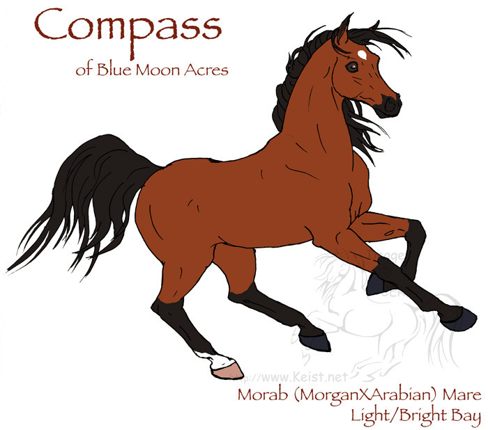
Stable: Blue Moon Acres
Driver: CERT/KunstFeuer
Breed: Norikers
Ages: 9, 11, 4
Class Entering: Team/Hitch Pleasure Driving
Watercolor and ink in a moleskin watercolor notebook. Original for sale.
Judge's Choice Award!
2nd Place:
Related content


Comments: 32

This is really awesome! I really love this style, it's very unique and different! I love how you used thick black lines to accent the muscles of the horses, it looks really awesome.  (Smile)")
I'm not entirely sure what the background is supposed to look like, but maybe instead of just that big blue 'cloud' in the back you could try and add more detail or not have as much of a cloud there and add more of a background? The 'cloud' just seems to take up a lot of space and looks a little awkward. That's just my opinion.
Other than that I really love this piece. Your shading looks really cool and again the lines are just really awesome! I like the swirls as well, they add to the motion and style of this picture. Great job!
👍: 0 ⏩: 1

Thank you for your wonderful comment!
It was supposed to suggest a grey, cloudy day and I really should have used a reference rather than just winging it. Or are you referring to the large blue-green "shrub-tree?"
Thank you again! It's good to hear that others enjoy seeing the style as much as I enjoy working in it!
👍: 0 ⏩: 0

I'm not sure if this style has a name, it does remind me of something but I can't put my finger on what. Maybe it's the swirls...but either way, I love it. It's gorgeous 
There's really one one thing in this that I think could be something to pay a bit more attention to - and it might be my eyes (which are notoriously bad), but to me the angle between the lead horse and the pair behind it seems just a little off...
Also, for a bit more life, you could try adding just a hint of a darker colour to the upper end of the swirls on the nearest blue 'bush' as the thick swirls there are a little distracting in their flatness compared to the vibrancy of the foreground.
Overall though...a joy to look at.
👍: 0 ⏩: 1
Thank you! I call it "expressive line" myself. I couldn't say if there was any particular style or movement that influenced it directly, but I've been working off and on in this style for almost 10 years. I really enjoy working this way. I should do it more often.
It may not be you, I struggled with Nordland's placement even as I started inking.
I guess my idea to leave the background flatter to avoid distracting from the subject failed, eh?
Thank you again for taking the time to leave this wonderful comment!
👍: 0 ⏩: 0

Wow this is absolutely gorgeous! I dont think ive ever seen anyone in the RPG sphere use this style. And your right it is more than just squiggly lines, it creates a real flow to the piece, and also gives it a sort of antique country feel to it. The colours you have chosen for this piece are just perfect too. One thing that I would have changed in this though would be the position of the front horse. When driving horse turn they actually side step instead of turning their bodies. Its not necessary in this piece as the current position fits in with the style, jus a minor technical note
👍: 0 ⏩: 1
Thank you for your wonderful comment!
I would argue on that point, especially when you're dealing with lead horses in a tandem or unicorn hitch (which is what this is). The only thing keeping the horse in-line is the traces, no pole or shafts, so there is a bit more play in how the horse moves not having to work around the pole or shafts just as they tend to do when ground driving.
👍: 0 ⏩: 1
Ahk well that makes sense then
👍: 0 ⏩: 1
It's still more than most have done! You tell most people you drive horses and they get slightly confused.
O my! I've been so busy in my little corner trying to reply to everyone's comments that I hadn't even checked to see who the winner was!
Hopefully you're not offended, but I don't have place or interest in additional horses added to my stables, but the points, features and so forth are greatly appreciated! Could you send me the link when you do the features?
👍: 0 ⏩: 2
Heres the feature on my art account [link] The Feature in the breed group newsletter will be coming in the next week when the next/first issue is released
👍: 0 ⏩: 1
No problems! Ill get them up right away
👍: 0 ⏩: 0

Wow, this is so pretty! I really love this style, it's very unique.
Some more shading on parts might help things not blend in so well, but that could just be the style. I have some trouble distinguishing the back horse's legs from the background, since they're so light. Perhaps a darker colour for the ground would work better?
To be honest that's the only thing I notice that could be better, I don't know what flaws you see 
👍: 0 ⏩: 1
Thank you for your wonderful comment!
Despite working this way off and on for nearly a decade it's still trial-and-error at times. I agree on the darker ground. There's other things that didn't go quite so well, but I think the good manages to outweigh the bad.
👍: 0 ⏩: 0

I love the style. I have a heard time doing stylized pieces, and while I usually prefer strictly realistic, when I find a great stylized piece, its even better. I love how the style of the harnesses and bridles match the style of the background, yet still look fairly realistic: you know exactly what they are. The shading on each horse is excellent, simple, but not underdone, with enough tones to add real depth.
I have only a few critiques. Instead of making the line on Nordland's back near leg complete, I would have left a bit of space, to connect gaskin and hip. The leg looks pretty cut off honestly, especially since you don't see much more before the page cuts off. Also, I think it's Geheime Macht's foreleg... but I honestly can't tell. While the link lines definately aid in being able to see, i would have possibly tried to maybe make the hoof dark, or a small line segment to mark off the back of the cannon, because it also looks like it could be part of Nordland's tail, kind of detached from everything.
The background is a mystery to me xD I don't get the context for it. I'm sure someone who knows more about the event probably would though. Over all, I love the style and feel of the piece, and you use your mediums expertly.
👍: 0 ⏩: 1
Thank you for your wonderful and thoughtful comment.
I have personally found that as I learned more and my draftsmanship increased I became drawn to this style of work because it was both challenging and satisfying and there's only so much challenge in replicating exactly what you see. How much can I push it before the subject is lost? I do both, but this style has a special place in my heart for sure.
The original has a little more to it on the top, bottom, and right sides. The paper has rounded corners that I cropped out. That said I didn't plan ahead properly for the edges of this piece. I agree that the parts you've pointed out are weaker areas of this piece.
The background is supposed to be large, shrubby trees flanking a grassy field with a dark, cloudy sky. It definitely did not have the thought in it that the subjects did and I ended up changing how I was going to treat it as how I was trying to do it really wasn't working.
Thank you very much! Sometimes during the process I don't feel so expert!
👍: 0 ⏩: 0

I like the style you did for this piece, really pretty!
The design to me is very unusual and unique at the same time. I like the swift and smooth edges you did on the horses, and just about everything else!! The shading is pretty and I like how its light colored.
The cart in the back is hard to make out, although if you look a bit you can tell what it is. Maybe next time making it more visible? Darker outlining and lighter shading might work
Great piece!!
")
👍: 0 ⏩: 1
Thank you very much for your wonderful, thoughtful comment.
The wagon was one of my rough spots and neither ink nor watercolor are terribly forgiving. There is some black on it, but I think the secondary shading is just a bit darker than it needed it be.
👍: 0 ⏩: 1
stil it turned out good
👍: 0 ⏩: 1


Bold and minimalist at the same time, very distinctive
👍: 0 ⏩: 1
Thanks! It has developed rather organically over time and it's a mode of work I thoroughly enjoy.
👍: 0 ⏩: 0

Thank you! I've been developing this style over several years.
👍: 0 ⏩: 0


Thanks! I thoroughly enjoy working in it, even if it is unnerving at times!
👍: 0 ⏩: 0

So do I! I need to do more with it (with the complete lack of spare time) in this and other media.
👍: 0 ⏩: 0