HOME | DD
 lapis-lazuri — Eclipse Notifications 03
#da #deviantart #eclipse #feedback #notifications #deviantarteclipse #daeclipse
Published: 2020-05-07 09:05:09 +0000 UTC; Views: 710; Favourites: 16; Downloads: 1
Redirect to original
Related content


Comments: 3

👍: 0 ⏩: 0

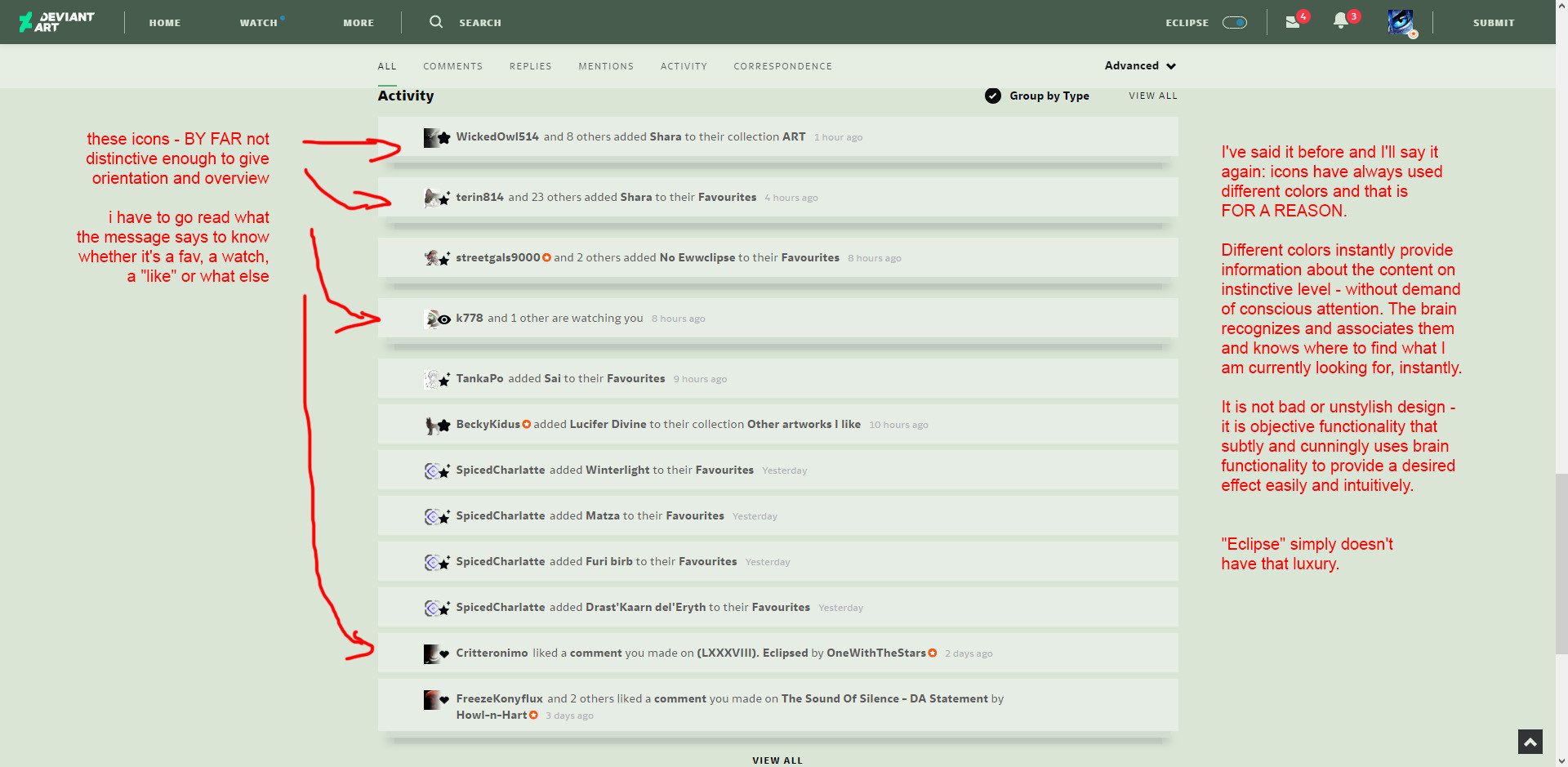
I understand what you mean with the colored icons, they used to be in color like in the older times. Today more and more Software and Websites using monochrome icons which sucks on the usability, because colors can be used for orientation.
But I'm in Web-Development, so I cant tell you WHY this is happening:
Monochrome Icons (or even flat icons, with simple shapes) are often used as vector-graphics, so they never become blurry on any screen size.
I'm personally more for colored 3D icons (due to useability and orientation) sadly these flat 1 colored icons are trendy plus the benefit i mentioned...
👍: 0 ⏩: 1

Them not becoming blurry is a very dubious advantage in "eclipse", which suffers from stuff being overly huge in the first place. I mean.... who would engorge this already blown-up design? Besides, it becomes completely unusable at anything more than 125% size because half of its functions get scattered in the nonexistent space way beyond the monitor. No, while I did check and the icons seem to be unblurrable (i.e. vector) indeed, I don't believe that's actually the reason. I think it's yet again done for "design" reasons - because it's a vogue and is considered stylish. But it's a very crappy design too, they are not only monochrome but awfully stylized, which makes them boring and often difficult to read and tell what the fuck do they even depict and symbolize. Not to mention they are made the same as all across the internet mass media nowadays - and there goes the uniqueness of deviantART. This is not good design, and boring is not style.
👍: 1 ⏩: 0