HOME | DD
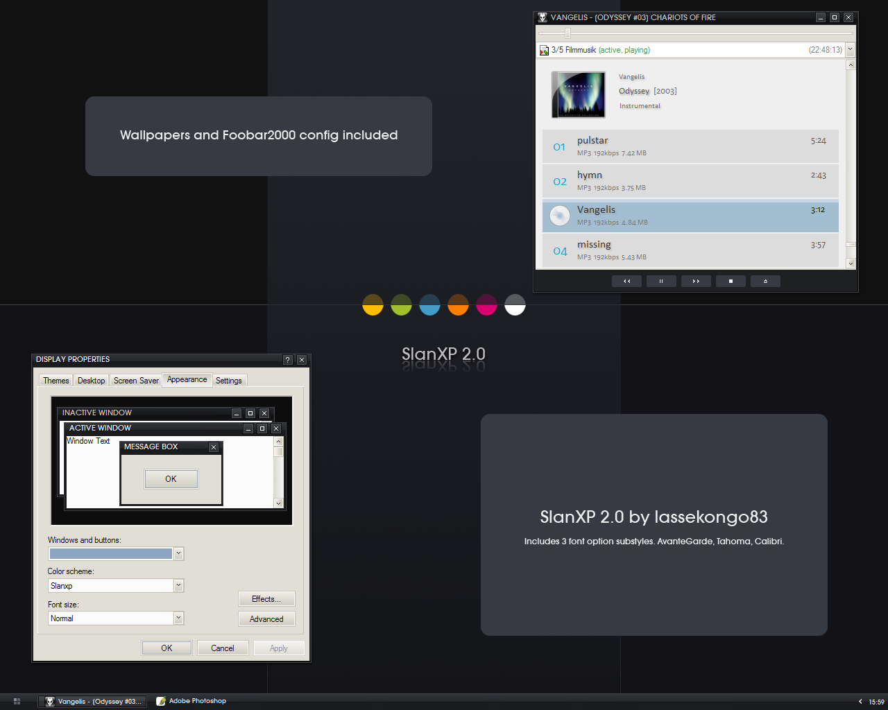
 lassekongo83 — SlanXP Edition 3
by-nc-sa
lassekongo83 — SlanXP Edition 3
by-nc-sa
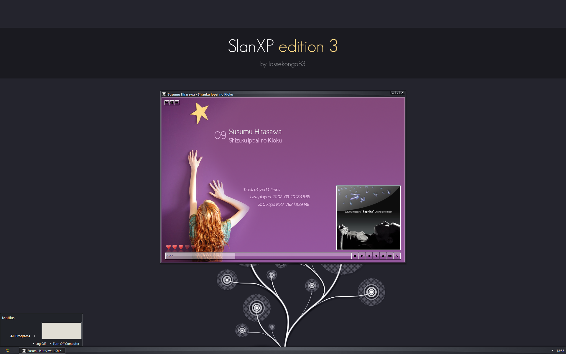
Published: 2007-09-11 17:06:11 +0000 UTC; Views: 422553; Favourites: 592; Downloads: 169929
Redirect to original
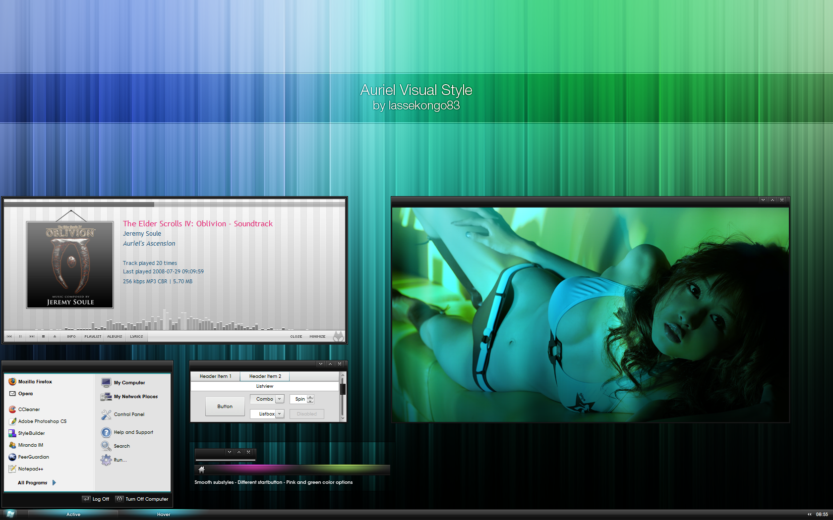
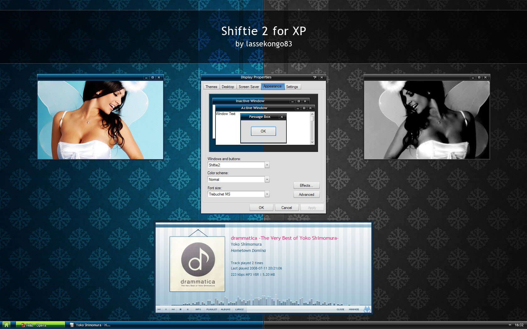
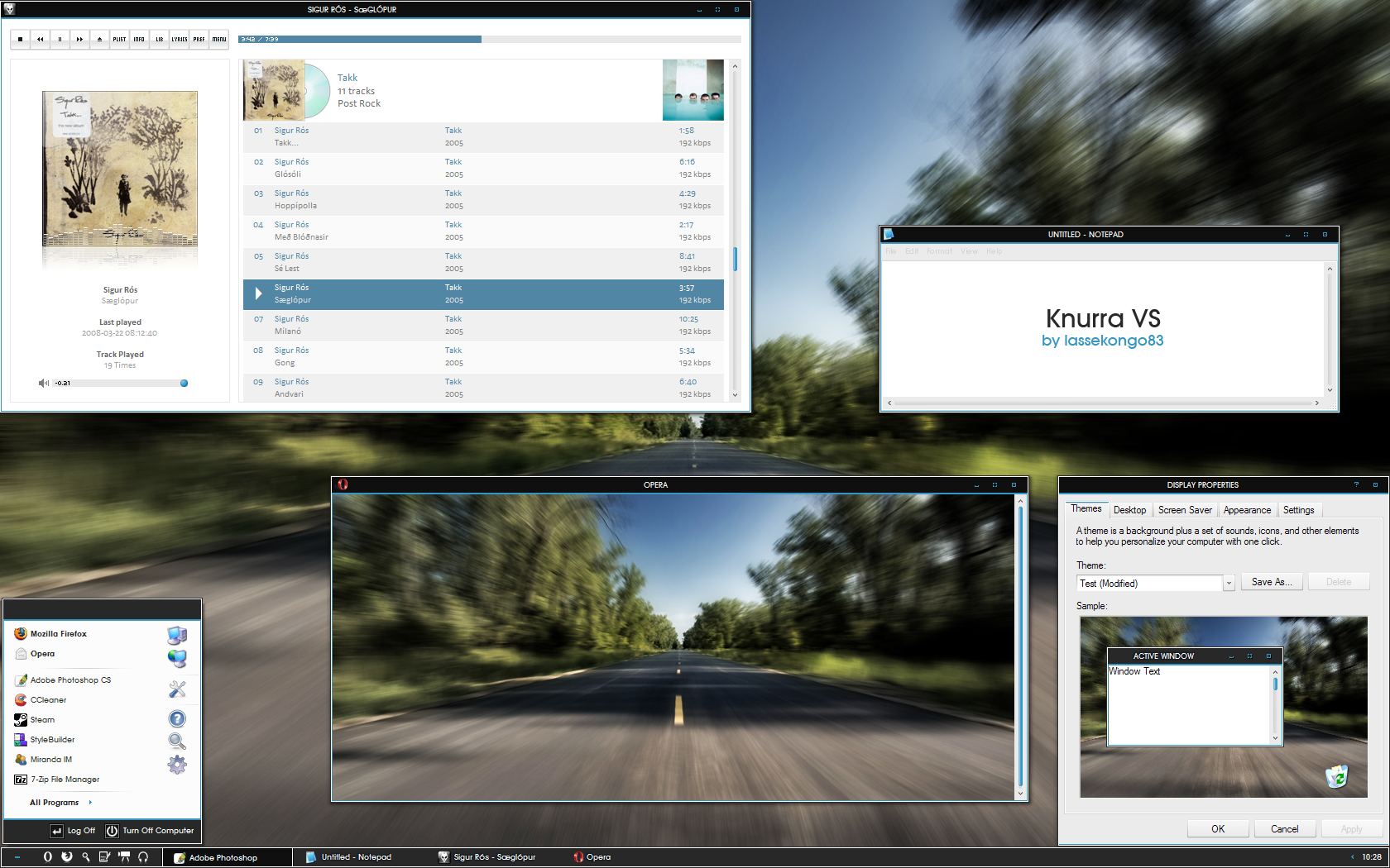
Description
1st one: [link]2nd one: [link]
And now comes the 3rd one.
")
Vista Basic port is available here: [link]
2 font options.
- Segoe UI
- Tahoma
Any questions or problems with my Visual Styles? See my FAQ first!
[link]
FOOBAR CONFIG: [link]
But it uses a different BG image. Reason why: Unclear usage of the stock photo in the background ( [link] ). Meaning, according to her rules, I didn't edit it enough.
Wallpaper is: [link]
Mods and ports of my visual styles are allowed as always. But please let me know if you decide to make and submit one. (All mods and ports must use the same creative commons license as you can see below the preview image.)
---
UPDATE: (2/12 - 2007)
- Compact startmenu added.
UPDATE: (20/10 - 2007)
- Minor startmenu fixes.
UPDATE: (12/10 - 2007)
- Pink disabled scrollbar color fixed.
UPDATE: (12/9 - 2007)
- StartPanel size increased.
- Brighter highlight color.
UPDATE: (Just a few hours after the first upload.)
- Taskbar.ProgList CaptionText set to RGB 100-100-100
- Top taskbar bg reversed.
- Toolbar font in the Tahoma substyle changed to Tahoma.
Related content


Comments: 157


It's a very nice VS. The only thing I would change is the color of the Inactive windows taskbar, from all black in color to a darker two toned version of the Active Window Taskbar.
Good job
 (Smile)")
👍: 0 ⏩: 0


I have been waiting for your work for a long time in which here is full of ugly 'Vista-Style'(for XP).
it is another cute one! Thanks for sharing!
👍: 0 ⏩: 0

awesome again
still using Slan 2 here, guess I'll switch now
👍: 0 ⏩: 0

 (Wink)")

"The Tahoma version is missing the arrows on the 'all programs' button..." is not fixed...
👍: 0 ⏩: 1

I can't find anything that's wrong there. It looks exactly the same in stylebuilder as it does in the segoe ui substyle. :/
👍: 0 ⏩: 1
Though, it could be because of the language you're using. The Tahoma font is bigger than Segoe UI, making the text "Alle Programme" pushing it further to the right. It does have more letters than "All Programs".
👍: 0 ⏩: 0


Really nice! I've got to try this out tomorrow! I like the other SlanXP themes, but this seams like the best one so far!
The Foobar config looks great to, even though I wouldn't use it
(To much pink for me, I guess it's easy to change the images though. Got to try that too!)
Keep up the good work!
👍: 0 ⏩: 0

i like this. the colours are better than V2.
if i open the start menu. there is a list of most started programs and the button for "all programs" on the left side. there is no color difference between "normal" and "mouse over".
you wanted that?
👍: 0 ⏩: 1
Thanks. That will be fixed in the next update.
👍: 0 ⏩: 0


Lovely gloss on the titlebar and the taskbar. Any chance of a version with slightly glossy buttons as well?
👍: 0 ⏩: 0


yep there are white arrows in all programs list on dropdowns...
👍: 0 ⏩: 0

Great work as always lassekongo.
Fortsätt så !
👍: 0 ⏩: 0
Another "problem": The Tahoma version is missing the arrows on the 'all programs' button...
👍: 0 ⏩: 0


I used version 2 for a long time, and now I decide to change the VS, and I c the version 3, damn, using it now
👍: 0 ⏩: 0
The toolbar font in the Tahoma version is wrong - as always
The classic colors are so la la - as always
The CaptionText in StartPanel.ProgList is way too dark. Should be set to 83 77 70 or 80 80 80.
Otherwise it's great - as always! And with my little modifications it will be my vs of choice for a very long time (after version 2). Thanks!
👍: 0 ⏩: 1
1. Noticed that. Will be fixed.
2. What can I say... I love beige!
3. Hmm. StartPanel.ProgList textcolor is set to 245-245-245. ")

👍: 0 ⏩: 1
3. TextColor yes but CaptionText is set to 8 8 8. This is the text used under Internet + E-Mail on top of the proglist if you've enabled this option.
2. My "version" is beige also. But your color choice doesn't look good with some older apps with non-skinned gui elements. PM me if you're interested - I could mail my version to you.
👍: 0 ⏩: 1


here i was looking for something that was minimalistic and the first result i get is the one i download")
👍: 0 ⏩: 0


<= Prev | | Next =>