HOME | DD
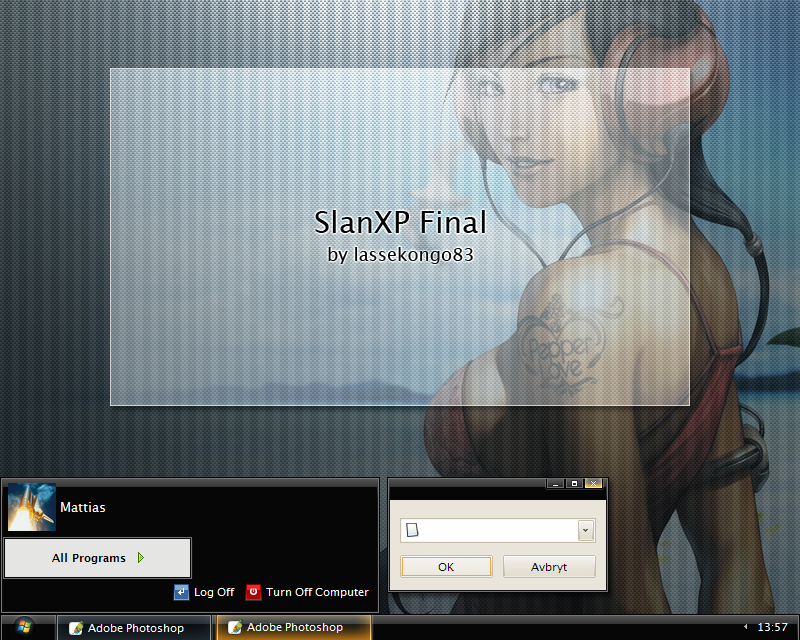
 lassekongo83 — SlanXP Final
by-nc-sa
lassekongo83 — SlanXP Final
by-nc-sa
Published: 2008-01-10 13:34:54 +0000 UTC; Views: 155410; Favourites: 235; Downloads: 51941
Redirect to original
Description
Finishing my SlanXP series with one final edition.")
Walls used in preview image:
- [link]
- [link]
Any questions or problems with my Visual Styles? See my FAQ first!
[link]
If you want those 2 wallpapers mixed as in the preview image you can do some simple editing in Photoshop or The GIMP. Paste 1 wall over the other as a new layer. Select the Soft Light - layer style on the top layer. I belive The GIMP have some similar layer styles too.
Changelog
2008.01.11
- Captionbuttons fixed. Thanks to [link]
- Shellstyle included.
- Fonts can be changed in the Font Sizes dropdown box.
Related content


Comments: 95


Your the best, LasseKongo83, you make great themes! Also, my favorite is SlanXP 2
And also, not to be weird but can you try to make a version of this SlanXP and SlanXP 3 in Calibri? Because Calibri is a great font!
")
👍: 0 ⏩: 0

Dude... THIS IS THE MOST EPIC THEME EVAR!!!!!!!111111 Lawl. Nice theme. I am going to use it FOR EVAR!
👍: 0 ⏩: 0

Very cool! I like this them a lot! Only down side for me is the orange color on the progress bar. Since it is a "Vista looking theme" it would be really cool to have the progress bar, and highlighted box colors green or blue. Other than that this is simply perfect!
Thank you!
👍: 0 ⏩: 0


superb!
'm using it right now...
but... there are some things that annoy me in this theme...
• the line (border) beside the start button and clock, hope you'd remove that...
• the caption buttons are bit too small, make it a little bold and make it vista-like colors when you hover at them...
• the color scheme... hope you'd also add green color scheme instead of just orange...
• the font and arrow color of the bar on task pane, make it white instead of dark gray...
• the scrollbar, make it a little more visible...
• and lastly, the taskbar... put dividers and make it green instead of orange when you hover and click at them (like the one see in the screenshot above)
👍: 0 ⏩: 0


Nice work, although I prefered SlanXP 2.0, my favourite of the SlanXP series. But still, fantastic job, though sad to see my favourite visual style series ending
")
👍: 0 ⏩: 0


So that's it with SlanXP? Not exactly what I would have expected as a final. It looks to much different. Too big, too dark. SlanXP3 rocks more, still this is another great VS you've created. Hope to see something new from you, soon
 (Smile)")
👍: 0 ⏩: 0


This style don't looks like SlanXP, this looks like some new style. SlanXP Edition 3 is better.
Style is nice but 2 things are bad:
1) this Final has very ugly buttons (Edition 3 has much better).
2) startbutton is much better on SlanXP 3 too (this one looks like vista).
👍: 0 ⏩: 0


hey just a question, did you change the whole OS font?? because the 'OK' looks different than the normal ones, this also happens in some other themes of you (I always check them, I'm your fan)
And if you did, could you please give me a hand with it?
👍: 0 ⏩: 0

I really like your theme, but on windows xp there is a problem. A picture of the problem is linked below.
[link]
👍: 0 ⏩: 0

Smooth version with Avantguarde Medium CAPS font would be GREAT??
👍: 0 ⏩: 0

Great VS Style ... I'm using it since its beginning ...
Is there a way to make a smooth version of it?
👍: 0 ⏩: 0

 (Wink)")

great theme, i just dont like the so tiny min max close buttons...
👍: 0 ⏩: 0


mmm.. this matches the colors of my Forest Keeper Vista theme..
👍: 0 ⏩: 0


With explorer windows, there's no title. Other windows are fine.
👍: 0 ⏩: 0


Mattias this looks good, but I'd rather go for SlankXP 3, it's much bettet, this glancing isn't looking far too good.
👍: 0 ⏩: 0


Very nice, but the square WinFlag was nicer than the ViOrb.
👍: 0 ⏩: 0

[link] This guy seems to have got it to work without the caption bar being lower than the caption buttons. I didnt check the height of the bar, or open it in stylebuilder to see how tho. Thought Id link you to it incase it helps.
👍: 0 ⏩: 1

Well, fixed the captionbuttons a few days ago.
👍: 0 ⏩: 1
Hehe, okies, I didnt see that
👍: 0 ⏩: 0

Wonderful, love how you used the WinXp logo in that taskbar too.
👍: 0 ⏩: 0


I love your themes especially SlanXP, but Nion2 also my favourite theme! Congratulations!
👍: 0 ⏩: 0


Nice work, lassekongo! I'm a fan of your whole SlanXP series.
👍: 0 ⏩: 0

Dude, looks awesome, but sorry, the windows doesn't snap right to each other.. specially the top of the windows keep a little bit space above it..
I use AllSnap (google) to snap windows to each other.. very usefull on my second screen for the standard-always-open-programs..
👍: 0 ⏩: 0

| Next =>