HOME | DD
 lassekongo83 — VITA Visual Style
by-nc-sa
lassekongo83 — VITA Visual Style
by-nc-sa

Published: 2007-11-07 21:10:10 +0000 UTC; Views: 75758; Favourites: 181; Downloads: 21322
Redirect to original
Description
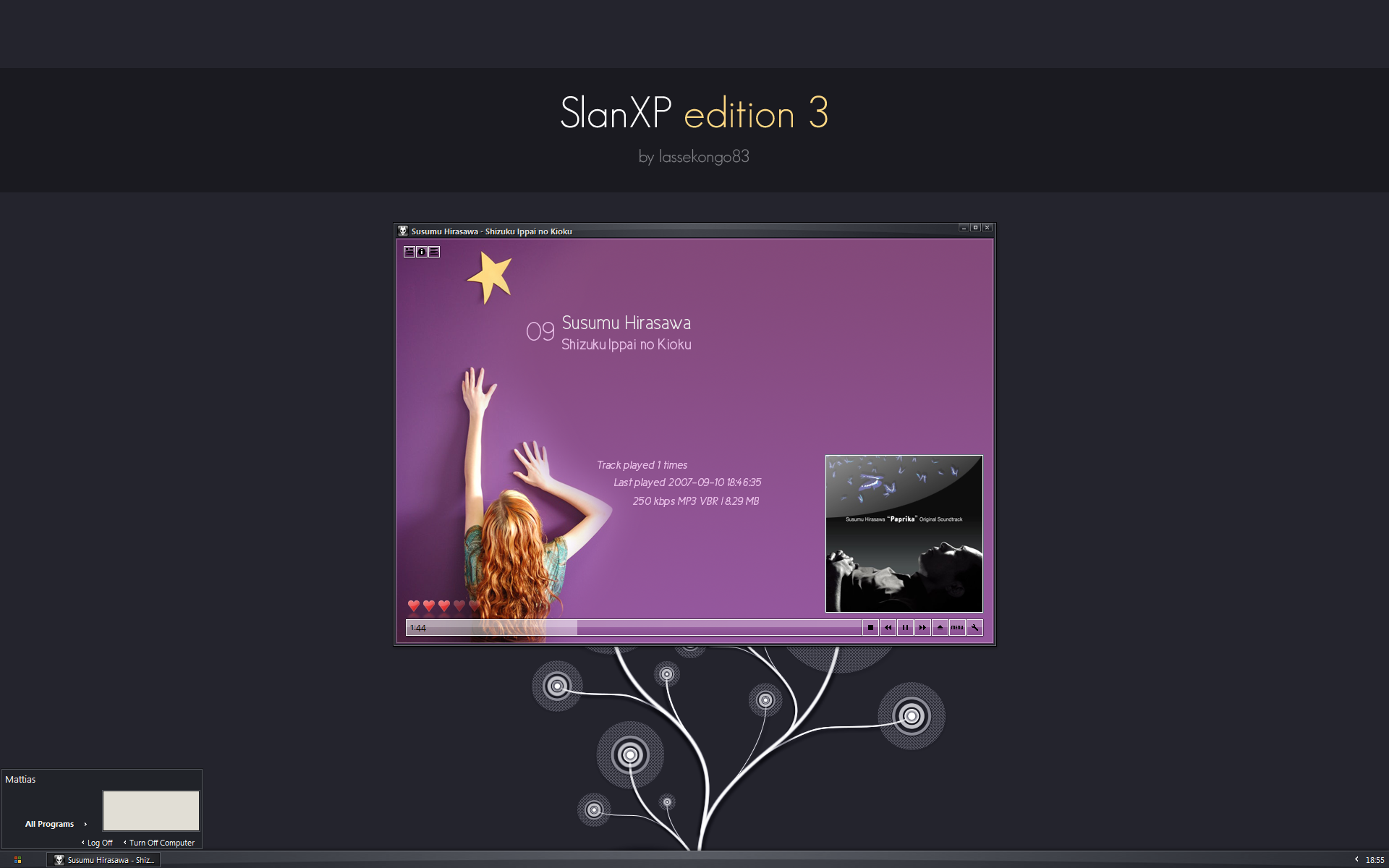
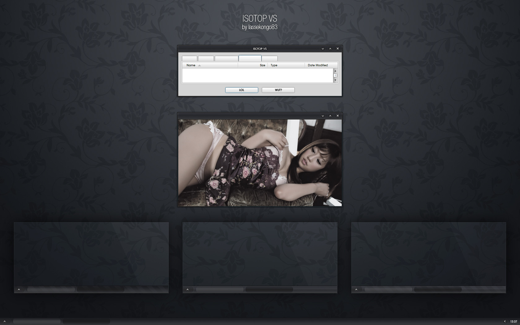
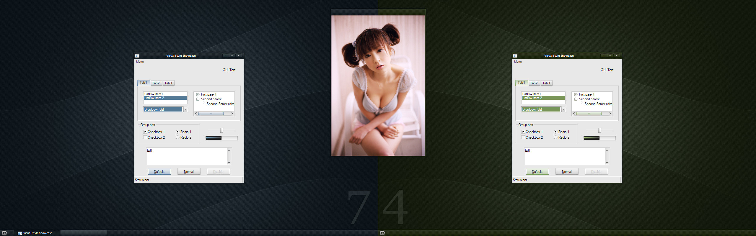
An exprimental minimalistic style without any 3D borders.Therefore usability in this theme isn't the best.
Preview screen: [link]
Brightness and contrast is different for each system. The only thing I can do is to suggest that you adjust your screen brightness after this image: [link]
Any questions or problems with my Visual Styles? See my FAQ first!
[link]
UPDATE (8/11 - 2007)
- Compact startmenu included
- Font included
And a few hours later...
- Foobar2000 (fooVITA) configuration included.
 (Smile)")
Related content


Comments: 54

the download link is broken
one of the best vs ive seen
👍: 0 ⏩: 0

Erm... any chance for a darker version (dark gray or black)?
Would be nice too.
 (Wink)")
👍: 0 ⏩: 0


this is definitely one of the best when not even the best of your visualstyles.
👍: 0 ⏩: 0


i love this...i have been looking for minimal white colour VS and this is perfect
thank you

👍: 0 ⏩: 0

i really do love this VS, so I made a desktop with it:
[link]
enjoy
👍: 0 ⏩: 0


I think unless the window buttons it's really a flawless slim theme/
👍: 0 ⏩: 0

cooool
👍: 0 ⏩: 0

Great work.
Only one small suggestion, a little more contrast in the scrollbars - this theme and Johka it's a challenge to find the bar to grab and move through a page.
👍: 0 ⏩: 0

Looks nice,but the only problem is : I dislike round edges. :S
👍: 0 ⏩: 0

awesome to see you try something with the minimal style, if you keep doing stuff different like this I would put up there as one of the greatest visual style makers of all time
👍: 0 ⏩: 0


Very nice yet again! Great work on this, I like it very much!
👍: 0 ⏩: 0


This awesome. Maybe a different start button icon, but overall really good!
👍: 0 ⏩: 0

Spectacular, its been some time since I've seen a VS of this caliber.
👍: 0 ⏩: 0

Wow ! Is there a visual style best maker on DA ? Cause if there is you should be the one. You're work is so great ! Good job guy keep it up !
👍: 0 ⏩: 0


looks awesome, have to check it out. a couple of more stylish looking caption buttons would've made this a hit. they look a little "dull".
👍: 0 ⏩: 0

I must say, when I saw that you had a new skin released, my heart went all a-flutter for a moment. Great work like always, and I well and truly look forward to your next release.
Kudos dude.
👍: 0 ⏩: 0


Wow I soo love your work.. Keep up the great work (L)
👍: 0 ⏩: 0

Very nice. Your best yet, and that's saying alot as I've used many of your themes before. With some refinement I'm sure it'll get even better.
👍: 0 ⏩: 0

this is a great vs man, I love it!
riktigt nice jobbat Matte.
👍: 0 ⏩: 0

Jag diggar detta stenhårt! ")
👍: 0 ⏩: 1

Featured at Pimpmydesk.org [link]
Sleek and useable, as always great work!
👍: 0 ⏩: 0

Menar du den lille eller store?
I den store så är väggpappret gjort av: [link] (Det är dock inte tillgänglig längre. ")
I den lille previewen så använder jag bara nåt som jag försökt knå
👍: 0 ⏩: 1

Okej, tråkigt att den inte är tillgänglig längre :/
Men den lille var också helt okej ^^
👍: 0 ⏩: 0


Looks good...but why release it if it's not completed?
")
👍: 0 ⏩: 0


I like this style it is different not only to some of your other styles but also to many of the recent styles that have been coming out.
A few things i have noticed which i would like to see improved if possible (and if you are thinking of implementing suggestions)
1) Compact start menu...that would be perfect for a minimal style like this one, or possibly one of a similar size to slanxp. It seems to me that the current one is a bit too big.
2) The fonts for some reason are far too tiny on my screen, possibly i have the wrong fonts although a standard font such as tahoma size 8 might be an idea...depending on how it fits with the rest of the theme.
3) As others have said it is a tad too bright although i find with a dark background the brightness does drop. My main concern with the colours is that the windows all have that cream/biege colouring and too my eyes there seems no seperation between the window and the file, edit, view toolbar at the top...possibly change the window colouring making it closer to white maybe?
4) A minimal shell style found in some of your other themes might be an idea although since this is a personal preference of mine i could also import a shell of my liking for personal use by creating the folders and doing some copy and pasting so not a big deal to be honest.
Just my thoughts, hope this helps if you plan to update the theme, and if you dont well maybe you can use the suggestions another time
👍: 0 ⏩: 1
Thanks.
1. Done.
2. I've now inlcuded the the font needed for this style. (Sizes can be changed in display properties.)
3. Usability wasn't in my mind when I created this style. I removed a lot of seperations because I wanted to experiment with minimalism and reshacking. The style may be too bright for some, it all the depends on the screen brightness.
4. Shellstyles aren't my thing. I think the Gaia shellstyle may look good with this.
👍: 0 ⏩: 1
Excellent, that compact startmenu fits so much better with the rest of the style in my opinion. And the fonts are coming up correctly as well ( I didn't have them installed so the provided fonts made the difference)
👍: 0 ⏩: 0


Foobar2000 (My own VITA theme) and Opera with all the toolbars removed.
👍: 0 ⏩: 1

I ment this one:
[link]
(I changed nick in case you were wondering)
👍: 0 ⏩: 1
That's no app. It's just a preview image I made in photoshop.
👍: 0 ⏩: 0


quite bright, in fact too bright to me.. but it has some refreshing flow in it...
👍: 0 ⏩: 0
| Next =>