HOME | DD
 Lastdragondreamer — Colour My World

Published: 2011-06-30 00:39:02 +0000 UTC; Views: 418; Favourites: 16; Downloads: 17
Redirect to original
Description
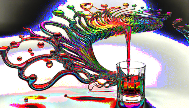
With depth to Flat I tried out more Start up Digital work with Arkeos. I think it looks great, What do you all think?Edit: I smooth the line to make it more vectorish.
Related content
Comments: 15

Very cool! Love the colours. I would say if you were planning on selling it (sorry, totally creeped on the other comments) that maybe (if you have time) it could be improved a bit. My only suggestion would be to work on the dripping colours a bit...make them more varied? Don't get me wrong, they look pretty sweet as is, but if you wanted an area to improve a bit more, I would say that's it.
👍: 0 ⏩: 0

very nice, abit of an abstract concept going on here, i like it.
👍: 0 ⏩: 1

Dude, that looks wicked!
Loving the character design and the crazy colours at the top are a nice touch.
👍: 0 ⏩: 1

Great, I hope it did, I need it to look good because I making it a print to sell at Ai-kon.
👍: 0 ⏩: 1

Oooh if your'e selling it, might I make a suggestion to improve it's apperance?
I'm not sure if you're planning to clean up the pic, but if you re-did the character using a vector app like Flash or Illustrator (or simulated it in Photoshop with the pen tool), that'd make it look extra super spiffy (I think that solid lines and some sharp angles would really suit the character).
What'd you think?
👍: 0 ⏩: 1

I thinks that is a great Idea, I reposted it. if you wanna look.
👍: 0 ⏩: 1

Nice, liking the cleaner look alot. And I hadn't noticed it before on my other monitor, but I like the white effects you have going on around the bottom and in the background of the page.
👍: 0 ⏩: 0

Wow, that's cool! I love the juxtaposition between the greys and monochrome tones with the colors.
👍: 0 ⏩: 1

I had no Idea what juxtaposition was until I looked it up. So THANKS!
👍: 0 ⏩: 1

It's one of my favorite words.
👍: 0 ⏩: 1

Hehe, It is a very interesting word I have to say.
👍: 0 ⏩: 0


