HOME | DD
 lastshadow — I have never trusted anyone.
Published: 2007-08-07 05:41:13 +0000 UTC; Views: 2026; Favourites: 21; Downloads: 0
Redirect to original
Description
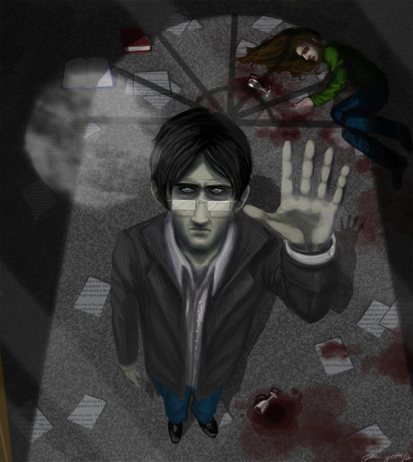
EDIT: Fixed a ton of crap, including Nic's shadow. Wooo.This is my entry in cypherx's contest [link] with the theme of "best friends".
Slightly bigger version: [link]
"This longing to commit a madness stays with us throughout our lives. Who has not, when standing with someone by an abyss or high up on a tower, had a sudden impulse to push the other over? And how is it that we hurt those we love although we know that remorse will follow? Our whole being is nothing but a fight against the dark forces within ourselves."
-Henrik Ibsen
Everyone betrays their best friend sooner or later.
Nicholas betrayed Miranda by being a vampire.
Miranda betrayed Nicholas by being mortal.
Interpret as you will. There are a hundred ways.
Related content


Comments: 29

very cool, i love the reflection of the moon and the shadows of the window on the ground.
 (Smile)")
👍: 0 ⏩: 0

wait wheres my coment. i comented.did I?...right?
I did D: ....
uh well anyways its really cooooooool
👍: 0 ⏩: 1

Thanks! You reminded me of how much I liked this pic, so it's my featured dev again (((((((: <3
👍: 0 ⏩: 1

Well, first of all i like the darkness of the concept and your interpretation as well..
second of all, i do not like that floor, because it is not detailed enough to understand what kind of floor is that, if its carpet, then the blood cant look like that, if its granite, again the blood cant look that.
third of all, i dont understand the text on the paper, is it coming from the sky, is it a message?
fourth of all, i like the light of the moon, it really creates a scene like from the gotham city, and the mans glasses help that scene as well..
👍: 0 ⏩: 0

The shading and textures are pretty good. Good use of lighting perspective as well. The only things I might be noticing for critique is that the text seems kind of large for stuff to be written on paper, unless you made them big on purpose so that we could read them. The only other things that bother me are the bottom part of the coat distorting the perspective a bit and the eyes being too close to the nose. It's not particularly distracting, I guess, but I used to have that problem a lot.
👍: 0 ⏩: 0

I may have to review this when I get home (so I can do that old flip trick so I can see things better in a mirror image). The first thing that strikes me is that they're both very grey. This wouldn't be the case for a normal human even in moonlight (it's pretty bright moonlight so you could see more colouring), but I'm not sure if you're treating them as normal people. I'll give you the grey is it's because he's a vampire and she's dead, but if she is dead (knocked out is another possibility) maybe show a little how she died, either a bruise if he hit her, or a little wine/blood from her neck. You did an excellent job drawing us to his face between the dark hair-pale skin contrast and the white shines on the glasses and the eyes. His right ear looks a little blobby though. One thing that may help move the picture is to put a little extra shine on the frame of his glasses next to his hand (I should try that just to see if it helps). I'd love to see his shadow more (you mentioned that you knew there were issues) because having the shadow hand extend in the direction of the girl will help highlight her even more. I would also grey his shoes a little more and lessen the highlight on his wine glass, they're just not as important as the upper half of the picture. His palm looks a little blobby with the shading (particularly where he's touching the glass)
I have a few little nitpicks for now, and I'll try to look at this more later. I'm not sure whether or not the girl has eyebrows, and also the text is going the wrong way on the pages. Neither of them are major though.
Over all very good work, and some of the things (like the colour) might be stylistic. Just remember that things can be very grey without being completely grey.
👍: 0 ⏩: 1
Oh wow, thanks!
Yeah, the hand was a work of chance...I could use my own hand as refernce for the angle, but for the pressing agains tthe glass, that was all up in the air xD Maybe smooth it out around the edges to make it a more round pressing?
I think I'll work on the hand shadow more (I'm a layer-whore, so the shadow itself is its own layer, luckily ")
As for the text on the pages, that was the one artsy stylistic thing I did with this piece...make an over layer with the story that these two come from and only have it appear over the shapes of the pages, regardless of the pages orientation. If it's not really working, perhaps I should tilt them the right way?
I agree with you also on the grey of her face...I was afraid that giving her too much colour would be distracting in the same way that the glass's highlight is, I think. Maybe along with taking down the highlight, giving her more colour would balance it out.
Again, thank you so much..I love critique!
👍: 0 ⏩: 1
For the hand - try pressing it against a mirror or the inside of a car window (you outside) that's the best way to see the colouration of the area that is pressing on the glass and around it. A few more lines might help it too, try to get one that goes from his face to the girl. That'll draw attention to her and emphasise the glass.
Exactly for the white! X3
For the text - it's that's the way you wanted it, then it's fine, I'd just rather catch someone who didn't know how to change text orientation than to let them go. It's called a nitpick for a reason.
The thing is that she's very important to the picture and you've already given her two bright colours so I don't think a little tint to her skin is going to hurt much. Just put it on a new layer and play with the saturation.
I might have a board you're interested in for critique. Note me!
 (Wink)")
👍: 0 ⏩: 1
yesterday i fixed a bunch of the stuff you mentioned, any better? ")
👍: 0 ⏩: 1
I definitely prefer it without the shiny shoes! Hmm... the girl, maybe see if you can play around with her levels, though it does make her more human (less vampire). The one thing I can still suggest about the shadow is stretch it more (especially the top!) It should look something like \/ not // and that might be able to be emphasized more. The other thing that would so is having the shadow closer to her would draw the eye to her more. I think the palm of his hand could be lightened a bit more, just there's not a huge depth change anywhere on the palm. I think it does look better overall though! I think the colour does help and emphasizes how different they are. Good job!
👍: 0 ⏩: 1
However, it's more important to decide if you like it better this way.
👍: 0 ⏩: 0

Great stuff! As a thumb, this reminded me of one of those potraits in heroes *yep, the TV show*. I like how this piece has a dark and lonely feeling to it.
👍: 0 ⏩: 1
I love heroes! And I'm glad the mood I intended came across.
👍: 0 ⏩: 0

Excellent message and concepts,very nice work. Now, with the shadow & reflection, consider the positioning of the figures & proportion. In response to the same light source, his arm is up, and the shadow is over to the left, so perhaps the window's reflection/shadow should also go in the same direction. It also should become narrower in accordance with the progression of its distance from the viewer, character, and location overall.
Also, the mind will even 'correct' what is according to 'written art rules' correct...sometimes it's best to go by what the mind suggests instead. In this case though, since it is indeed hard to decipher, perhaps turn to a art instruction book or some online advice for further, more professional suggestions.
Lastly,consider fixing a few spelling errors/typos in the quote...it's very effective, but will be even more so if grammatically correct
Great work overall
👍: 0 ⏩: 1
Oh my goodness! I can't believe I missed that *so ashamed; fixes* Usually I'm a spelling Nazi. ._.
Ahhhh, that seems so obvious now that his raised arm's shadow should be to the right because of the moon's position to the left. I think that was primarily the issue that my eyes were refusing to interpret
👍: 0 ⏩: 1
No problem...i can related definitely
You're welcome, glad it led to that realization, it's difficult sometimes to point out the direction too, since it has to depend on whether to use 'the viewer's perspective or the correct,literal one when stating what is left & right.[pun intended too].
Excellent work though, this actually reminds me of part of hmm, The odyssey? by Homer...or something from Greek Mythology anyway, because of the betrayal scenario & the depicted symbols/glass/death etc
👍: 0 ⏩: 0


wow, i love this. 
👍: 0 ⏩: 1
Thank you! Haha, I had to link to the bigger version in the comments because I didn't want all the details to be missed u_u Thanks for the fave as well. (:
👍: 0 ⏩: 0


Brilliant. The treatment of light and careful use of colour.. mmm, *___*.
👍: 0 ⏩: 1
*heart* I like never do backgrounds or lighting...WHAT HAS COME OVER MEEE
👍: 0 ⏩: 1
PROOF YOU SHOULD DO THEM MORE OFTEN o0o
👍: 0 ⏩: 0

Thats so creepy,it cam eout great. Its funny because i was just watching the omen and poltergeist
👍: 0 ⏩: 1
Thanks!
👍: 0 ⏩: 1
its alright,i rented it. gets kind of boring at points, poltergeist is a must though,heh.
👍: 0 ⏩: 0