HOME | DD
 Laurie-J — Renault
Published: 2007-12-22 07:03:08 +0000 UTC; Views: 3922; Favourites: 15; Downloads: 159
Redirect to original
Description
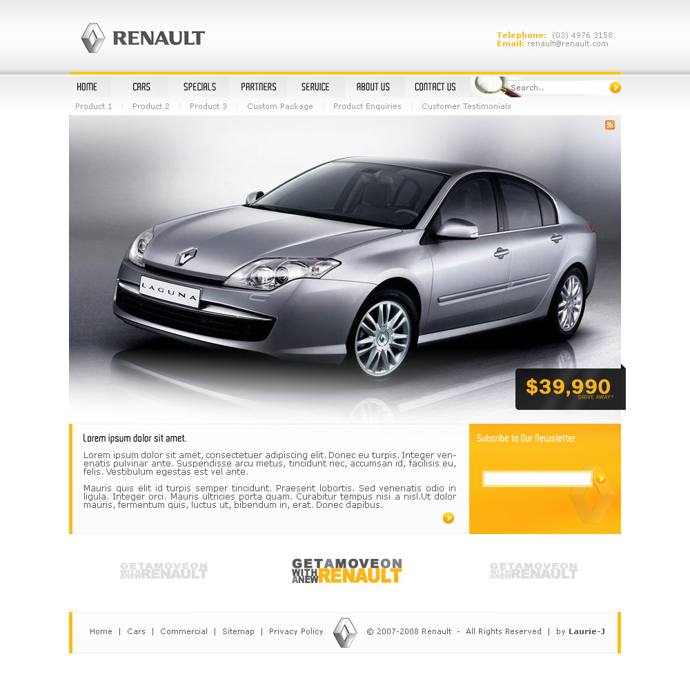
Alright well I started with this one a couple of days ago, was going to be a standard business template, but I got stuck. I've always loved the Renault logo, so I thought I'd use it.It's not brilliant but I thought I'd upload it to see what you think about it. So comment away
")
The Renault logo is obviously not my own and the car image was found on google
 (Wink)")
Related content


Comments: 26


nice and simple !
The magnifier near the search field is... an intruder !
👍: 0 ⏩: 1

thanks man
An intruder? haha
because it's overlapping the search box?
👍: 0 ⏩: 1
yeas, it's kinda strange to see it there  (Smile)")
👍: 0 ⏩: 1
yeah, the more I look at it the more it seems a bit out of place.. But i made this 2 years ago so I think it's a bit late to be making changes
")
👍: 0 ⏩: 1
you're right ! the best to do is to smile while looking at it
👍: 0 ⏩: 1

Thats good work, love the Lagune also haha
👍: 0 ⏩: 1


This is nice, couple of things:
- The RSS icon placement makes it mean nothing to a user. What does the feed provide? Photos? Prices? Product information? Since it has no label or obvious context, it's a bit confusing to place it there.
- The orange newsletter button could do with a border or something, or make it a different colour all together.
Other than those two points, good work
👍: 0 ⏩: 1
Thanks mate, when my computer is fixed, I'll take a look at what you mentioned
👍: 0 ⏩: 0


gradients could be better done mate, i do like the price tag effect style though, thats cool, but yea nice colors, it just needs some fine tuning imo
👍: 0 ⏩: 1
I agree, and I'll take another look at it. That is when my computer is fixed, as right now it doesn't turn on
")
👍: 0 ⏩: 1

Thanks ali, i like the nav too
👍: 0 ⏩: 0