HOME | DD
 LazyPixel — School Project 1
by-nc-nd

Published: 2012-11-25 06:13:12 +0000 UTC; Views: 2401; Favourites: 26; Downloads: 82
Redirect to original
Description
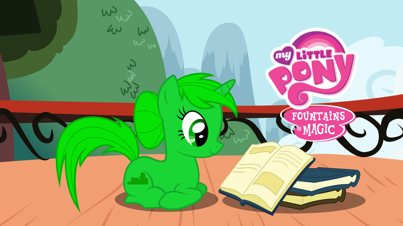
Another OC as if there weren't enough. She has merit though, she's for school. Basically my teacher asked if any of us do anything artsy so she could stick some stuff around her classroom. My friends pointed at me and said I drew ponies. So she asked if I could draw a mascot for fountains (which is our house) and I said yeah.And if you're wondering why she's so green, s'cos our school house colour is green. Also when I asked my teacher what she wanted in the OC she just replied "as long as it's green".
--------------------------------------------------------------------------------
References taken from MLP:Fim S1 ep4 Applebuck Season
Also MLP logo (modified by me) is taken from [link] because I was too lazy to make it myself. Props to the guy who traced it
Approximate time 4 hours
Vector made in Illustrator
--------------------------------------------------------------------------------
MLP:FiM © Hasbro, DHX and Lauren Faust. Fountania © me and if you use her I will end you <3
--------------------------------------------------------------------------------
EDIT: Changed the mane, tail and cutie mark colour as a few people said they were off and I agreed
Related content
Comments: 19

Her base design is very nice. Definately a win. She could use some more variation to her coloring. I suggest changing the mane to have darker or lighter greens to add a bit more color depth.
👍: 0 ⏩: 0

I really do think the green is too flat, I have to agree with everyone else when they say try to use a few shades instead of one solid colour.
👍: 0 ⏩: 1

I will change the colours eventually. Just need to find time to do it
👍: 0 ⏩: 0

hmm, maybe vary the green some, use different shades a bit more? seems kinda awkward.
👍: 0 ⏩: 0

Oh, I cannot wait to see this in my maths room! xD
👍: 0 ⏩: 1

The dimensions will be different as A4 paper doesn't have the same dimensions as what you're seeing now. Basically more of the background will be cut off
👍: 0 ⏩: 1

1.78 aspect (16x9, standard HD) vs 1.41 (A4 paper) vs 1.29 (Letter paper) shenanigans. 
👍: 0 ⏩: 1

XD If I can find bigger, i'll do that
👍: 0 ⏩: 1

Go to a poster printing shop! Make it HUGE!
👍: 0 ⏩: 1

Sure! Just uh give me the money i'll do that tommorrow.
I'm not spending my own money on this, no way no how. I don't care about this project that much
👍: 0 ⏩: 1

Lol! I've been using the school printer to make paper copies of my vectors. Hopefully your school has a nice color laser.
👍: 0 ⏩: 1

Yeah but you teach at your school. And if I print the vectpr on a massive piece of paper, it'll be realy flimsy and hard to carry around. And there's no point in folding it because then it gets creases
👍: 0 ⏩: 2

And, if printed on large paper, the solution is, wait for it....Party Cannons! er, uh...Poster Tubes!
👍: 0 ⏩: 0

Oh, I don't print poster size on letter paper. That's the stuff of college freshmen. I just make it as big as possible on standard paper. I assume that's what you'll be doing
👍: 0 ⏩: 0

A color scheme like my character, but green instead of grey c:
The concept of monochromatic pony OCs intrigues me, as long as the color is attractive c: And fo sho, you chose a good shade of green. Although maybe a more obvious variation between the green in the mane and the green in the fur would be better, but who am I to judge, it's gonna be a while before I get good enough to vector backgrounds and characters
👍: 0 ⏩: 1

Appreciate the critique.
Yeah i'm not so good with colours or colour schemes. I was thinking about making the fur colour more saturated, but the lazy got me and so I left it. And the reason the OC is just green is because my teacher wanted green, so I just thought "lets make everything green".
And vectoring backgrounds isn't that hard. Most of the work comes from layering stuff properly. When you think about it, a lot of time is spent on the strokes and outlines of the ponies and that's why they take so long. Backgrounds don't have strokes, they're just made out of fills. BG's are time consuming but they're not as hard as you think
👍: 0 ⏩: 0


