HOME | DD
 lDestiny — Pepper Coloring Contest Entry
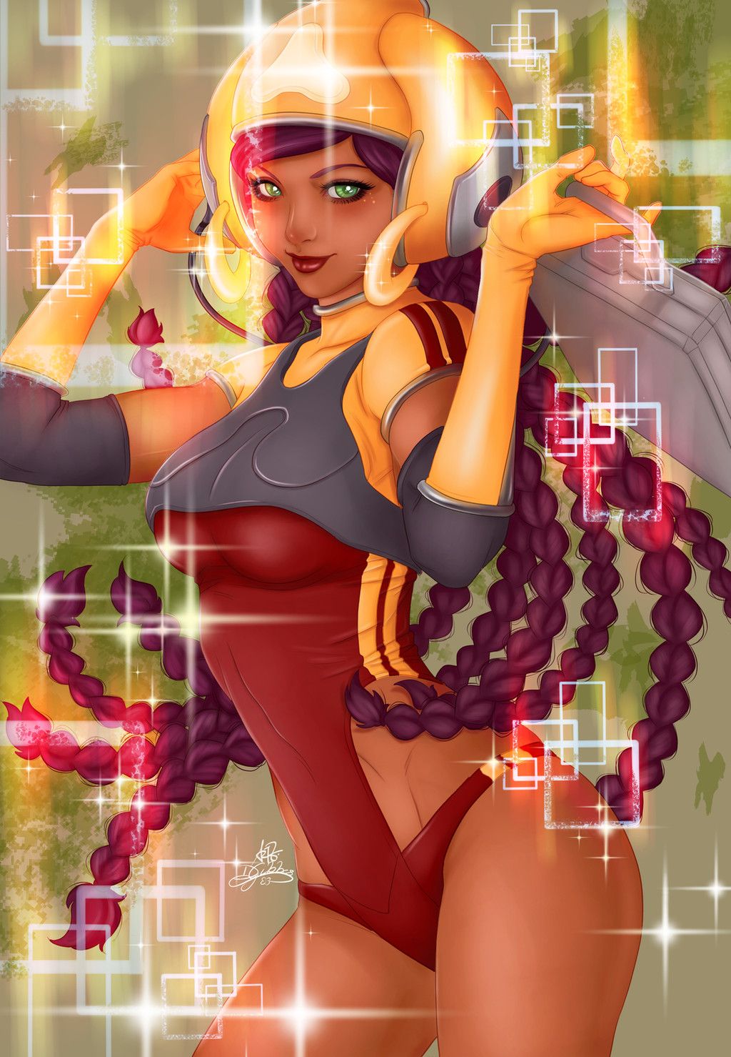
#artgerm #braids #pepper #sparkles #artgermpeppercontest
Published: 2016-06-01 22:06:06 +0000 UTC; Views: 1351; Favourites: 27; Downloads: 0
Redirect to original
Description
My entry for Pepper Coloring Contest: fav.me/da2eucmI wanted to take a different approach so I braided her hair and added earrings to her headphones.
It was a lot of fun working on this!
")
Lineart & original pepper character design: Artgerm
Coloring: me
Related content


Comments: 12


I love this. Very impactful. Lovely use of light and colour. (:
👍: 0 ⏩: 1

Thank you very much! I'm glad you like it!
👍: 0 ⏩: 1
Well deserved, nice job! You have quite the eye for colour and detail.
👍: 0 ⏩: 1
You are more than welcome. (:
👍: 0 ⏩: 0

Hey there friend!  (Smile)")
I totally loved Pepper back in my early days of dA; being half as good as Artgerm is still one of my main motivations 

Keep the awesome stuff coming!
👍: 0 ⏩: 1
Hi friend!
Yeah Artgerm is really inspiring *O*
I'm glad you like my take on her!
Wanted to experiment with the colors so I'm glad it you like the final result!
You're right about the green - I went back to take a look and she does pop more! sta.sh/01iqz1rmamzj
Thanks so much!
👍: 0 ⏩: 1
Good to hear!
And yeah, it makes all the difference, doesn't it? Has to do with separating the foreground from the background - value is one of the easiest ways to do it, I find. One particularly great trick is to use a different general value for the fore, middle, and backgrounds. For instance, using the darkest values in the background, medium values in the mid ground, and the brightest values in the foreground - but any order works!
You're welcome friend!


👍: 0 ⏩: 1
Oh I see! I'll give that a try in my next piece
Thanks for the tip!!
👍: 0 ⏩: 1
Yes, it's really great for establishing depth! I'm trying to spread this trick around like the gospel
Np~
👍: 0 ⏩: 0