HOME | DD
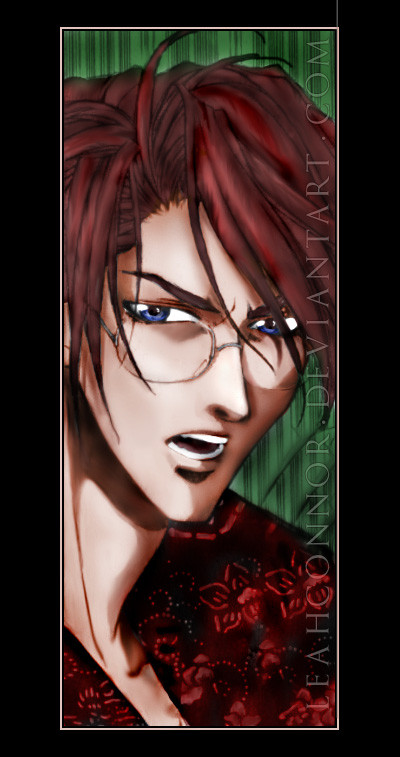
 LeahConnor — Time to Go

Published: 2005-04-27 19:00:50 +0000 UTC; Views: 1244; Favourites: 31; Downloads: 199
Redirect to original
Description
The time has come. Are you ready?...
Credits:
The line above and the pictures of the model (yours truly): ~Muire
Stock used: ~dreamstock , =resurgere , ~ anodyne
Related content


Comments: 96


Very dark I like how only the rose and sword stand out
 (Smile)")
👍: 0 ⏩: 1


Lovely composition. The rose and the sword is perhaps a bit too colorful for my tastes, but otherwise a really good image.
👍: 0 ⏩: 1


Thank you. ")
👍: 0 ⏩: 0


I loved the whole thing. At first, the large overall view is what caught me and then the little details made it even better!
👍: 0 ⏩: 1

I like this one very much. The colors enhance the composition and I think the overall look was wonderful. I like the imagery as well. I have one comment, though. I think the characters looked a little skinny. Maybe it is just me. Anyway, this piece is very nice.
Jenny
👍: 0 ⏩: 1
...sorry, I don't think I could have gained weight especially for that photoshoot... ")
👍: 0 ⏩: 1
Oh god, I had no idea it was using an unmanipulated photo. LOL! No, don't gain weight for ANY pictures! LOL
Soo sorry!
Jenny
👍: 0 ⏩: 1
Heheh, that's okay
👍: 0 ⏩: 0


Ya time to go.To go and give this pic a fav.great work dude
👍: 0 ⏩: 1

wow... simply gorgeous. I love the coloring and the dramatic sense of the image. Any reason you didn't center the title?
👍: 0 ⏩: 1
Oh! Thanks for reminding me. It was an accident actually, heheh; I was already dead tired when I finished this and simply didn't notice; when I DID notice, dA had this issue with preview images, and I didn't want to mess with it. I'll upload a fixed version now
Thanks for the comment!
👍: 0 ⏩: 1

Whoa, cool! I love it... it has this deathly touch to it, like reading Edger Allen Poe...
👍: 0 ⏩: 1

That's terrific! Everything comes together so flawlessly!
👍: 0 ⏩: 1

I love the symbols, the lightning gives more strenght to the scene, good work
👍: 0 ⏩: 1


a realy cool pic. i love how u made the gost and the mood is just perfect. 
👍: 0 ⏩: 1
:;snicker:: [bit of probably useless trivia] that ghost is also me :;snicker:: but that's besides the point ^_^ Thank you for the comment and fav!
👍: 0 ⏩: 0


Very cool manipulation.. I see an eye looking down on the model from sky. ^-^
👍: 0 ⏩: 1

beautiful manip, I love the atmosphere you've created, the lightening creates and amazing sense of motion too, well done!
👍: 0 ⏩: 1


Beautiful! The colors are really creppy, and the picture has a wonderfully dark air about it.
👍: 0 ⏩: 1
Thank you! For the
👍: 0 ⏩: 0

I love the lighting and the eerie feel to it. The darkness of it also makes you want to look further into it to see what elce there is!
The only thing i would pick out is that i'm not keen on the archway on the left area, it kind of fades away too much in my opinion, the rest looks awesome though
👍: 0 ⏩: 1
The arch is icky and I'm fully aware of that x_x I just couldn't resist using it as the background because it's quite lovely in itself (barring the quality issue). I will be redoing this some time, though (hopefully I'll get a tablet one day to do it properly >.< (Wink)")
👍: 0 ⏩: 0

Wow, brilliant concept and very well applied. The colours reflect the theme so well. Vgj
👍: 0 ⏩: 1
| Next =>