HOME | DD
 LeeSmith — ArtOrder: Gotta Have A Hook
Published: 2010-08-02 10:36:52 +0000 UTC; Views: 11822; Favourites: 72; Downloads: 122
Redirect to original
Description
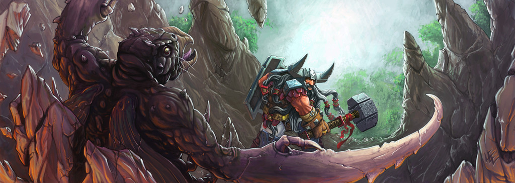
EDIT: I have uploaded a new version after a discussion with Jon Hodgson about monitor calibration. It occured to me that maybe everyone is not seeing things the same way I am. I would appreciate any feedback on whether this version looks better than the previous version on your monitor, thanks!My entry for the ArtOrder Gotta Have A Hook challenge. Here's the brief:
Description
Setting - A cavern
Characters - A Male Dwarf Fighter and a Hook Horror
Scene - The dwarf has just delivered a mighty smack to the hook horror and knocked it backward through a stalagmite and/or stalactite.
Details: The dwarf is wearing heavy scale mail armor. Wielding a warhammer and a heavy shield.
Size
11.25" w x 4" h @ 300 dpi, RGB
Yes, it's a wacky size, but with a challenge comes an opportunity to create something unexpected.
Related content


Comments: 22

Overall


Vision
Originality
Technique
Impact
I really like this piece. The style seems to stand out from the other pieces in your gallery too, perhaps its the attention to detail in all areas of this pic that differs from say the backgrounds in some of your other work. Great use of lighting and great contrast, from the trees and what I interpret as a waterfall then going through the cave and eventually the suggestion of fiery depths behind the creature. The eye contact and the facial expression on the dwarf are very believable and add so much to the conflict in the piece, so many artists can draw two characters fighting but fail to make the conflict emotionally believable.
As a critique firstly the expression from the Hook does not carry the same intensity that the dwarfs does but I really think you are limited by the lack of expressive qualities that a bird like face has, you did very well with what you had to work with there, it is still expressive. I might suggest that the motion in the picture could have been emphasised more, it took me awhile to notice the breaking rocks behind the beast. Perhaps his beard could have been flailing more to help this.
Hope you find that useful
Dust
👍: 0 ⏩: 1

Thanks for taking the time to crit this piece. I appreciate the comments you made and will be working more on imparting some more action and movement into my work in the future
 (Smile)")
👍: 0 ⏩: 1
You're very welcome Lee, i'm looking forward to your next piece
👍: 0 ⏩: 0

This version looks way better. The Dwarf is less orange and the Hook Horror of stone is light enough to see the detail. Awesome!
👍: 0 ⏩: 1
Thanks, definitely an improvement in my opinion too
👍: 0 ⏩: 0

just amazing. Everything just comes to life in this,
👍: 0 ⏩: 1

Great piece, and a classic choice for your subjects. Dwarves and Hook Horrors have been enemies since the 1970's. Let's see more just like this.
👍: 0 ⏩: 1
Thanks for the feedback, I'll try to keep more coming
👍: 0 ⏩: 0

This one looks much better than the darker one. I know for a fact that on older sucky LCDs you'd see half of your older version as just pitch black.
👍: 0 ⏩: 1

Excellent work!
The only thing that i find distracting or some what confusing is that the dwarf does not seem to be looking at the hook horror. I think that drains some of the intensity of the picture.
Overall a beautiful piece though, good work!
👍: 0 ⏩: 1

lol, not quite, but thanks anyway
👍: 0 ⏩: 1
 (Wink)")

woah sick work it was crazy spesific requiremnts i remember talkn about this ona live stream a while back, i cant find any probs with me
")
👍: 0 ⏩: 1
Thanks, it was fun working to such a strict brief and trying ot find ways to make it unique with such a limited scope.
👍: 0 ⏩: 1

Awesome as usual. Since you asked for critique here are my harshest issues I can dredge up for improvement:
Taste: I'm not very fond of the horned helmet look, too often its drawn paralleling "Vikings" and its so off target that its not funny--however, for a fantasy dwarf? It works well enough. (I for example love Ram horn adorned helmets. Realism not required.) Not much you can do to fix taste issues.
Perspective: The hammer seems to be too relaxed or turned the wrong way for the blow which just landed, it looks like it should be facing more front to back rather than up and down. In the future might try getting someone to swing a tool or toy axe or something. The details otherwise are fantastic and the details are awesome. I doubt anyone will care or notice, I only did because I'm going over it LOOKING for things to suggest for improvement.
It's a fantastic piece of artwork.
👍: 0 ⏩: 1
Hey Tim,
thanks so much for taking the time to give me a crit on this piece, I really appreciate it. I understand you comments on the helm, while it is a bit inpractical Jon Schindehette's comment was 'coolest helm in the competition' so I don't think i'll be changing it
The angle of the hammer had me second guessing a couple of times too. I think it is a believable position, but maybe not the most likely. Your suggestion of having someone act out the swing and grabbing a couple of ref photo's would have been a good idea. Unfortunately what usually happens is I get so caught up in the sketching I end up drawing everything from my head and then it feels like going backwards to get the ref! I'll try and plan things better for my next piece.
Thanks again!
👍: 0 ⏩: 1
No worries. I had to dig for even that much. I understand about the head, I star there too, and its sometimes hard to get parts to fit on the paper when I'm moving down the body. (I especially hate that I get this one perfect eye, and side of the face, only the other side is utterly wrong in every way.) Then again I lack your skill, so
")
👍: 0 ⏩: 0