HOME | DD
 leetNightshade — Laughing Man
Published: 2006-11-09 00:13:43 +0000 UTC; Views: 14285; Favourites: 121; Downloads: 88935
Redirect to original
Description
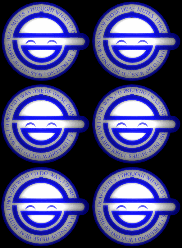
This is the laughing man symbol from Ghost In The Shell.This is the updated version. MUCH smoother animation. I used Rhino to model it, and Cinema 4D to render and animate.
Unfortuantely I had to reduce the frame rate, because the original image took way too long to load, even on a decent cable modem connectionl. So sorry. It was really crisp and smooth at 30 frames per second for 5 seconds. Which is 150 frames for the whole cycle.
I'm going to try to fix this as soon as possible. I am going to try to upload the 30 fps file. I've been having trouble uploading the 30 fps file, even though it's only 2 mb.
Related content
Comments: 44

no probs trying to find a moving version of the logo for msn 


👍: 0 ⏩: 0

It moves too fast and It's rotating in the wrong direction. Otherwise its nicely done.
👍: 0 ⏩: 1

[link]
The thumbnail is the correct version you speak of
I tried changing the image, but DA complained about gifs not being allowed in the category it's in, and I don't feel like changing the category.
Thanks
👍: 0 ⏩: 1

Well that's odd ._.
Oh well.
👍: 0 ⏩: 0

best 1 ive seen so far.
was wonderin if i could use this as a avatar or if u could make a tekkonkinkrete for me?
👍: 0 ⏩: 2

And thanks alot! And if you want to use it sure, though I recommend the thumbnail version: [link]
unless you need the large one. The thumbnail is spinning much slower (though in the wrong direction).
I still have the large smoother animation file, as soon as I get a good program installed I'll resample it and post it for you to use if you want.
_______________________
Again, what would like like from tekkonkinkrete? I've really been wanting to draw something sweet lately (this was my latest ambition: [link] )
👍: 0 ⏩: 0

ha, wow; haven't gotten a request in a while. I just watched tekkonkinkrete again today XD god I love that movie. What from tekkonkinkrete, I think I may feel inspired to do something from that movie for you
👍: 0 ⏩: 0

You should slow it down a little, but sweet though!
👍: 0 ⏩: 0

I'm so happy, I just got Ghost In The Shell 2 Innocence on sale at my local video store for $5.25 (used, but in very good condition).
Thanks a lot
👍: 0 ⏩: 1

awesome 


I must say It's very very very very veeeeeeeeeeeeeeeeeeeeery good
👍: 0 ⏩: 0

Oh no, the laughing man returns
👍: 0 ⏩: 1

yea and dont forget it
👍: 0 ⏩: 0

nice! i wish i could have a shirt with the logo on it. btw, do you know the eye hand symbole in the manga 20th century boys?
👍: 0 ⏩: 1

Yeah, a shirt like this would be pretty cool 
👍: 0 ⏩: 0

great animation. super smooth, and the lighting effects are great. But why make it spin that way?
It might be easier to read the quote if you reversed the frames? *shrugs* maybe not.
👍: 0 ⏩: 1

I didn't get a chance to reverse the animation, and I realize it's spinning in the wrong direction right now. Also, this file has a reduced frame rate because the file was too big, so the animation isn't as smooth as the original animation I made. THAT'S why the animation is fast, to make it seem smoother than it is in it's reduced frame rate.
If I upload the original file, people who don't have a fast internet connection won't be able to load the image that easily. So, if I can figure out to reduce the file size without losing anymore quality, I will do so.
Thanks for your critiques, I appreciate it
👍: 0 ⏩: 1

Ah, gotcha. filesize gets ya every time. I hate when that happens.
👍: 0 ⏩: 0

A Flavor of Love Point for this awesome drawing, I just love the movement.
👍: 0 ⏩: 1

Wow, thanks 
👍: 0 ⏩: 0

What a perfect opportunity for self promotion. Check out my version: [link]
This guy has the best static version I have seen (personally I think the color is too light, other than that, it's dead on) [link]
👍: 0 ⏩: 2

Here's the link to my old, unfixed version: [link]
It was rendered in a 3D program, but at the time I wasn't sure how to animate it. So I rotated the letters by hand in Photoshop, and the picture was off center, so it wasn't easy
👍: 0 ⏩: 1

At least that older one has a sort of bloom effect. Makes it look spiffy.
👍: 0 ⏩: 0

Yours is pretty good, and I see what you mean by the problem with flash (the text to path, or whatever). It's the best I've seen, nice work. Darn, I see what you mean about the rotation. Mine's going the wrong way 
As for the second guy's, his is way off as far as the real logo color goes(I know mines not exact either), and it looks closer to the TV color broadcast, like his picture shows at the bottom.
Thanks for your comments and corrections!
👍: 0 ⏩: 0

Yeah, I noticed my version is particularly fast. I originally had the frame rate at 30 FPS, like I stated above, because this is an animated GIF, and when I posted it, it took too long to load; as a matter of fact, it never loaded it was so big. Since that was the case, I went back and changed the FPS, besides having to reduce the quality. The full 30 FPS is the preview file you can see from my gallery at the following link (even though it's kind of small to see): [link]
Mine is completely done as a 3D model, with an attempt at this 2D animation. I noticed what you, and the other guy were talking about, the words when they get to the brim of the hat, or formatted in a way so you can read it, even while covered. I have no idea how I could do that in 3D, so I think that defect will always remain in my versions, no matter how hard I try.
Once again, thanks for commenting!
👍: 0 ⏩: 1

"I noticed what you, and the other guy were talking about, the words when they get to the brim of the hat"
That was the hardest part for me. I use two sentences that rotate at the same time thus doubling the CPU usage. (up to 80% on my computer) Not a very elegant solution.
👍: 0 ⏩: 0

Thanks 
👍: 0 ⏩: 0

Hey, that's pretty cool. Keep up the good work.
*still waiting for his Stand Alone Complex boxset*
👍: 0 ⏩: 1


