HOME | DD
 lefiath — Admin panel

Published: 2013-06-14 08:14:36 +0000 UTC; Views: 6365; Favourites: 61; Downloads: 52
Redirect to original
Description
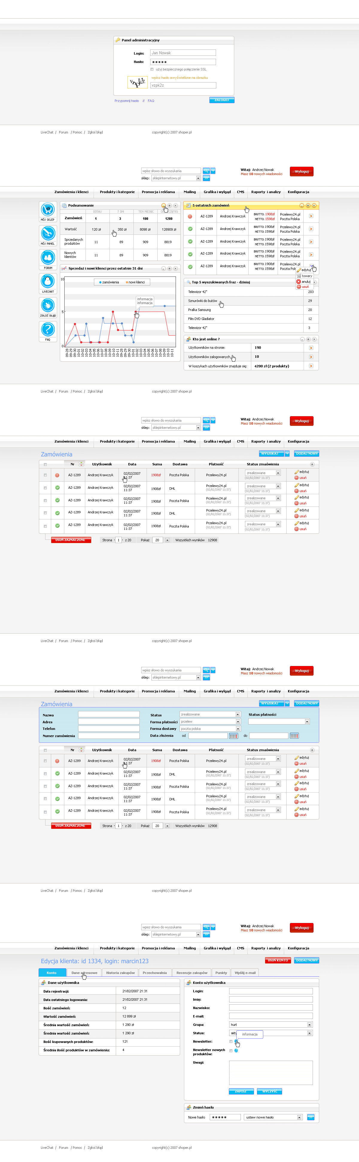
Something I've been working on in fre past days, it's for specific system that provides e-shop hosting and templates. I wasn't really satisfied with intuitiveness and I'm still not really sure if this is the best I can do, but hopefully things I've focused on will turn out to be exactly what people want. I've based this on some input and data I got, because it's a redesign of old design that I've actually done as well few years ago, so it's not like I'm just guessing how people are going to use it, I'm just little worried about submenu which is on the top of content.Related content


Comments: 17


 (Smile)")


Thank you - you'll find out what it is in description
👍: 0 ⏩: 0


Obsahová část spolěčně s tím vertikálním menu se mi hodně líbí.
👍: 0 ⏩: 1


it's looks really professional, with that submenu on the top you can maybe try it without that background or move it more on top where is the green background., good luck
👍: 0 ⏩: 1
Thank you. Submenu can't be on green, because it's second level navigation and that would make it look more dominant than main menu on side. I tried to swap those, but it just didn't work that well, so this is what I ended up with. About submenu background, I needed something to visually emphasise it's importance, just the button alone wouldn't cut it.
👍: 0 ⏩: 1
Maybe with the ideal pattern as background will do the trick!
👍: 0 ⏩: 2
I'm satisfied with the outcome, there is no room for patterns in clean design like that. And I can't even imagine using it for submenu.
👍: 0 ⏩: 0
I know that site (look at other designs from my gallery, I use their patterns from time to time), trust me on this, no patterns, it's a bad idea.
👍: 0 ⏩: 0