HOME | DD
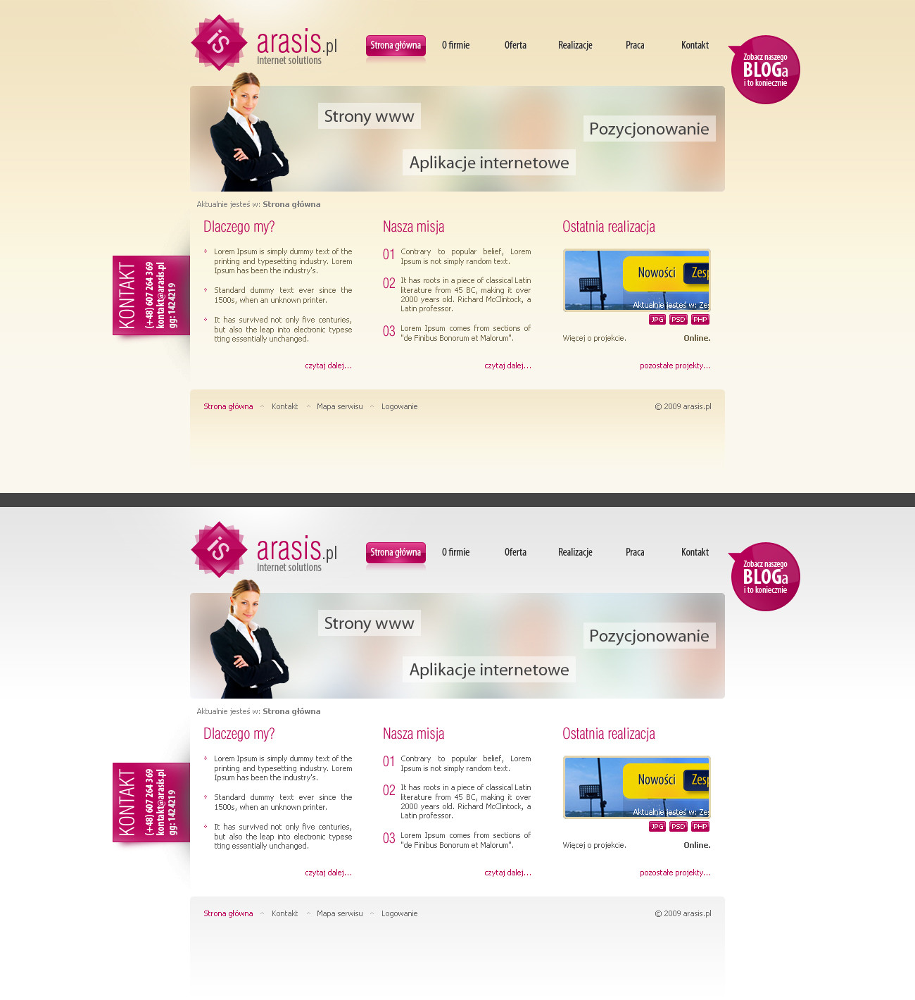
 lefiath — Minimalistic blog template

Published: 2011-07-31 09:43:27 +0000 UTC; Views: 4747; Favourites: 46; Downloads: 138
Redirect to original
Description
Just for fun and practice. I also have white version, which what I originally intended to do, but later I chose the black version, because it's just more interesting.White: [link]
Related content


Comments: 14


 (Wink)")
 (Smile)")

personally i think its a little bit chaotic, it could be more clean. but got some great parts in it
👍: 0 ⏩: 1

Thanks, it's true that it could be simplier.
👍: 0 ⏩: 0

mě tam nesedí ten text u těch piktogramů, jak je odskočenej nahoru.
👍: 0 ⏩: 0

The design is good, but I feel that the font choice is a bit poor.
👍: 0 ⏩: 0


Very nice. Flows very good. +fav + watch
What fonts have you been using?
👍: 0 ⏩: 1
Thanks. It's Akko Pro and then just Arial. Akko Pro is still available for free (full commercial use), google it. After 12 august (I beleive) the offer will be over and font will be again for full price.
👍: 0 ⏩: 0
