HOME | DD
 lely — DUALITY

Published: 2006-01-21 20:37:10 +0000 UTC; Views: 10311; Favourites: 391; Downloads: 1233
Redirect to original
Description
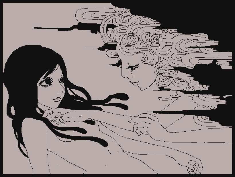
//EnglishWork of Class for to contest of magazine "The Creator". But the end not the present thing.
Date Spring 2005
Base Photographic [link]
Tools Watercolor & colour pencils.
Concept Represents the duality, two concepts, extroverted & introverted.
//Español
Trabajo de clase para un concurso de la revista "The Creator". Pero al final no lo presente.
Fecha Primavera del 2005
Base Fotográfica [link]
Técnica Acuarela y lapices de color.
Concepto Representa la dualidad, dos conceptos, extrovertido e introvertido.
Related content


Comments: 103


I love it...I don't know what else I could say...maybe a little back story ?
👍: 0 ⏩: 0

Muy macabra la parte cosida!! Me gusta el tratyamiento de la imagen, y el hecho de que sea un coloreado tradicional, que para mi siempre resulta un poco más "vivo"^^
👍: 0 ⏩: 0

wow very captivating, it makes you stare at your computer screen for a succesion time of 7 minutes ( yea i counted) , i really love the blending, and the almost antique modern style its very lovely.
👍: 0 ⏩: 0


Mal hecho en no haber presentado este dibujo, a mi me parece genial!!!!
👍: 0 ⏩: 0


Impressive! I love the colors and the idea too.

👍: 0 ⏩: 0


You know when I saw this I didn't interpret it as introverted/extro. I thought, "oh look, someone else has just been thinking about yin and yang".
That's one potent law of the universe there if you ever get to know it. Introverted/extroverted, good/evil, law/chaos, being/non-being.... they're all one thing.
It fucks the mind
PS: YOUR ART IS INCREDIBLE!
 (Wink)")
")
👍: 0 ⏩: 0


Me encanto tu trabajo, los colores son geniales. Me facina la dualidad que manejas!! Bella!!!!
👍: 0 ⏩: 0


O.O grandioso!!! Realmente grandioso!!!!!!...pos ala pa la saka ^.^
👍: 0 ⏩: 0

uoo me encanta O.O y el concepto tmb me gusta ^^
👍: 0 ⏩: 0

hey i think this piece is amazing ur work is so subtle. its cheered my day seeing that.
👍: 0 ⏩: 0

excellent work... i think maybe if the stitched face was on top, and the other on bottom... i think it'd have more of an impact then. just a thought. great work though. keep it up.
👍: 0 ⏩: 0

Está hermoso. Me encantan las acuarelas, y ciertamente impactan las costuras de los ojos y la boca.
👍: 0 ⏩: 0

Da yuyu... y hasta grima con esos puntos... (¿Viste una peli de miedo o qué?).
👍: 0 ⏩: 0


Wow this is awesome! Love the colors and the theme. Nice stitches on the darker one.
👍: 0 ⏩: 0

Me gusta mucho, por un momento pense que apesar de que ambas son la misma, tuvieran una relacion, o algo por estilo ")
Me gustan mucho los colores

👍: 0 ⏩: 0

This is very well executed. You blend mediums expertly! This has such a dreamlike, yin-yang feeling to it.
The choice for the warm red and the cool dark-violet keeps the eye moving in a pleasing way. Analogous colors.
Plus, the whole concept... very neat. They obviously look like opposites with a white schizm between them. They also appear to be like celestial bodies in the cosmos. Heavenly.
Very very cool!
👍: 0 ⏩: 0

Una buena idea y muy bien realizada, refleja perfectamente esos dos conceptos. Estoy empezando a trastear con los lápices de colores... ya quisiera conseguir resultados así de buenos, de momento se me dan fatal...
👍: 0 ⏩: 1

Prueba a combinarlos con la acuarela, una base de color en acuarela, y luego comenzar a dar las sombras con lápiz. Da muy buenos resultados y no es una técnica muy complicada. ^_^
👍: 0 ⏩: 1
 (Smile)")


I love the gist of this artwork, magnificent. I hope you win the contest. ^^
👍: 0 ⏩: 0

Pues está muy chulo, me mola el contraste de colores, y lo "tetrico" del a cara morada.
👍: 0 ⏩: 0

sweeeeeeeeeeeeeet!!! oh uh....esta muy buena pero perdon mi espanol yo soy mala a lo.
👍: 0 ⏩: 1
ningún problema, se entiende bien, muchas gracias ^_^
👍: 0 ⏩: 0

de nueva cuenta haces uso de tu gran talento. excelente obra lely cada dia me sorprendes mas

👍: 0 ⏩: 0

fantastic! I love the perspective of the upper face.
👍: 0 ⏩: 0

")
👍: 0 ⏩: 0

el concepto esta buenisismo, jamas se me hubiera ocurrido representar ese tema de esa manera,!@
👍: 0 ⏩: 1
gracias, aunque tampoco es muy rebuscado, reaproveche la misma cara y la inverti.
👍: 0 ⏩: 0

wonderful picture with amazing colors. i love the purple part
👍: 0 ⏩: 0

The coloring looks crazy. Though abit confused. They are two different sides. One is day and the other one night? Or just...Blah yeah I'm confused. xp But nice drawing though.
👍: 0 ⏩: 0


i love this,really nice clean contrast wonderfully done.
👍: 0 ⏩: 0

¡Muy bueno! ¡Los colores y la idea de uno que es agradable y del otro como mal es asombrosos!
👍: 0 ⏩: 1
Shi? Aunque la chica rosa es un poco vizca, suerte que esta al revés y no se nota XDDD
👍: 0 ⏩: 1
jejeje 
👍: 0 ⏩: 0


I love the ... I am not sure of the technical term for it, but the sort of washed look around the edges, and in the gap between the two women. It really suits the theme.
👍: 0 ⏩: 0

Looks amazing. I love how, to show the dichotomy, you didn't use the stereotypical black and white sort of thing. The contrast between a warm and a cool colour is just more unique and beautiful.
👍: 0 ⏩: 0
| Next =>