HOME | DD
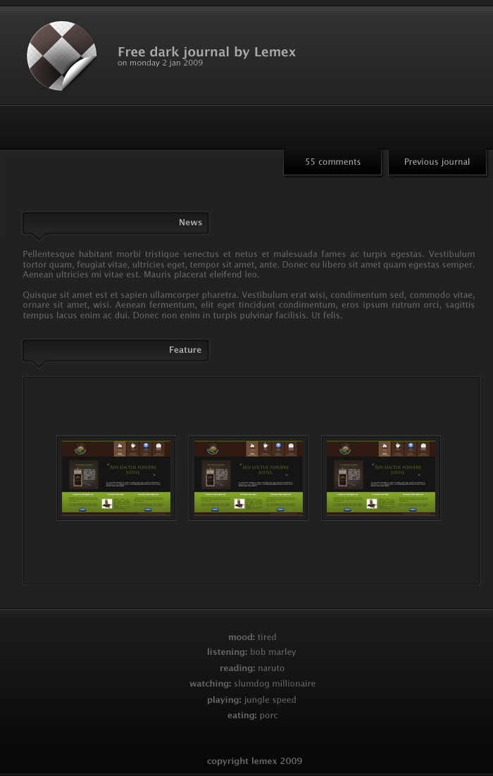
 LeMex — contest entry

Published: 2009-07-14 23:18:32 +0000 UTC; Views: 7540; Favourites: 77; Downloads: 301
Redirect to original
Description
I wanted to test some new design things I've been reading in smashing magazine.Ended up spending hours and hours in a contest to make a nice and crisp design that I work to the detail.
I don't think I'll win at all
 (Smile)")
But I'll be glad to know what you think of it
Related content


Comments: 50


I like the layout but if im critical i'd have to say that the text looks completely, but nice style!
👍: 0 ⏩: 0


Hey,
what I like is definatly the blue color. Overall a really good work but I (personal meaning) wouldn't add bubbles in the header. See no point for that.
Anyway, good job or in your language: Trés bien. (but no, I don't speak french enough for a longer conversation) ^^
👍: 0 ⏩: 1

thank you very much
Yes bubbles are maybe too much, but since I wanted to put something I came out with that, since it's simple to do
👍: 0 ⏩: 0


")
merci bcp
il me plais bien aussi. C un peu la synthèse de tout ce que j'ai appris dernièrement. (j'ai lu enormément d'articles sur le webdes dernièrement )
👍: 0 ⏩: 1

Ah oki, ben... continue à lire, ça te réussi ^^
👍: 0 ⏩: 1
hehe merci bcp. En plus il est très "mac" quand même le design
👍: 0 ⏩: 1

J'sais pas si on peut dire que quelque chose est "mac" mais c'est dégradé, sobre, pas surchargé, etc.
👍: 0 ⏩: 0


hey, thx m8!!!! Really glad you liked it
")
👍: 0 ⏩: 1

No, not a little better - an extraterrestrial leap. Your work was very good before - but this is an awesome, professional piece that really is a cut above the designs I've been looking at lately from anyone.
Keep it up!
👍: 0 ⏩: 0
thx. Indeed I like clean design!!!
👍: 0 ⏩: 1

np but unfortunately, "beauty is in the eye of the beholder," so the client will probably have a different opinion.
But good luck with your contest
👍: 0 ⏩: 1
 (Wink)")
👍: 0 ⏩: 0

definitely a winner for me!!!
keep your had up bro!!
👍: 0 ⏩: 1


Don't say you won't win. I think that this is absolutely amazing!

👍: 0 ⏩: 1
hehe, thx man. It's just that I submitted the thing yesterday, and since then the organisator of the contest connected a couple of times to give feedback, but didn't gave ma any.
But the kind words here are just great, and for me it's a full win since I did this to train, and it looks like it's achieved
👍: 0 ⏩: 1
Well, if you don't win, you could sell it to another company perhaps?
👍: 0 ⏩: 1


nice job
the anti aliasing for the text is a bit weird though
")
👍: 0 ⏩: 1
ha yes? I the whole text? I use smooth generally with either arial or lucida grande since I think there pretty reliable websafe fonts, but maybe I changed the antialiasing somewhere.
👍: 0 ⏩: 1
well, i guess it just gets blurry when the font's too small or smaller than usual
look at the basket case and log in on the top right
👍: 0 ⏩: 0
