HOME | DD
 Lemon-Heartss — Flutterby

Published: 2013-01-30 03:15:22 +0000 UTC; Views: 8459; Favourites: 179; Downloads: 180
Redirect to original
Description
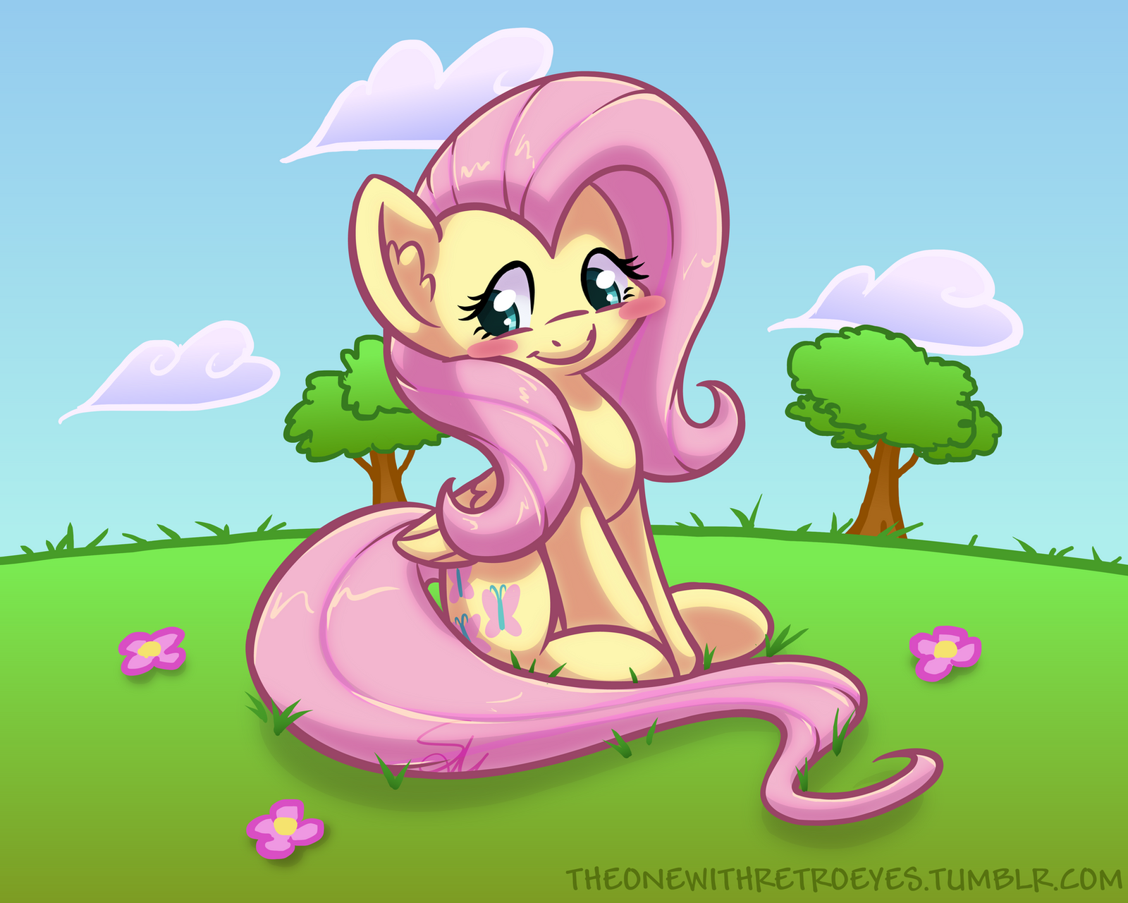
whoa guys look I think I can shade now XDRelated content


Comments: 24


Originality
Impact
This painting looks great. There's so many things I like from the shading to it's detail and consistency. I like how there are shadows in virtually every part of her body. It's on her face, her hooves, her wings, and even in her hair which makes it realistic because she is right in front of the sun. In terms of the consistency, I mean that I like how the art has no piece that looks awkward or out of place. Every piece on Fluttershy fits with every other piece and makes her a joy to look at. I also love the details used on her feathers, the fur ending at her hooves, and her mane and tail. I see that on her mane and tail there are little strands of hair sticking out in random places and I think it adds to the detail already presented on her. I also like the wing detail where not every feather is perfect and some have little chips and tears on them. While not necessarily a complaint, I do wonder what those swirls in her eyes are supposed to be because they don't look like pupils and they are definitely not a reflection of the butterfly she's looking at. I don't find anything really wrong with this painting, my only comment on my star review is that there are a lot of pictures of Fluttershy looking at a butterfly. But while that is true, that doesn't make this painting look bad in any sense.
Great job my fellow brony. /]*[\
👍: 0 ⏩: 1

wow thank you! Im glad you like it!
explanation on the eyes? its just an effect on the pupils I guess. I thought it looked pretty cool. its not a reflection or anything. and YES OMG this picture is so unoriginal. butterflies and sunshine? seriously? oh boy. I need to be more creative. anyways, im happy you think I did a good job and thanks for your critique!
👍: 0 ⏩: 0

Overall
Vision
Originality
Technique
Impact

The shading threw me off for a moment, it's much stronger and a wholeeee lot prettier . . . ! I was all "Wait, Lemony er Pott . . . drew this?"
D'ya have a nickname you prefer to go by anychance? For future reference
You're drawings have been relatively light/flat-shaded so this is an amazing and obviously welcome change~
Now since you opened the critique window -
3 for Vision, from what I see the drawing is meant to depict Fluttershy passing by simple, peaceful scenery. This idea is definitely present, however there is much more that could be done such as livening the field and adjusting the camera's perspective.
1 for Originality, not to take to heart, it's simply because the idea itself has been well over-done and there are no features to this drawing that makes it stand out from any others, but that doesn't mean it was bad or anything to draw this, it's great practice for all the changes you've made since previous drawings.
3 for Technique, you have improved in how you draw and color ponies greatly over the course of time and this drawing definitely stands out a lot from your previous drawings. The reason for not providing a higher rating however, is because you still have a lot more potential, and much more to learn, that you just need to keep working hard towards. So long as you keep it up, this rating of mine's won't drop, only to move up.
1.5 for impact, basically what I've mentioned in vision and originality sums this up as there's not much to this drawing that helps it stand out too much from another drawing similar in idea.
Perspective
In this instance, your perspective of the background appears different then the perspective that Fluttershy is being viewed at.
Fluttershy appears to be viewed from the side as the side closest to us (her right side) and the side farthest from us (her left side) are on the same level. Note that you placed the hooves pretty much on the same horizontal line practically.
This is to note a fact for consideration - You've vastly improved on your character coloring, but now I feel it's best you consider practicing to put the characters into a different angle of perspective and/or trying new poses such as what you've done in "twilight's test" and "Lustrous Dreams two".
The background however looks like an angled view slightly from up to down. Probably a personal opinion 'though as I can't seem to pinpoint the exact reason why. Nonetheless Fluttershy is still viewed from the side-view, and as such the grass area appears to be a hill yet doesn't due to the lack of indication of this fact.
Backgrounds
As of lately, I've noticed you've been working on doing backgrounds more. It is still very basic right now, but nonetheless a very good step, the simplistic method at which you draw the grass, clouds, sky and sun work well together and have a neat cartoonish style to them.
Composition-wise however, it is rather plain. The foggy shading/clouds added to the ground/sky respectively help it from being completely plain, but because you don't have Fluttershy taking up most of the space of the drawing, the viewers would give the same amount of attention to the scenery which is not as detailed as Fluttershy is here.
Fluttershy, the butterfly and the sun helps, but there is relatively no activity or detail to the right-side of the drawing. Although it is good to keep things off-center, it is also recommended you keep objects relatively in balance across the drawing, like a scale.
Attention to Detail
The wings are what stand out to me the most, because in my opinion, you've done them much better than I have been doing them especially by how you shaded them. The little additions to the mane, having the stray mane/tail strands helps add detail to them while still preserving the simple-method approach to shading them (as if they were solid, note that this is fine to do especially in simple/cartoon-like drawings).
However 'though, you might be over-doing it slightly as it starts to look frayed, especially the smaller side-mane where the lines start to bunch together.
You've paid lots of attention to Fluttershy and she matches well with everything, except the butterflies. The butterflies don't appear to be in the same style as the rest of the drawing because they do not have a dark outline around them.
Coloring
Very strong without being overbearing, as well I also notice that you've done colored outline instead of a single-color outline instead.
For coloring itself, I would say that you've done great, and only now need to help improve on it by the previous category 'detailing'.
I cannot comment too much on shading/lighting, as it is very simple for an atmospheric-lighting setting (sun in this instance) to put down shading. The one issue however is that lighting appears to be directed on the tail in an omni-direction, many spots you have shaded where areas are another part, but the tail has the lighting follow the tail without taking into account the lower part that is under the upper half of the tail, as well it's a touch odd having shading at the back of Fluttershy's leg right next to the tail that is being lit.
Her eye's, how pretty. Right now they look a small water surface with a ripple 'caused by water drops. When you start to consider that 'though it looks a touch odd, but considering you haven't done detailed eyes before, it's quite amazing.
So to basically summarize my suggestions -
Try new poses
Check on how you do perspective
Practice working on artwork composition
and as well, continue with what you're doing, the details and color changes is quite the jump~
Although originality, vision and impact may be improved upon, I would consider it optional to work on until you're able to actually draw different poses and in different perspectives and such.
Note - When I type a lot, I get worser at double-checking what I typed, so if there's anything odd or anything you want to ask more about in detail/have an explanation then just comment and I'll see how to help.
Hope the critique helps, again keep up the amazing work~! It's a pleasure to see ya draw and I always quite love seeing people improve as well.
👍: 0 ⏩: 1
My two closest friends are the only ones who still call me potter. You may call me Lemon, though! c:
Thank you for all the nice compliments! Im really happy you were impressed by the shading!
I will work on every single thing you said on here. definitely. I know its REALLY unoriginal. I was killing myself just drawing it. but its really only because I couldnt think of anything that I could do. I had few ideas, but I would have had to change all the shading and I honestly dont think I could have pulled it off. so this is what I got stuck with. and yuck that background. I like the colors, but I wish i used like brushes or something. plus it was a like a hill shape which wasnt good because shy's hooves were flat on the ground. definitely not pleased with the background. oh the eyes are a new thing! my eyes were a little boring, so I found a different way to do them! I really like it c: same with the wings, i think they look pretty cool. as for the mane, well I tried making it look a little more 3D, but I may have overdone it with the strands of hair. and Im not sure how to make it look real and still look good... I guess that will be something I'll work on.
Thanks for the critique!
👍: 0 ⏩: 1
T'was wondering if you were gonna give a reply to the critique, I admit I did type a lot xD;
You're welcome~!
👍: 0 ⏩: 1
Lol I did a really short response because I wasnt in the mood to write a lot XD having your critique in my inbox for the past week has been killing me!
👍: 0 ⏩: 0


And here I thought this would be a Ni no Kuni reference.
👍: 0 ⏩: 0


Oh my god, it's mazing.. the colours, shadinng... OH MY GOD... I CAN'T STAND THE AWESOMENESS
")
👍: 0 ⏩: 0

OH YES. It's done and looks amazing! Like what Catflail said, I think the hair should be more "hairy", but don't overdo it like many artsits do. I think it looks wonderful, though.
👍: 0 ⏩: 1
I wish someone could teach me how to make it look like hair... so many people think I should do it, but I have no clue!
but hey thanks Im glad you like it! Took a while XD
👍: 0 ⏩: 2

I do hair by doing small lines in a darker and lighter tone comapred to the hair, then putting some small strands on the side of the hair.
👍: 0 ⏩: 0
I don't how to, that's for sure. I just end up making it look worse. I like how you shaded your's a lot.
👍: 0 ⏩: 2
Really? thanks I used some color advice someone gave me! dont just darken the color, move it one color towards red! Its the oppostie for tinting. I'm glad they told me that, it looks a million times better!
👍: 0 ⏩: 1
Huh, I've heard that. I'll have to try it out one day.
👍: 0 ⏩: 1
trust me, it really works c:
👍: 0 ⏩: 0

Looks great :3 Love the shading as for a Critique, eh... hmm.. shading on the mane and tail needs to be more like hair than a solid object. That's just my 43 cents though.
👍: 0 ⏩: 1
Dang! I need to figure out how to do that then... XD thanks!
👍: 0 ⏩: 1
You're most welcome, just happy I can give some insight :3
👍: 0 ⏩: 1
happy I have something to work on! c;
👍: 0 ⏩: 0