HOME | DD
 lemurstyle —
On polarity: x-axis+y-axis
lemurstyle —
On polarity: x-axis+y-axis
Published: 2005-03-26 01:12:03 +0000 UTC; Views: 5790; Favourites: 60; Downloads: 1303
Redirect to original
Description
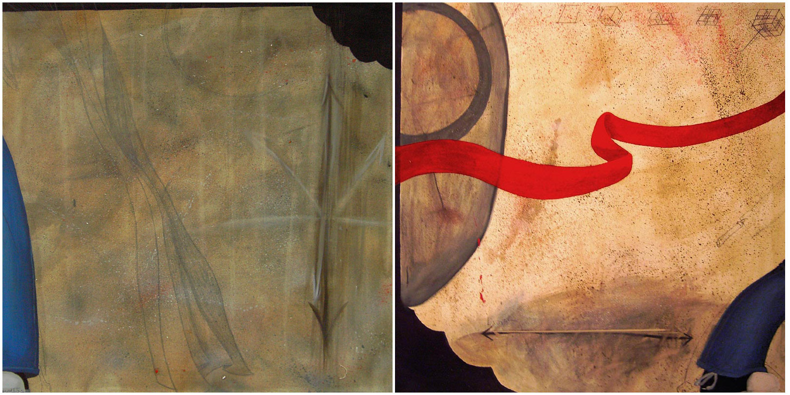
The diptych.edit: Thanks to everybody who commented on this. I thought that since so many people mentioned it that I should explain some of the meaning behind this painting. I kept things diliberately obscure before so people could come to thier own conclusions.
The core of this painting lies in the arrows, they are meant to symbolize the linear nature of politics these days. It's really about all you ever hear when people talk about politics is left this and right that, all people seem to care about is whether something is conservative or liberal, all other factors seem inconsequential. Sometimes you hear about moderates but for the most part people are incredibly polarized and can not agree on anything, everyone lies on the ends of one horizontal axis. The tiny drawings on the top of the X-axis painting are diagrams of the 1st-3rd dimensions as well as theoretical diagrams of possible higher dimensions. These are meant to allude to the fact that our political model is completely one dimensional and that if people can concieve of dimensions in space-time above the third can't we expect more than one dimension in politics? Can't we add a Y-axis to the political world? What about a Z-axis? Is there anyway to avoid lines completely and just approach everything in a utilitarian way devoid of polarized platforms?
The "bite marks" on the painting are supposed to be reminiscent of thought bubbles from comics; everything inside of the paintings is purely intellectual action, outside of the thought bubbles/paintings lies the real world which is invisible becuase the paintings are not concerned with the real world.
The red ribbon and the blue legs are merely meant to be entertaining distractions. They are parts of characters I have from stories, roleplaying games etc. and they are there because sometimes it is just so much easier to daydream about the adventures of fashionable heroes.
Huge thanks to anyone that has had an interest in this painting and I hope the comments are helpful.
Related content


Comments: 29

wonderful use of color, love it.
Great job.
👍: 0 ⏩: 0


I think it is extremely interesting in the way it provokes me to come to a conclusion whether it is an aerial view of a vast natural landscape or a close up view of some object made artificially (i.e.: a piece of paper with mathematical drawings). But at the end, I think it is irrelevant. What it matters to me is that it is quite provocative visually and conceptually - how there is no apparent connection between the two paintings and your intention for it to be political, and there is a need for me to draw them together, to engage.
But what I don't like is that the photo of it is too small, I can barely see the faint drawings in the top section of the second painting (and I am sure there are more in different places).
👍: 0 ⏩: 1

Thanks for the comments. I just made the pictures of this painting much bigger, I hope that helps.
👍: 0 ⏩: 0


It seems that you have deliberately tried to create the impression that these two works are croppings out of larger works. I like that idea...although I think you might have taken it a bit too far, I feel lost – the two works are not really holding together compositionally, in both cases the elements are not coming together successfully to make a whole. Perhaps this is intentional to add to the effect that these are parts isolated out of a more complete whole but I feel that you could have created that effect and created works that still hold together compositionally. All that said, I would certainly say that the work on the right is the more successful compositionally – I think that’s because there is some interaction between the various elements, some of them overlap and form clusters hence creating more cohesion. This doesn’t happen on the left; instead the three main elements remain evenly spaced apart from each other – there’s no relationship between these elements. Again maybe this is an intentional effect, but I don’t know that it is working, at least from my point of view.
Anyway, looking at the two works together as a diptych again I’d say there needs to be more unity. The blue and the bite mark (?) do manage something in the way of bringing the two pieces together, but there’s still too much disparity, they don’t quite feel that they belong together.
I have to say though, I’m impressed with the way you have applied the paint (or whatever else, wish that it was larger so I could see more of this detail), there are some really beautiful textures and marks here in this piece; you seem to have handled it very well. The quality of light, the gleam that you have created, on the right panel is excellent, there is a lot of depth because of it in that panel (which is missing on the one on the left).
👍: 0 ⏩: 1
This is a very helpful comment, I'm starting to think that you are exactly right about the right side working better, several other people have made a similiar comments. There was a substantial gap in time during the painting of the two sides, perhaps that led to the disparity in the composition.
👍: 0 ⏩: 0

I enjoy this diptych immensely for a few reasons though the first is that it is rare to see such an effective use of the diptych presentation on DeviantArt. I would argue even that this is one of the strong of this style that I've seen of late in galleries around here [nyc] and the like. I think that the feeling that these are two details of larger works then used as a paper upon which to think out something else is beautiful. It reminds me very much of material shortages and artwork being re-tasked for other purposes that do not destroy the original but present it and alter it so that it becomes a new creation entirely. The analogous tonalities in "Y-Axis" play a wonderful contrast to the bright primaries in "X-Axis". The blue ties the two images together in a way that composition alone could ahve done but underscores it and makes it have greater impact in my eyes. The iteration of planes in "X-Axis" is a wonderful sort of DaVinci like detail, most so that other artists that did the same with different purpose because I think here it underscores creativity and creation much as DaVinci was a pioneer of artistic thought. The repition of curves in both works is really strong, and the two circular elements create a harmony within each piece but still allow for symbiosis. The jigsaw detail is a little too overt for my liking but still quite excellent.
I will stop here as you noted in an earlier comment that it is without meaning.
Strong work. +fav.
~adoniram

👍: 0 ⏩: 1
Thanks for the great comments. Its nice to hear someone recognize the plane diagrams for what they are because I wasn't sure if many people would.
👍: 0 ⏩: 1
Sure thing. Just my thoughts, glad they were of some merit. Cheers.
~adoniram
👍: 0 ⏩: 0


I just added some more information about this painting if that helps clear things up any.
👍: 0 ⏩: 0


I like how it looks like, but I'm trying to figure out what it means - why it's political. I see horizontal and vertical - two streams, opposites bound to clash at some point... but I think there's more to it. I'd like to know what that 'more' is.
👍: 0 ⏩: 1

Why the hell do you think it's political?
👍: 0 ⏩: 1

"Category: Traditional Art > Paintings > Political "
Because of that.
Personally, i don't get it either.. could someone who has understood explain?
👍: 0 ⏩: 1
Oooh, I didn't see that; you're right. That's indeed very strange. I thought of this as a very nice abstract piece with no real message. Maybe it's a random nonsense categorization?
(I do hate uninforming artist's comments; that box is there for a reason)
👍: 0 ⏩: 1
Thanks for checking out this painting, I just edited the description to add some more information about the thoughts that went into the painting. I hope it clears things up for everyone.
👍: 0 ⏩: 0

Wow. This is beautiful (it'd make a great album cover, front and back  (Smile)")
👍: 0 ⏩: 0

very nice! the composition is really quite something!
👍: 0 ⏩: 1
Thanks for the comment. I really like your gallery by the way.
👍: 0 ⏩: 0


Beautiful works here - crafted nicely with a comfortable set of colours.
+fav
👍: 0 ⏩: 0

i can dig it. you should put more sweet work up.
👍: 0 ⏩: 0