HOME | DD
 lennard — Metallurgy
Published: 2004-03-10 18:55:30 +0000 UTC; Views: 58017; Favourites: 79; Downloads: 60984
Redirect to original
Description
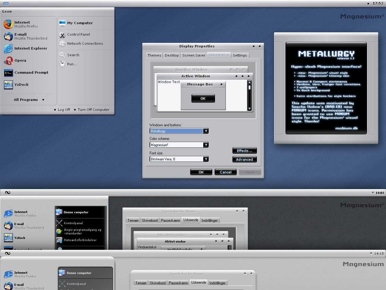
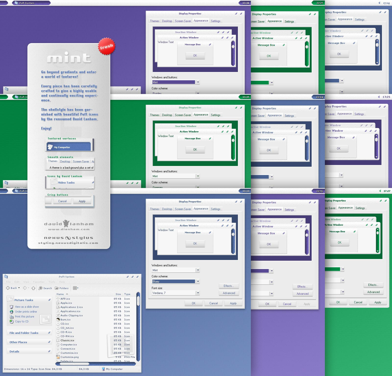
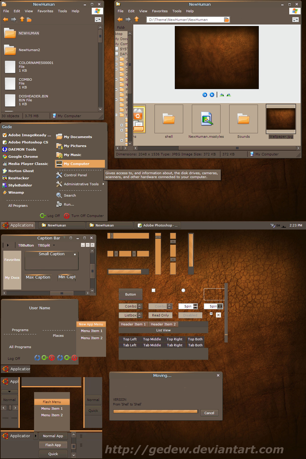
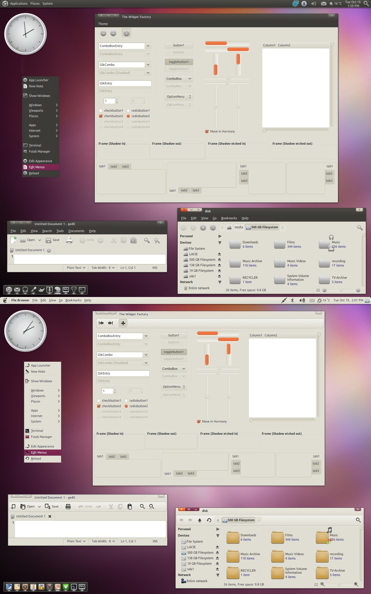
Hyper-sleek Magnesium interface with Boron elements!* -NEW- Magnesium³ visualstyle
* -NEW- Magnesium³ Winamp skins by MattO
* Magnesium³ shellstyle icons by Sascha Höhne (www.rad-e8.com)
* Magnesium & Magnesium² styles.
* Bitstream Vera 8, Verdana 8 & Linotype Frutiger 8 font versions.
* Normal & Compact startmenu versions.
* Yz Dock background.
* Extra startbuttons & startbutton PSD.
Enjoy!
----
credits
The Magnesium³ shellstyle uses the fantastic MINIUM icons by Sascha Höhne (www.rad-e8.com) and permission has been given.
The new style was actually motivated by the release of this iconset
 (Smile)")
Thanks!
The Winamp skins were made by MattO - superb style and a fast winamp skinner
----
update 1.3
* ADDED The Magnesium³ styles.
* ADDED Magnesium³ Winamp skins.
* CHANGED Verdana, size 7 to Bitstream Vera, size 8 version.
* CHANGED Tahoma, size 8 to Linotype Frutiger, size 8 version.
update 1.2
* ADDED The Magnesium² styles.
* CHANGED Lucida Grande version to a Verdana, size 7 version.
update 1.1
* FIXED toolbar content cut-off bug.
* CHANGED style to contain both versions in same file.
----
installation
To use this visual style you need StyleXP ([link] ) or Neowin UXTheme Multi-Patcher v2.5.1([link] )
Bitstream Vera fonts are freely available here ([link] )
Related content


Comments: 77

 (Wink)")


Hi Lennard!
Could you make a grey-buttoned version of Magnesium3? I know, TiSkin has grey buttons, but I think Metallurgy is softer and better.
Metallurgy is more suitable for every day use.
👍: 0 ⏩: 1

That would kindda break the theme, but you are always welcome to play around with it yourself
👍: 0 ⏩: 1
Okay...
I would do it, if I could do it.
")
👍: 0 ⏩: 1
Stylebuilder has a recolor tool that makes this much easier
👍: 0 ⏩: 1
Congratulations! Good work!
I like the black buttons.
👍: 0 ⏩: 0

With the updates this remains one of my all time +favourite styles. It continues to have that professional feel to it and is possibly the only "complete" style of its kind. So many have attempted "metal" styles.. but not one has come close to this quality.
Exceptional ..
5*****
👍: 0 ⏩: 0


")

Add me to that list of people with this as default VS. It's awesome. Smooth as hell. Great job. Honestly, you make styles that are exactly what I want.
👍: 0 ⏩: 1

")


Great work on this lennard...I love metal based themes!
Cheers, Steve
👍: 0 ⏩: 0


hi
nice design!
I'd like to know what calender program is used there?
also can u mod a version to support 1600x1200 resolution? at the moment its usable, but the button fonts almost dont fit.
thanks
👍: 0 ⏩: 1
Thanks.
The calender is rainlender.
Check your displays DPI settings. They are most likely non standard.
👍: 0 ⏩: 1
thanks. rainlender looks good.
cant find the matching rainlender skin u used in the picture. did u also create that urself?
👍: 0 ⏩: 0

Sweet vs! I really like the colors and the FX in the text (grabed or beveled) really cool! and it fits so cute with my desk. I'm downloadin' it right now, well done 
👍: 0 ⏩: 1


I've had this skin up and running 4 a couple of days wow! very smooth and sleek , I would love to thank you for such a great skin , kudos a million kudos 4 u!!!
👍: 0 ⏩: 1
I greatly appreciate your comment
👍: 0 ⏩: 0


cool! i like the graident on the wp, because it reminds me of the sony adverts.
👍: 0 ⏩: 0


yea real sweet......it's not to light or white to the point where it turns me off either.....good work
👍: 0 ⏩: 0
I like this a lot.....it's not 2 light or white to the point that it turns me off either......good use of color combo with the black....sweet style
👍: 0 ⏩: 1


| Next =>