HOME | DD
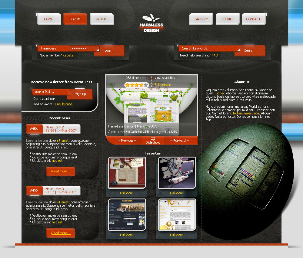
 LessOrdinary — NO 2 ALCOHOL
Published: 2005-04-23 10:05:28 +0000 UTC; Views: 4998; Favourites: 22; Downloads: 2084
Redirect to original
Description
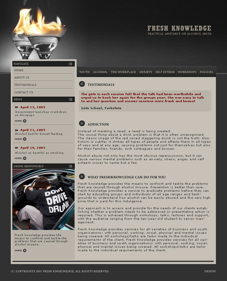
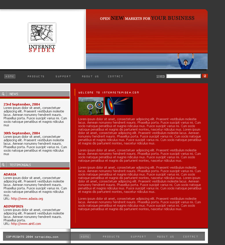
layout for fresh knowledge, a website dedicated to assistace on alcohol abuse.i've been doing really crappy work recently.. but i feel relatively happier about this one..
thanks to all my sweet watchers for their eternal support

Related content


Comments: 89

thanks
psl you have any link related to photograph image or pattens image
pls fow i am wating >>>
👍: 0 ⏩: 1

For stock photos I use,
[link]
[link]
[link]
If you want to use free images, then
[link]
For patterns
[link]
👍: 0 ⏩: 1

i like the colour combination & the detail in it.
very hard work u have done it. 2 Thumbs Up
👍: 0 ⏩: 0

hi...
i wonder if somebody noticed the spelling mistake at bottom in ur copyright
great job by the way!!


👍: 0 ⏩: 0

would you be intrested for wroking for a media company? [link] ?
👍: 0 ⏩: 0


very well done and you've kept it simple. Nice choice on the colors too.
👍: 0 ⏩: 0

yeah i can develop ANYTHING in XHTML and CSS but my problem is design, i can never think of a fresh design
👍: 0 ⏩: 1
happens to me too sometimes ")
👍: 0 ⏩: 0
do you ever develop or just do design, love this layout
👍: 0 ⏩: 1
yeah i develop too - although i'd prefer it if i dint have to ")
but yeah i do
👍: 0 ⏩: 0

Awesome colors pick and very nice layout. Always doing some great stuff

👍: 0 ⏩: 1
thanks so much for the appreciation! 
")
👍: 0 ⏩: 0

Great colours, design and layout.
I love the header. Classy work.
Well done.
👍: 0 ⏩: 0

Excellent layout lady! MashAllah, you have a beautiful sense of design and usage of negative space. 
👍: 0 ⏩: 1

Wonderful, so elegantly composed and such harmonious arragements of navigation blocks, amazing
👍: 0 ⏩: 0

Awesome .. 
👍: 0 ⏩: 0

hi... it was very good .. i like very much of magazine style... visit my new porfolio too, hhhee and fav+ if you want... bye bye bro [link] [link]
👍: 0 ⏩: 0


Really wonderful....and seriously its lay out is really great. Hey wats this on extreme upper left....hummzz
Anyways colors are very smooth and sober.
👍: 0 ⏩: 1
wat on extreme upper left?  (Smile)")
👍: 0 ⏩: 1
Yes wats on extreme upper left? And u are welcome ...
👍: 0 ⏩: 1
ooh left
👍: 0 ⏩: 0

Gorgeous! Fabulous! Stupendous! Magnificent-ous! Hehe....lovely piece of designing. It is really inspiring.....almost makes me wanna quit drinking & driving.
Very nice color scheme, and beautiful layout. In one word, WOW!
👍: 0 ⏩: 1


👍: 0 ⏩: 1
You're welcome! Its the least I could do after looking at creativity in such abundance.............
👍: 0 ⏩: 0

WOW...its like every thing is on its right place.Composition and Colors just fit so well.and Congrats from breaking free of your trade mark designs.
👍: 0 ⏩: 1


👍: 0 ⏩: 0

Nia its beautiful, umm...I just don't feel right with the font used for "fresh knowledge" fit layout hai wesay
👍: 0 ⏩: 1
thanks for commenting. u have something in mind?
👍: 0 ⏩: 1
You are most welcome and no i don't have anything in mind  (Wink)")
👍: 0 ⏩: 1

Very Nice Design. It really gives you the feeling the site needs. That alcohol is very serious and can be very bad to you ( like the fire ) Great use of colors, i'M lOVING IT!
👍: 0 ⏩: 1
thanks a lot for liking it
👍: 0 ⏩: 1
no problem! don't hesitate to visit any of my designs and comment
👍: 0 ⏩: 0


damn good!!!!!!!!!!!!!!!!!!!!!!!!!!!!!!!!!!!! !11
👍: 0 ⏩: 1

yaar this is too good! mashAllah say, tooooo good! really likve the colors and concept! makes a lot of sense!
👍: 0 ⏩: 1
yes but sadly, the client got the colors changed to light blue! 
👍: 0 ⏩: 1
aahhh, don't you just hate it when that happens?! tsk tsk...chullo i'm sure most of your clients agree with yur work
👍: 0 ⏩: 1
| Next =>